


Selecting the perfect sheer shade color for a small room is a powerful design strategy. The right hue can transform a cramped space into one that feels open, airy, and intentionally designed. This guide provides a detailed roadmap, explaining not just which colors work, but why they work, and how to implement them to maximize light, perception, and style in your compact space.
Here’s what you’ll learn:
-
The color theory and visual principles that make certain shades expand a space.
-
A curated list of the most effective color families and specific shades to choose.
-
A clear guide on which colors to avoid and the visual pitfalls they create.
-
How installation techniques and fabric choices can amplify your color strategy.
-
How to coordinate your sheer shades with existing wall colors and decor for a cohesive, enlarged feel.
To begin visualizing these transformative colors in your own home, explore our main collection of sheer shades available in a spectrum of space-enhancing hues.
The Visual Science of Color in Small Spaces
Choosing a color is more than a decorative preference; it's a tool for manipulating perception. In a small room, the primary goals are to reflect maximum light, recede visual boundaries, and create a seamless flow. Light colors, particularly those with high Light Reflectance Value (LRV), achieve this by bouncing ambient and natural light around the room, making walls feel less solid and the space more expansive. Conversely, dark colors absorb light, making surfaces feel closer and the room's dimensions more defined and confined.
The Best Sheer Shade Colors to Make a Small Room Feel Larger
The most effective colors are those that act as a neutral, light-reflecting canvas. These shades work in harmony with light rather than competing with it.
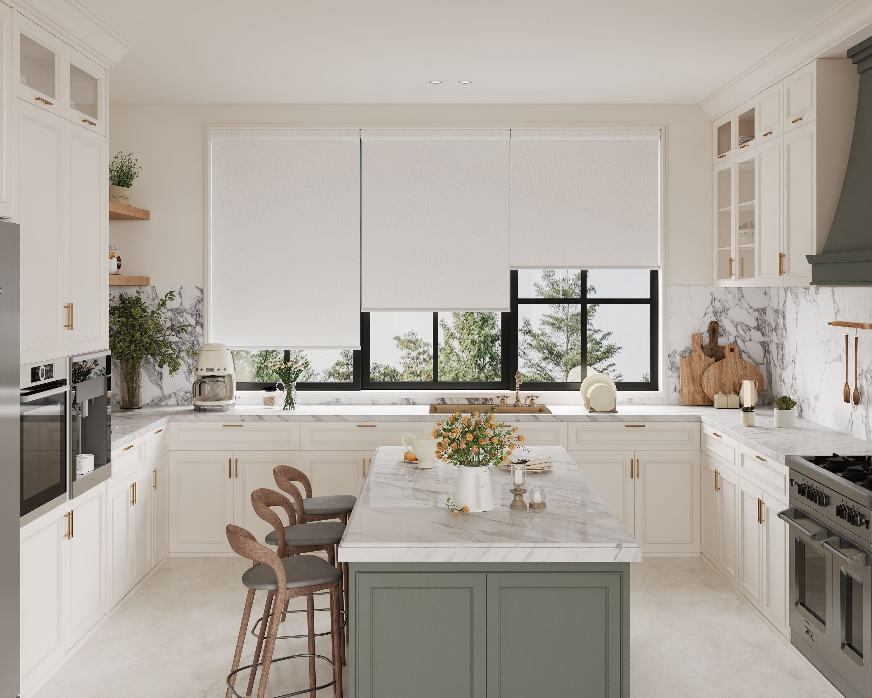
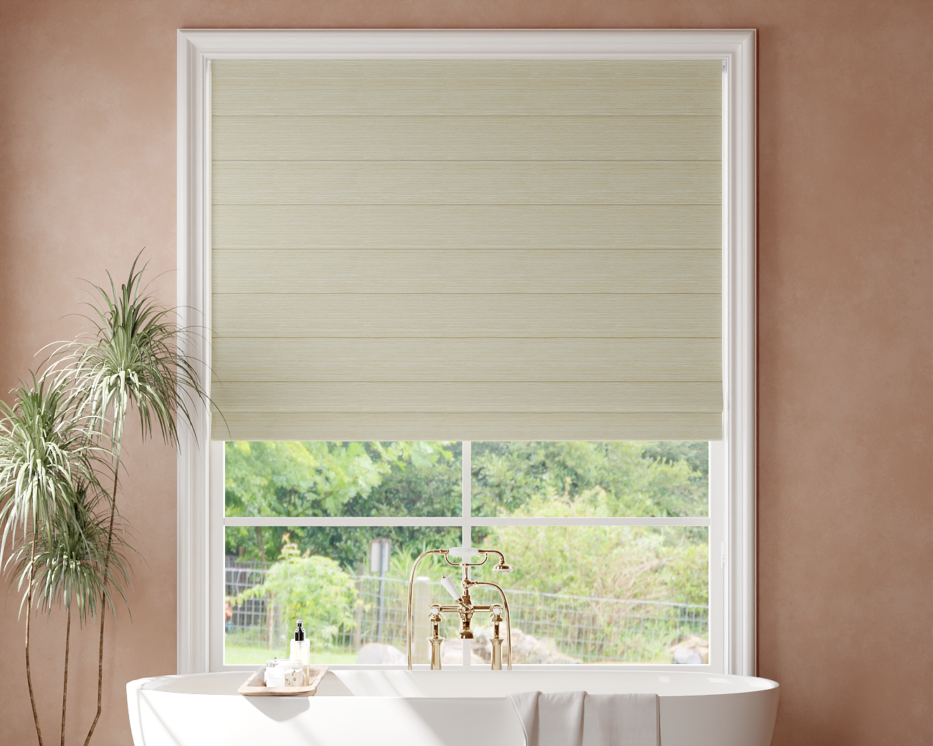
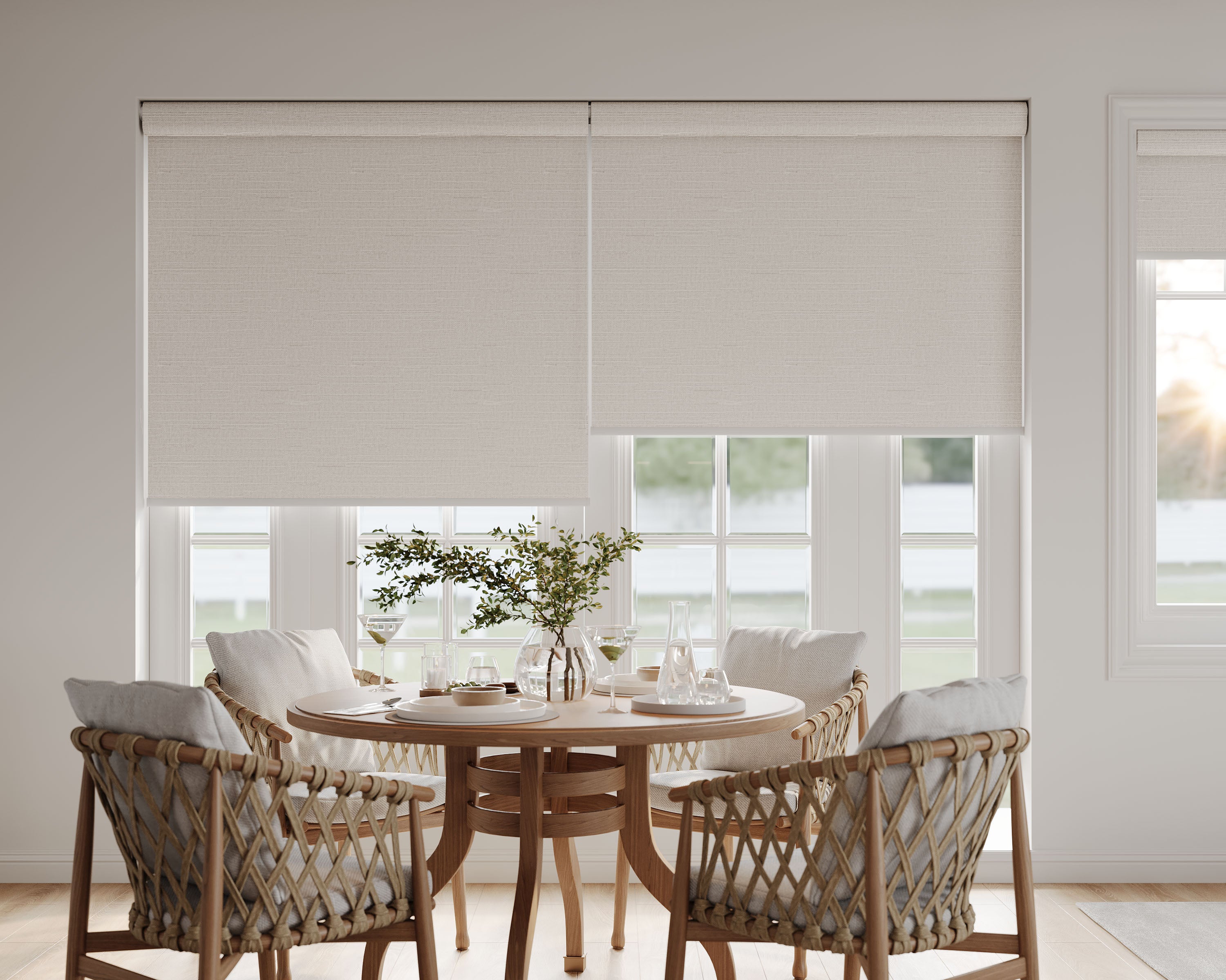
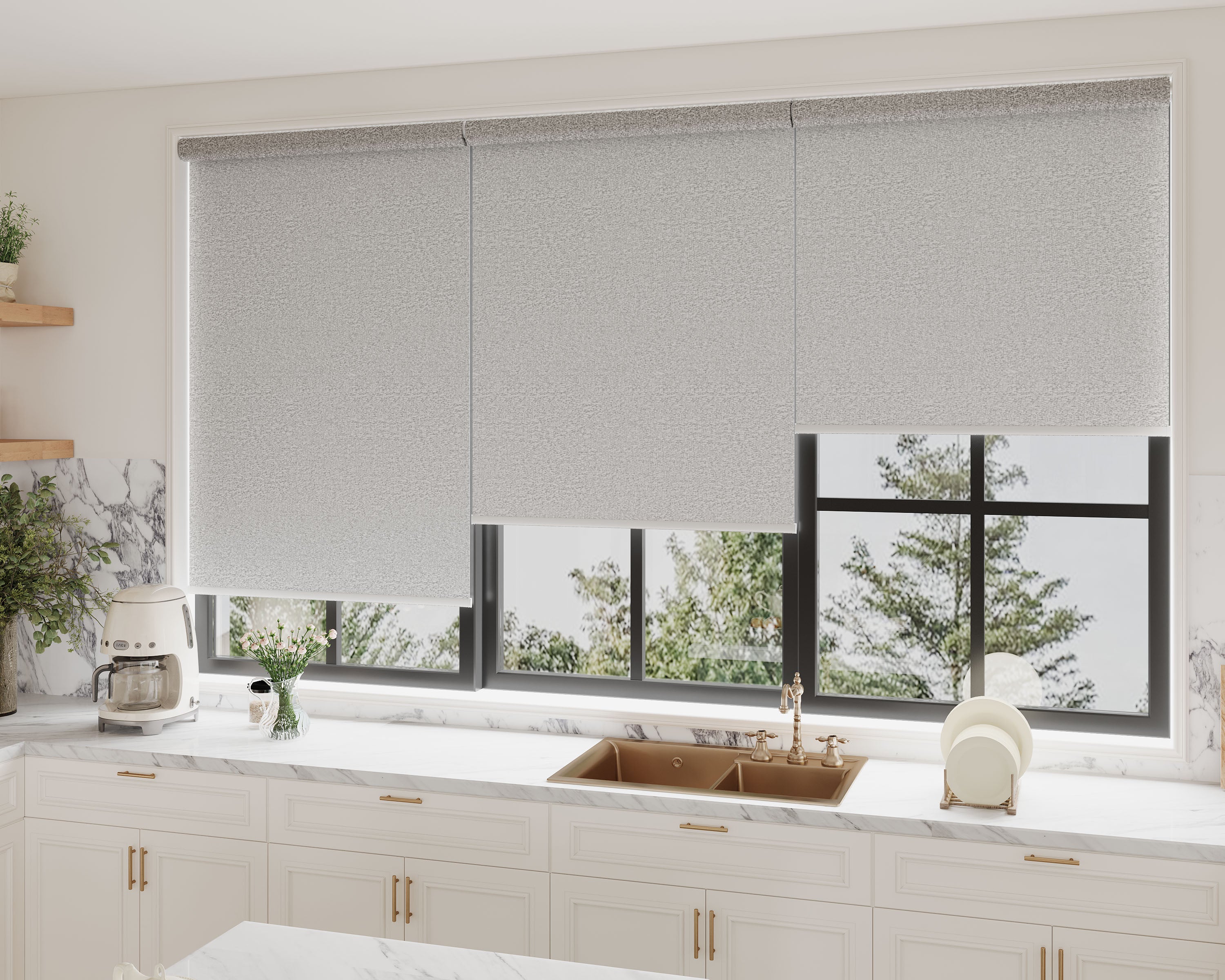
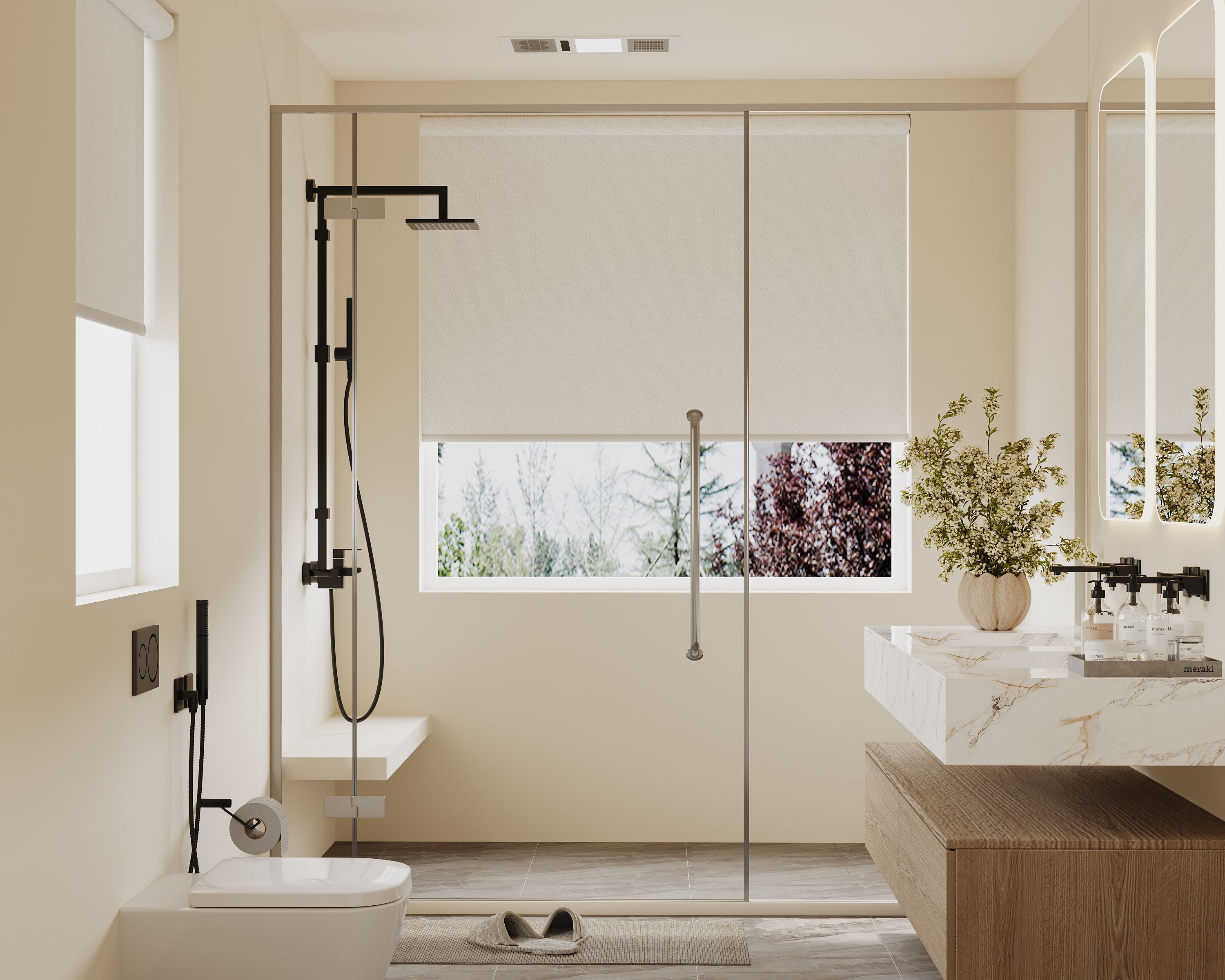
Pure and Soft Whites
These are the most reliable choice for maximizing brightness and creating a clean, open backdrop.
-
Why They Work: Whites reflect the highest percentage of light, instantly brightening a room and blurring the line between wall and window. This creates a sense of uninterrupted space.
-
Pro Tip: Opt for a "soft white" or "warm white" over a stark, cool white. Shades with subtle warm undertones (like Swiss Coffee or Ivory Lace) feel more inviting and produce a gentler, more diffused glow that is flattering at all times of day.
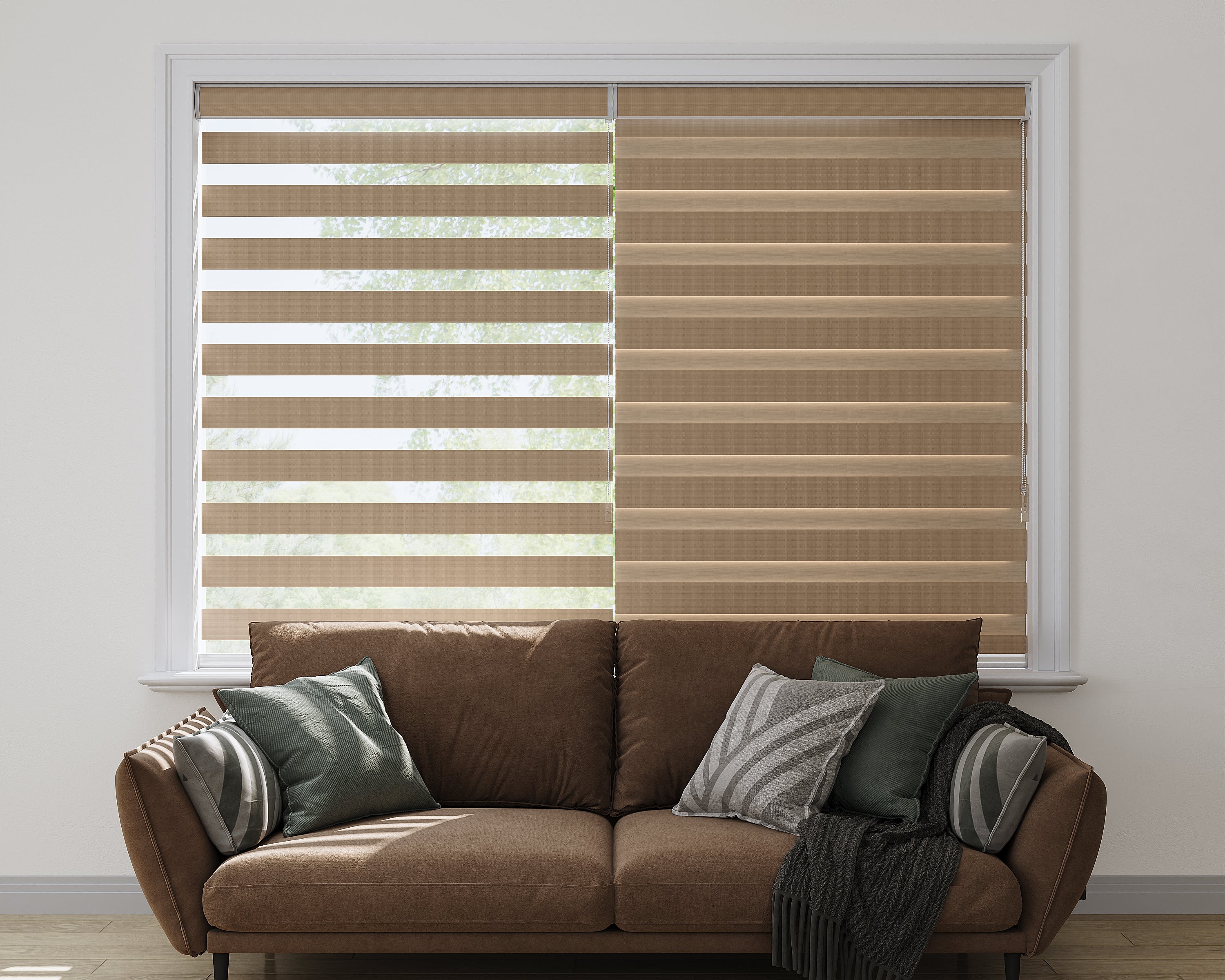
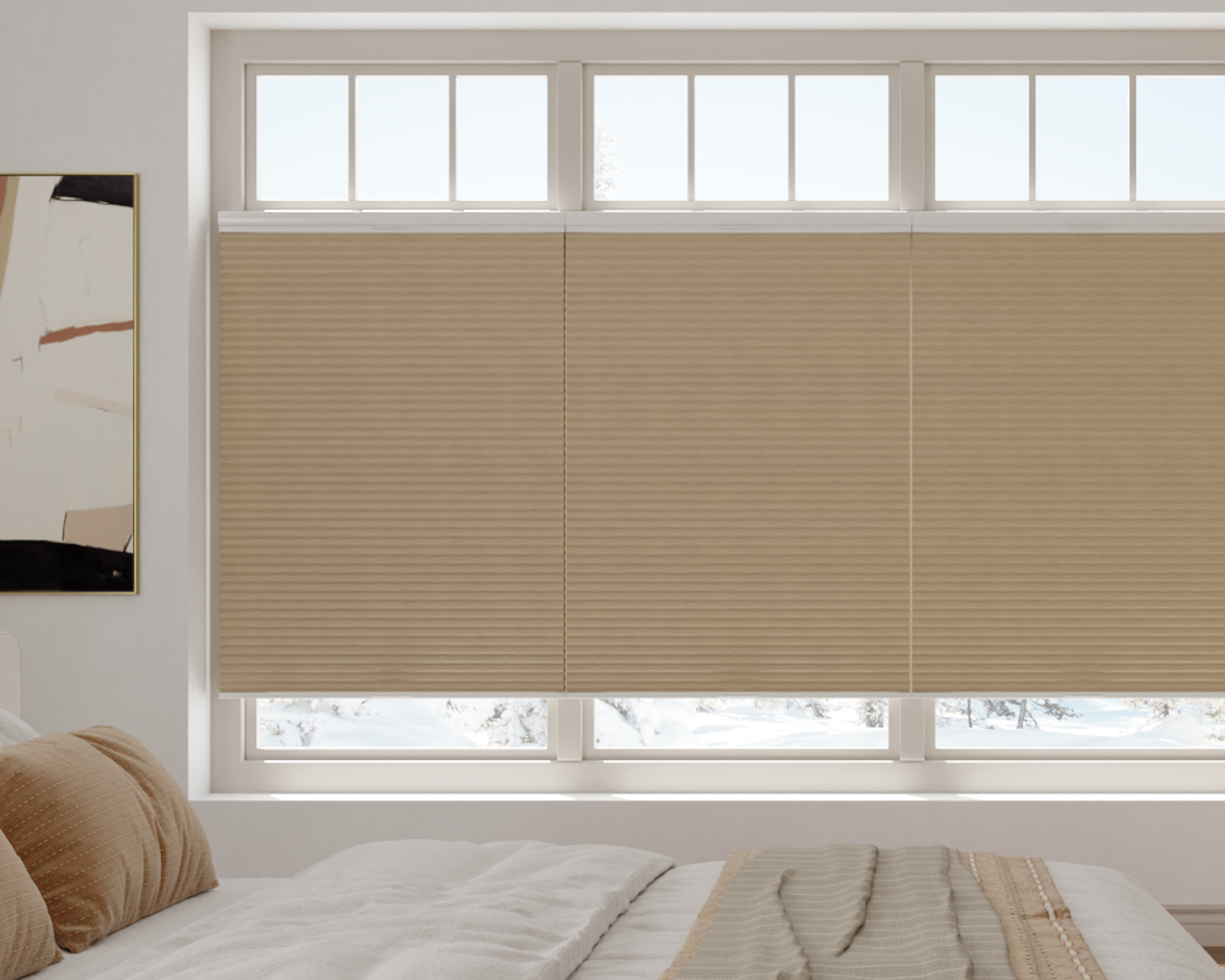
Light, Warm Neutrals
For those seeking warmth without visual weight, light neutrals are an excellent choice.
-
Why They Work: Colors like oatmeal, creamy beige, and light taupe add a layer of sophistication and warmth while still reflecting ample light. They help a room feel grounded and cozy without the heaviness of darker tones.
-
Pro Tip: These shades are particularly effective in rooms with north-facing light or lower natural light, as they counteract cool, grayish shadows and add a welcoming warmth.
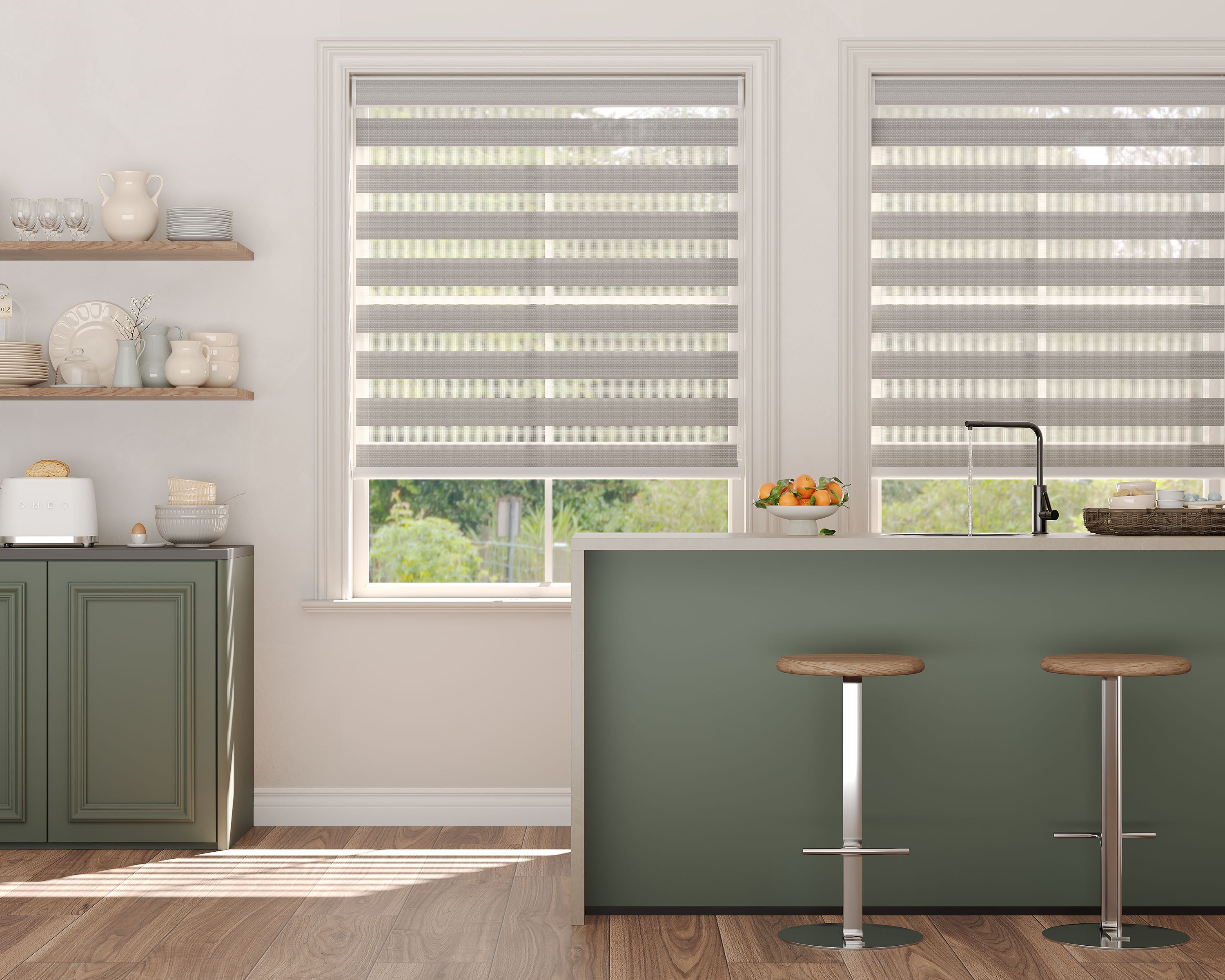
Soft, Dusty Pastels
Introducing a hint of color is possible without sacrificing the feeling of space.
-
Why They Work: Muted pastels like powder blue, blush pink, sage green, or lavender reflect light well while imparting a specific mood or personality. The key is the softness; these colors should feel like a whisper, not a shout.
-
Pro Tip: Ensure the pastel is "dusted" or grayed-down. Avoid bright, sugary pastels which can feel childish and visually advancing. A soft, dusty sage can make a home office feel both larger and more focused, a principle explored in our guide to creating an optimal home office environment.
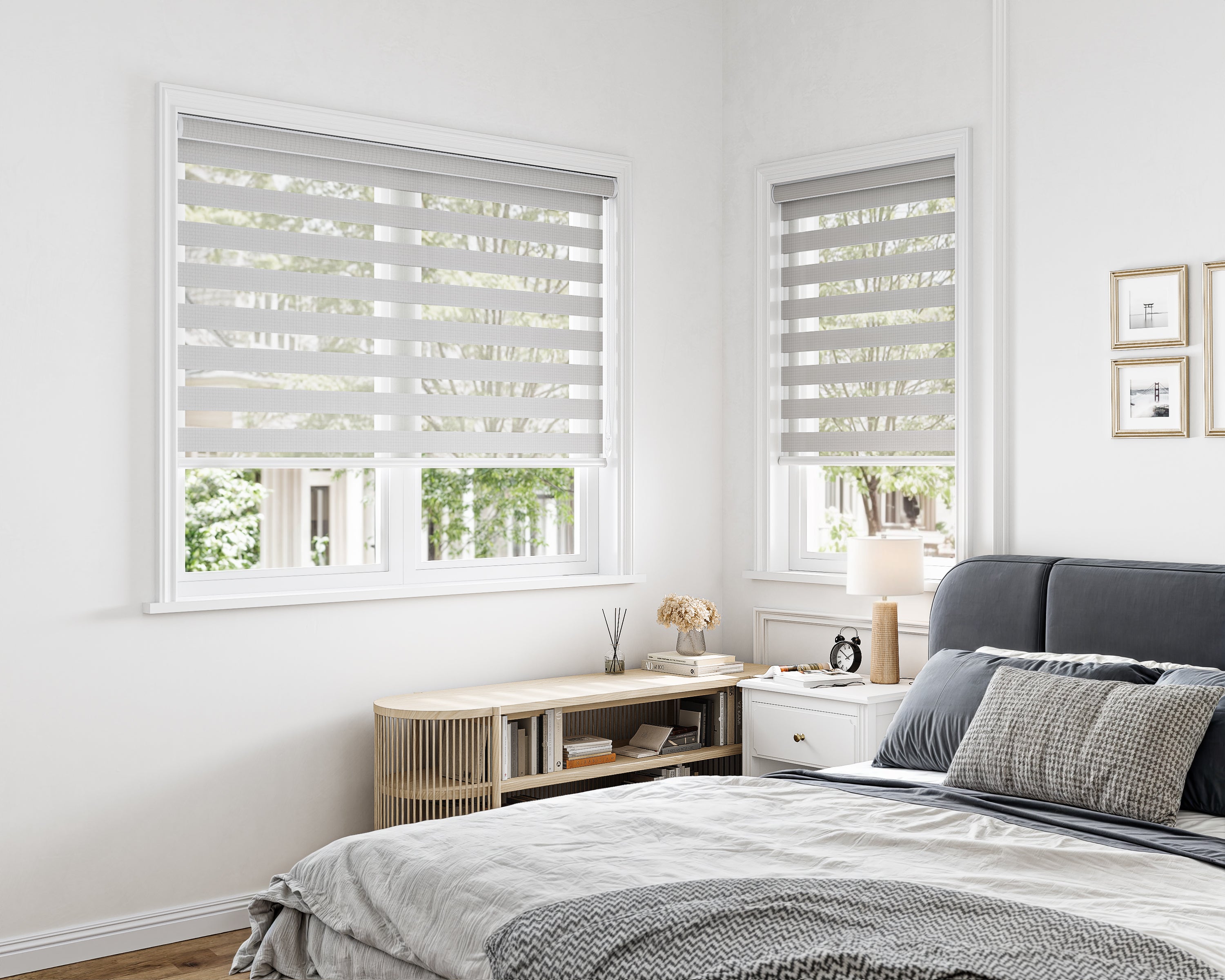
Light Gray (Chosen Carefully)
Light gray offers a modern, crisp alternative.
-
Why They Work: It provides a contemporary, sleek look that can make a small space feel thoughtfully designed.
-
Pro Tip: Undertone is critical. A gray with blue or purple undertones can feel cold and shadowy in a small room. Choose a gray with warm green, beige, or taupe undertones (often called "greige") to ensure it feels airy and light.
Sheer Shade Colors to Avoid in Small Rooms
Certain colors actively work against the goal of expanding a space. Generally, these are shades that absorb light and create strong visual contrast.
-
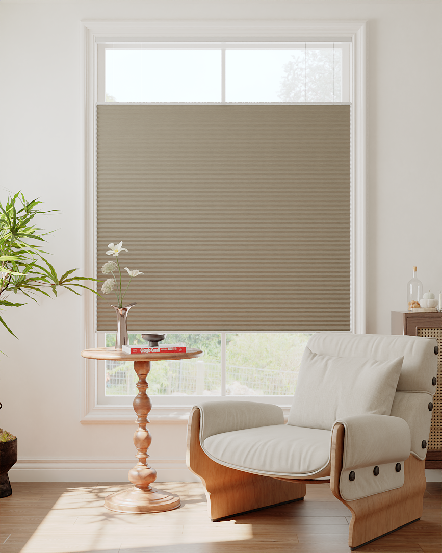
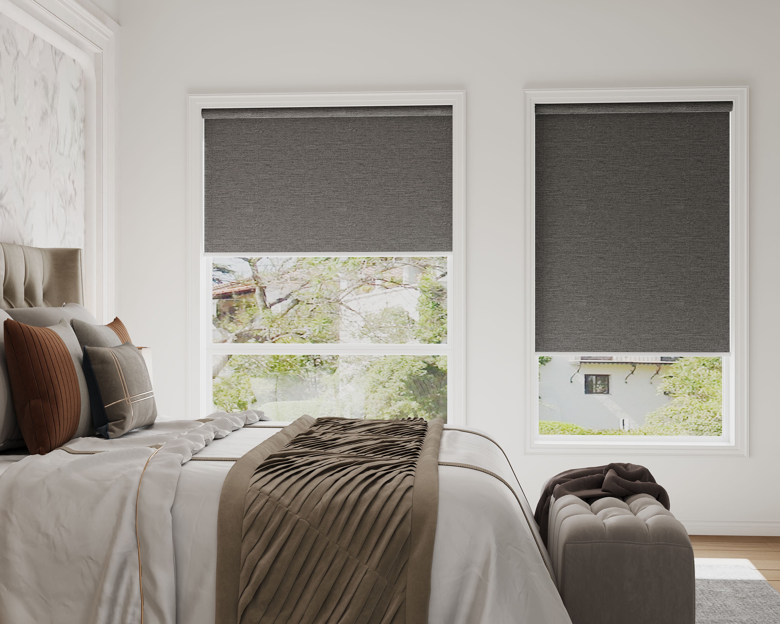
Deep, Saturated Colors: Navy, charcoal, forest green, and chocolate brown absorb light, making walls feel closer and the ceiling lower. They create a pronounced visual weight that can make a small room feel oppressive rather than cozy.
-
Bold, High-Contrast Hues: Vibrant red, orange, or royal purple are energetically and visually advancing. They demand attention, emphasizing the room's boundaries and making the space feel busy and confined.
-
Optically Heavy Neutrals: While not always dark, some neutrals like certain taupes or muddy beiges can have a low LRV and appear heavy, failing to provide the light-reflective boost a small room needs.
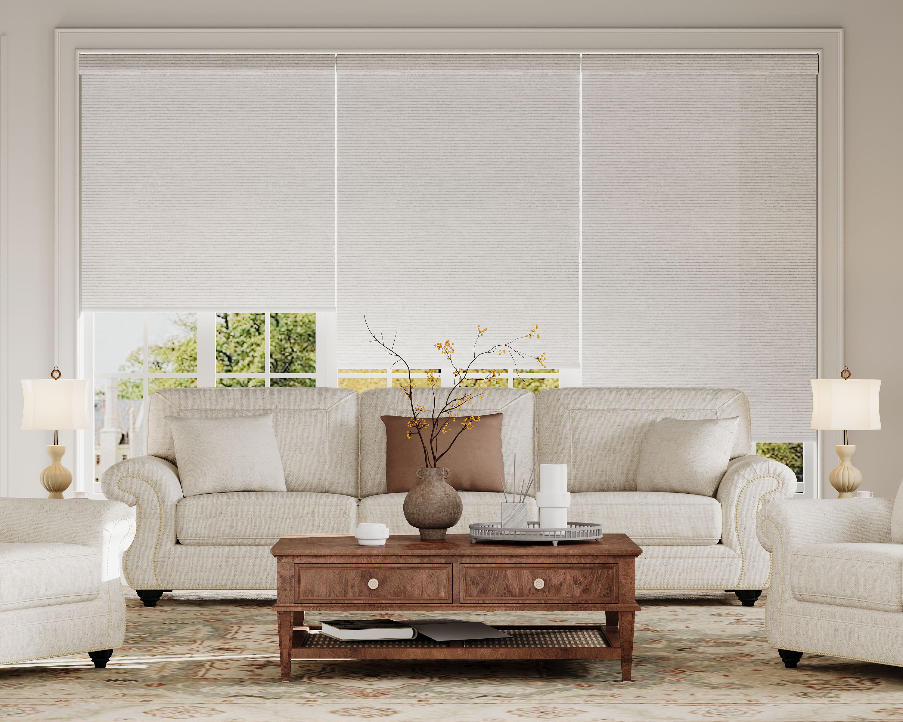
The Golden Rule: For the most expansive effect, select a sheer shade color that is the same tone as your wall or slightly lighter. This minimizes contrast and allows the treatment to blend seamlessly, extending the visual plane of the wall. A dark shade creates a hard frame around the window, sharply defining and often shrinking the perceived space.
Strategic Installation and Coordination for Maximum Impact
Color choice is just one part of the equation. These implementation strategies will ensure your chosen shade performs to its full potential.
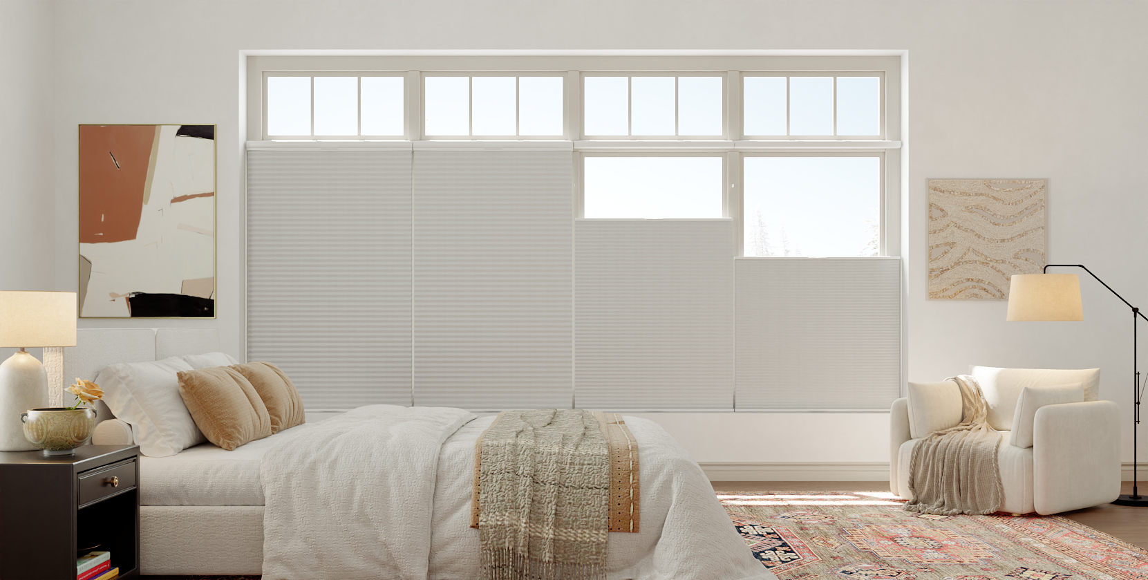
Installation for Height and Width: Mount your shades using an outside mount, positioning the bracket several inches above the window frame and extending it 3 to 6 inches on either side. This technique draws the eye upward, creates the illusion of a larger window, and allows for maximum glass exposure when shades are open, flooding the room with light. Understanding the functional impact of mounting decisions is key to this strategy.
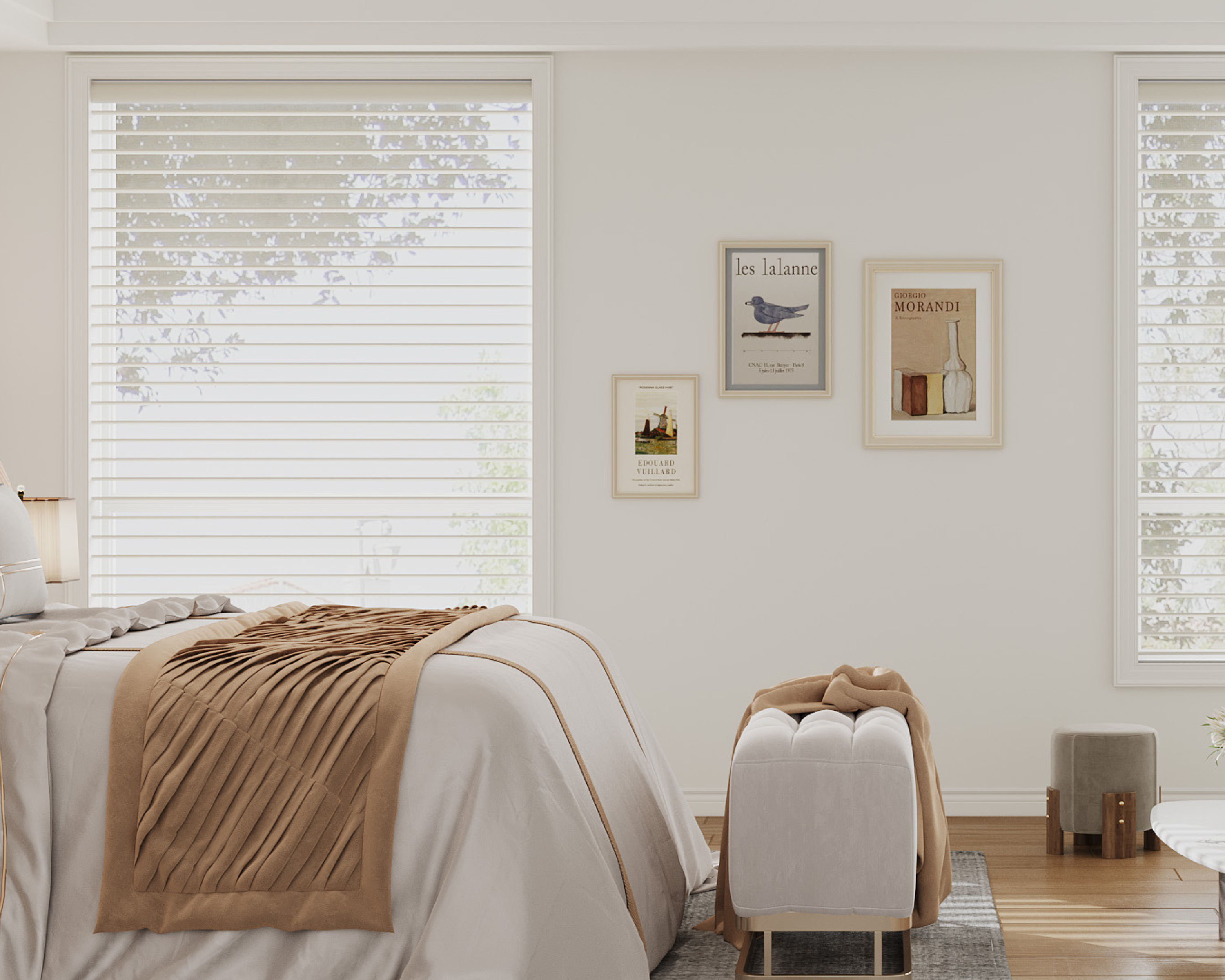
Fabric and Texture Considerations: The material of your sheer shade influences how color is perceived. A smooth polyester will reflect light cleanly, while a textured linen will create a softer, more diffused glow that can add depth without darkness. For more on this, see our detailed comparison of sheer shade fabric types and their characteristics.
Coordinating with Walls and Decor: If your walls are already a light color, matching your sheer shades creates a seamless, expansive look. If your walls are a darker or more vibrant color you cannot change, choosing a sheer shade in a harmonizing, lighter tone (e.g., a creamy shade with a dark green wall) can help balance and brighten the space. This thoughtful coordination is a hallmark of a designer-approved approach to window treatments.
Conclusion: Crafting an Expansive Feel
Transforming a small room with color is an exercise in thoughtful restraint and strategic choice. The core finding is that light-reflective, receding colors—when paired with proper installation—can fundamentally alter spatial perception, making compact areas feel significantly more open and inviting.
Key Highlights:
-
Light, bright colors like soft whites, warm neutrals, and muted pastels are essential for reflecting light and making walls visually recede.
-
Installation technique is crucial: mounting shades high and wide creates the illusion of larger windows and higher ceilings.
-
To avoid making a room feel smaller, steer clear of deep, saturated colors and bold, high-contrast hues that absorb light and emphasize boundaries.
-
The most effective result comes from selecting a sheer shade color that matches or is slightly lighter than your wall color to create a seamless, expansive look.
-
The fabric material and texture play a supporting role in how color interacts with light, influencing the final ambiance of the room.
By applying these principles, you can confidently select sheer shades that do more than cover windows—they actively enhance the livability and perceived space of your room, proving that even the coziest spaces can feel bright, airy, and beautifully proportioned.
Shop Sheer Shades by Light Control


Frequently Asked Questions
My room gets very little natural light. What color is best?
In a low-light room, your goal is to maximize every bit of available light. A soft, warm white or a very light cream is your best choice. These shades will reflect both artificial and ambient light most effectively, helping to combat gloominess. Avoid any colors with gray or cool undertones, as they can accentuate the lack of natural light.
Can I use patterned sheer shades in a small room?
You can, but with extreme caution. The only safe choice is a very small-scale, tone-on-tone pattern where the design is subtle and the colors are nearly identical (e.g., a white-on-white delicate geometric weave). Large, bold, or high-contrast patterns will fragment the wall space and make the room feel visually cluttered and smaller.
What if I want a dark, dramatic look in my small bedroom?
Achieving a dramatic, cozy "cocoon" effect is possible but requires commitment. To prevent the room from feeling like a cave, you must ensure all other elements are light and minimal. Pair dark charcoal or navy sheer shades with light walls, pale flooring, and simple, streamlined furniture. The contrast can be striking, but it's a high-maintenance look that leaves little margin for error.
Do these rules apply to other window treatments like blinds or blackout shades?
The color principles are universal for any treatment in a small space. However, the material matters. A light-colored blackout shade will help with light reflection when up, but when down, it creates a solid block of color. Sheer shades have a unique advantage because even when lowered, their translucent nature continues to allow a light, glowing effect, maintaining an airy connection to the outside.
How do I choose a color without seeing a large sample?
Always order physical fabric swatches. A small chip can be misleading. Tape the large swatch to your window frame and observe it at different times of day. Notice how it looks with your wall color in both direct sun and shadow. This is the only reliable way to see how the color will truly behave in your specific room's light.
