


Choosing the right window shades can totally change the vibe of a room, whether you’re all about that farmhouse coziness or prefer the crisp lines of a modern space. Matching shade styles with our décor themes is one of those small moves that just makes everything click. But honestly, with so many textures, colors, and designs out there, figuring out what works with rustic, transitional, or contemporary interiors isn’t always straightforward.
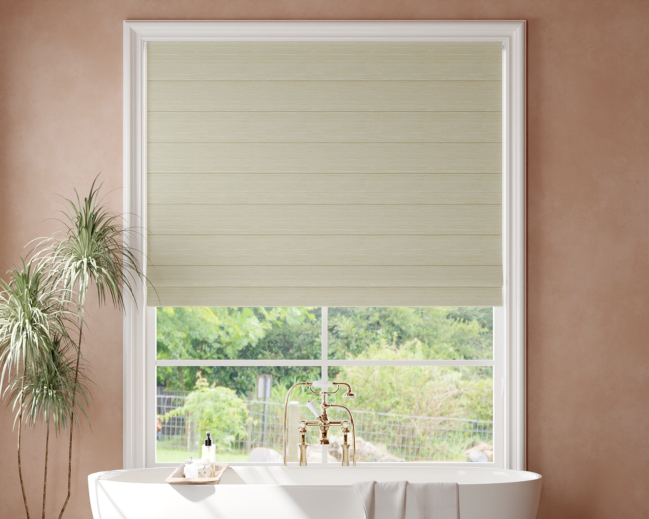
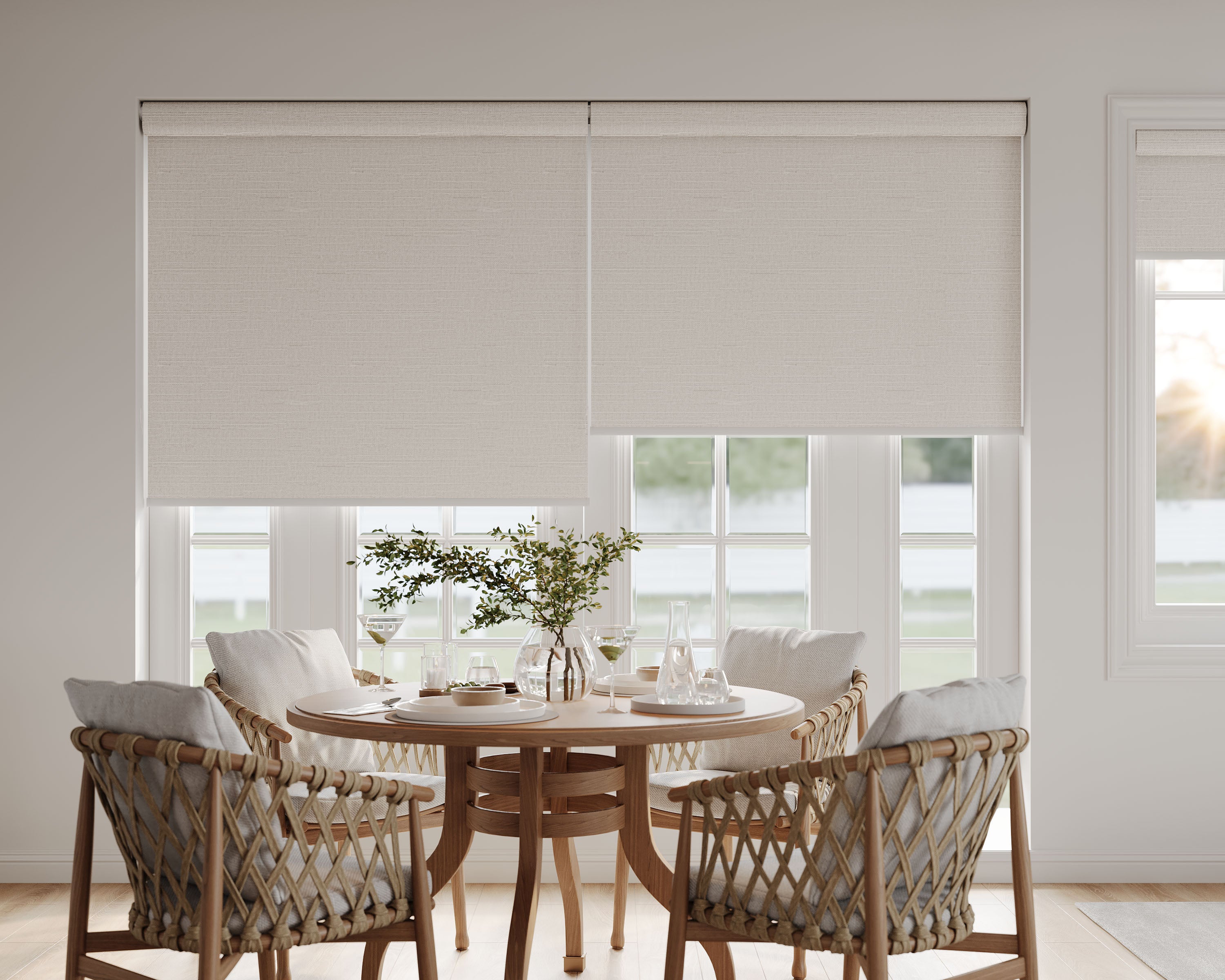
Let’s dig into which shade styles actually suit which décor themes, plus some no-nonsense tips for picking the best options. No fluff, just ideas to help our homes feel comfortable, stylish, and—most importantly—like us. For a classic, versatile option that suits many of the styles we’ll cover, explore our roman shades collection for tailored looks from rustic to contemporary.
Key Takeaways
- Pick shade styles that match your home’s décor theme.
- Think about materials and colors that work with your space.
- Use real-world tips to keep your window coverings fresh.
Understanding Shade Styles
When we decorate with shades, both the material and the design seriously shape a room’s mood. The styles we choose can set the tone, whether we’re after a cozy nook or a sharp, modern look.
Defining Key Shade Materials
Shade materials really set the mood. Linen and cotton shades have a soft, classic texture—perfect for farmhouse or laid-back contemporary spaces. Paper shades? They’re light, a little quirky, and work well in minimalist or Japanese-inspired rooms.
Woven materials like rattan and bamboo bring in natural warmth, grounding the room in earthy tones and adding a tactile touch. Metal shades, common in industrial or urban spaces, add structure and a bit of edge. Glass comes in all sorts—glazed, frosted, or clear—and each plays with light in its own way.
But material isn’t just about looks. Fabric and paper diffuse light gently, while metal or darker shades focus it more directly. That choice affects the vibe, so it’s worth pausing to ask: what sort of mood are we after here?
Popular Shade Designs in Home Decor
Shade designs make a big first impression—sometimes as much as the materials. Here’s a quick cheat sheet:
| Shade Design | Notable Features | Best Décor Pairings |
|---|---|---|
| Drum | Simple, cylindrical | Modern, Transitional |
| Bell | Flared bottom | Traditional, Vintage |
| Empire | Tapered sides | Classic, Rustic |
| Rectangular | Clean, linear | Contemporary, Minimalist |
| Pendant | Hanging, often sculptural | Eclectic, Modern Loft |
| Globe | Spherical, soft edges | Mid-century, Retro |
Drum and rectangular shades give off a tailored, modern vibe. Bell and empire shapes are warmer and more inviting—think bedside tables or reading corners. Pendant and globe styles let us have a little fun with scale, especially over a dining table or kitchen island.
How Shade Styles Influence Ambience
Shade choices go way beyond looks—they really change how a room feels and works. Light-diffusing shades soften harsh bulbs, making living spaces feel calmer. Narrow or opaque shades focus light down, which is great for a desk or task lamp.
Translucent materials like linen or thin paper keep a room bright but not glaring. Opaque or metallic finishes turn a lamp into a spotlight, perfect for highlighting art or cool architecture. It all comes down to the effect we want: cozy, practical, or a little dramatic.
Mixing shade styles throughout the house is one way to guide the flow from relaxed hangouts to more focused spaces—just by tweaking design and material here and there.
Assessing Your Décor Theme
Picking the right shade style starts with understanding our home’s personality. The trick is to look at what we have, then choose shades that bring out the best in it.
Identifying Your Home’s Signature Style
Before we start shopping, we should figure out our home’s main design style. Are there lots of reclaimed wood pieces and vintage finds, or is it more about clean lines and shiny surfaces? Knowing if we’re farmhouse, modern, boho, or minimalist helps us pick with confidence.
Try this: walk into each room and jot down the colors, textures, and materials you see. Snap a few photos—your phone’s gallery is perfect for spotting patterns. If you see baskets and linen everywhere, you’re probably leaning rustic. Sleek surfaces and neutrals? Sounds like modern or contemporary.
Most of us fall somewhere in between. Blended styles are totally normal. The point is to get a sense of what feels right, so our shade choices look intentional, not random.
Matching Shade Types With Decor Categories
Once we know our décor category, picking a shade style gets easier. Here’s a quick guide:
| Decor Category | Suggested Shade Styles |
|---|---|
| Rustic/Farmhouse | Burlap, linen, wood veneer |
| Contemporary | Drum, metal, glass, acrylic |
| Bohemian | Patterned fabric, rattan |
| Traditional | Pleated, silk, bell-shaped |
Rustic spaces love textured fabrics or distressed finishes. Contemporary rooms work best with bold or minimal shades—think glass or metal drums. Boho? Go for playful prints or woven details. Traditional shines with classic, pleated shades.
Mixing it up is fine, but matching shade style to décor category helps everything feel like it belongs. That way, we get personality without chaos.
Rustic Shade Styles
Rustic shade styles are all about natural textures, classic finishes, and those muted, earthy colors that just feel comforting. They bring character and a bit of that handmade spirit into our rooms.
Natural and Textured Materials
What stands out in rustic shades? Materials that show off texture and a bit of roughness. Woven rattan, burlap, reclaimed wood, or hammered metals pop up a lot. These choices bring the outdoors in and add a warmth that feels inviting and real.
Glass can be seeded or frosted, and sometimes metal shades are intentionally a little imperfect. Here’s a quick list of go-to rustic materials:
- Wicker or Rattan: Great for pendants and table lamps.
- Burlap: Soft light for table lamps and sconces.
- Distressed Metal: Brings a vintage, industrial edge.
There’s something about these textures—they look cool up close and play with light in ways that smoother, modern shades just don’t. For a perfect blend of rustic texture and tailored design, see how roman shades for modern farmhouse style can anchor a cozy, lived‑in space.
Earthy Color Palettes
Rustic décor leans into earthy colors: browns, mossy greens, sand, clay, muted reds, and dark bronze. These shades never look too shiny or bright, which keeps things feeling lived-in and relaxed.
A rich, subtle shade can tie together other rustic touches—like exposed beams or a stone fireplace. Even an off-white or “greige” (that gray-beige hybrid) can be just right when you want something understated.
Here’s a quick color guide:
| Color | Best Use |
|---|---|
| Warm brown | Chandeliers, pendants |
| Olive green | Accent lighting |
| Burnt orange | Table lamps, sconces |
| Natural linen | Floor and table lamps |
| Antique bronze | Overhead lighting |
Vintage-Inspired Fixtures
Rustic lighting brings in vintage details everywhere. Shades shaped like lanterns or mason jars? Instant charm. Oil-rubbed bronze, Edison bulbs, and exposed hardware are back in a big way.
Those retro touches make rustic shades both practical and nostalgic. A barn-style pendant over the table isn’t just a light—it’s a statement. Clear glass globes with filament bulbs give off a soft, amber glow that’s just right for evenings.
If you want a subtle vintage vibe, shades with wire cages or pulley systems are a safe bet. They look handmade, even if they’re fresh off the shelf.
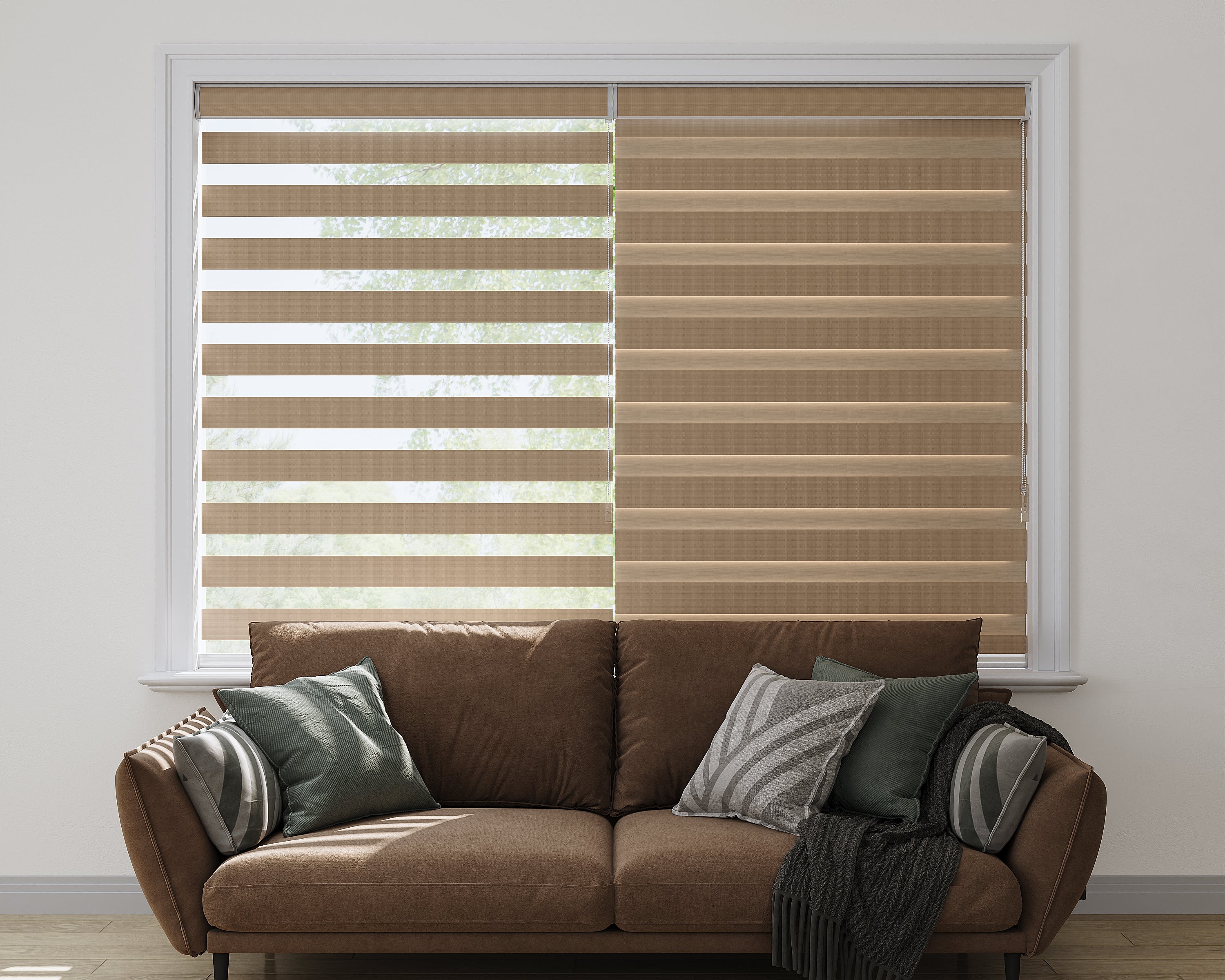
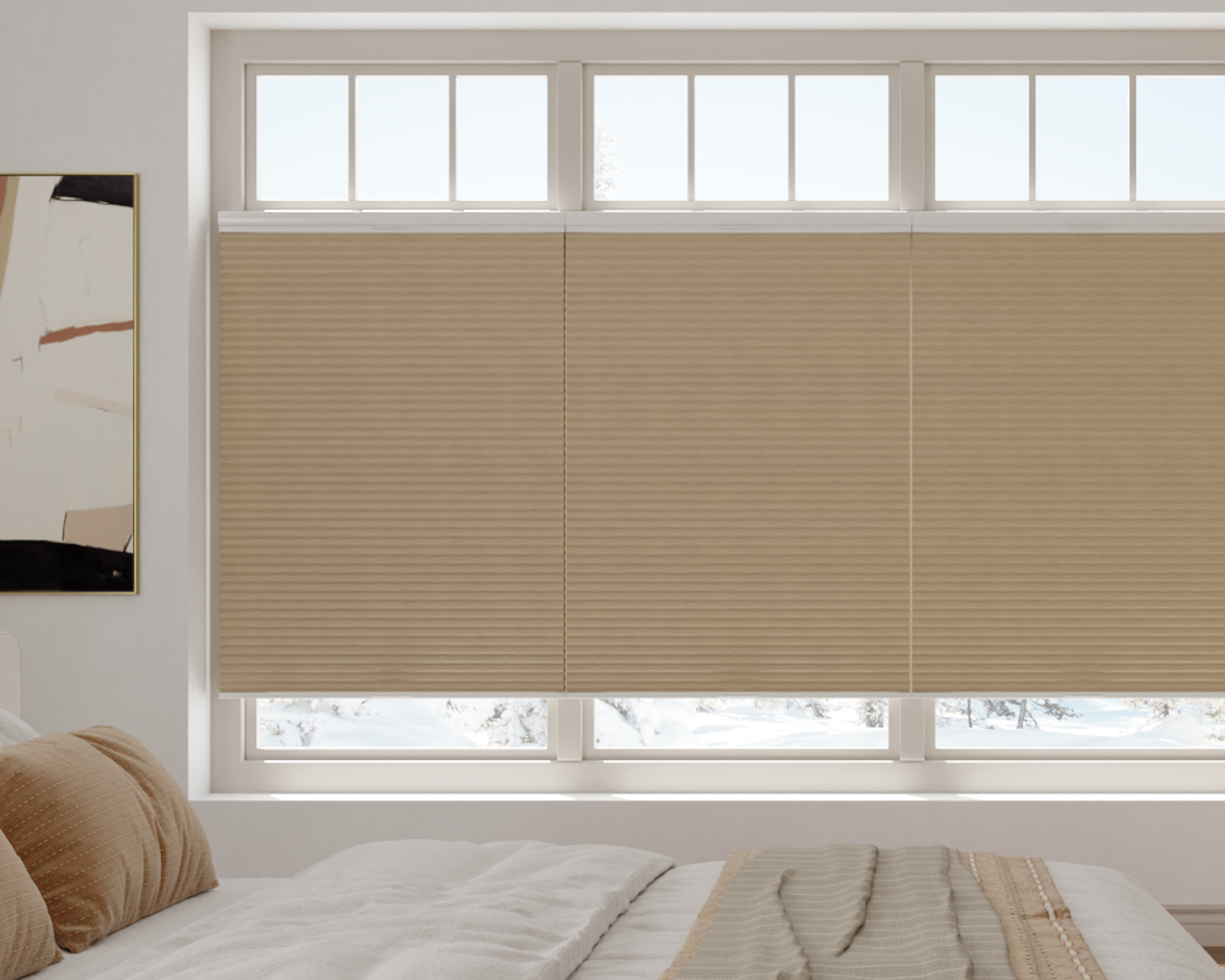
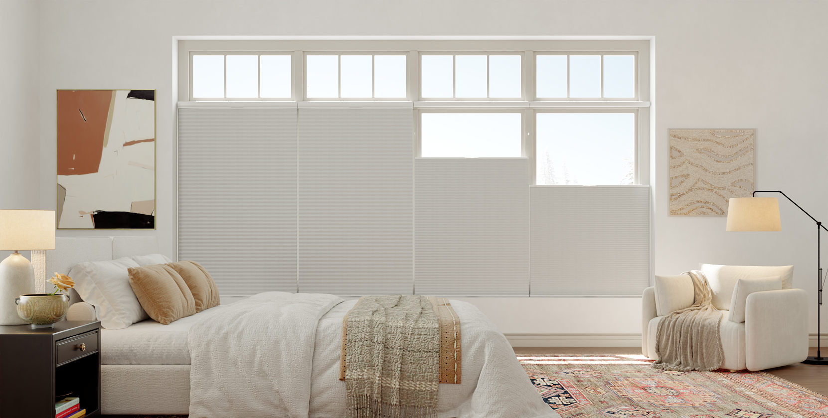
Transitional Shade Options
Transitional shade styles are for those of us who want spaces that feel current but still cozy. The right shades let us blend classic shapes with modern materials and patterns.
Blending Old and New Elements
We don’t have to pick between vintage charm and a modern edge. Transitional shades often mix gently curved lamp bases with crisp, straight-edged shades. Mixing materials is key—linen drum shades on brass, or pleated cotton on a simple black base.
Check out these combos:
| Classic Element | Modern Twist | Result |
|---|---|---|
| Pleated fabric | Simple cylinder shape | Understated elegance |
| Ornate metal bases | Solid neutral shade | Balanced sophistication |
| Embroidered trims | Sleek, monochromatic palette | Subtle nod to tradition |
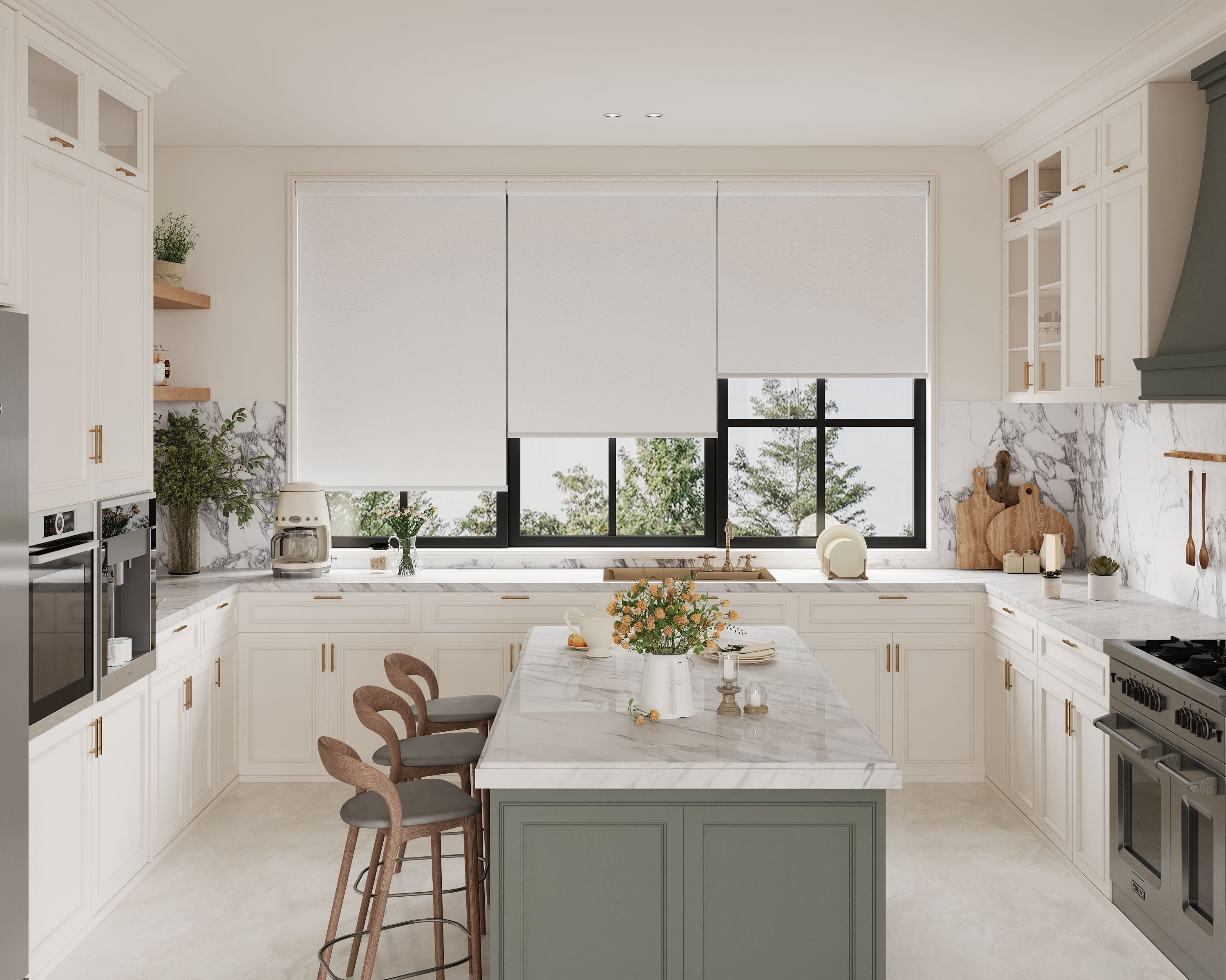
It’s all about balance. We keep things from feeling too formal or too cold by blending old and new in just the right amounts. A prime example of this balance is in motorized roman shades, which blend classic folds with modern convenience for a truly transitional window treatment.
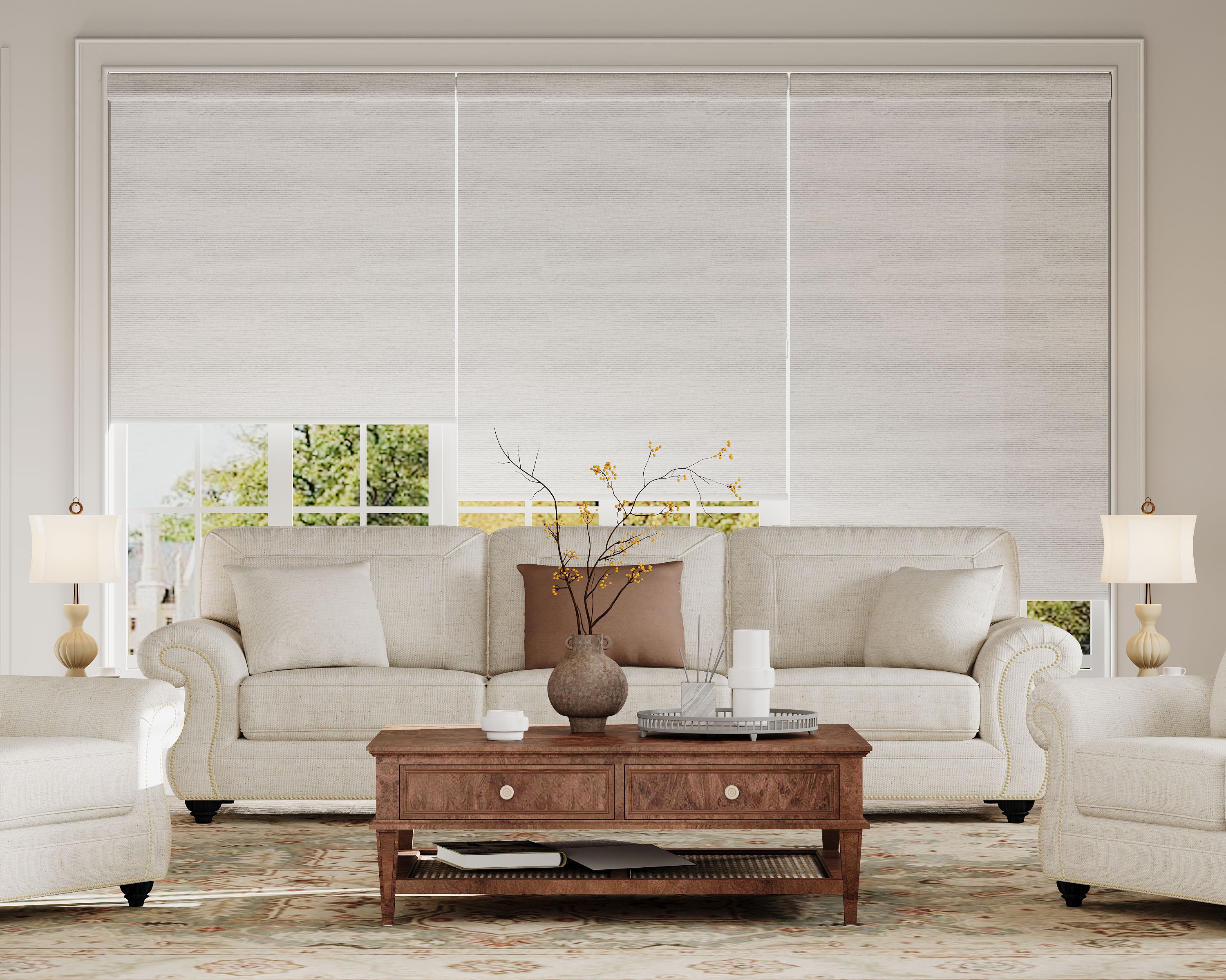
Neutral Tones and Subtle Patterns
Transitional shades usually stick to soft, neutral colors. Ivory, taupe, greige, and muted gray fit in almost anywhere—no need for wild colors.
If we want a little personality, we look for gentle patterns or textures. Subtle stripes, tone-on-tone jacquard, or a faint geometric weave add depth without shouting.
A few favorites:
- Best neutrals: Off-white, warm beige, pale gray
- Ideal patterns: Herringbone, stitched lines, small diamonds
- Good textures: Slub linen, brushed cotton
These choices add interest and keep our décor feeling timeless, even as our tastes change.
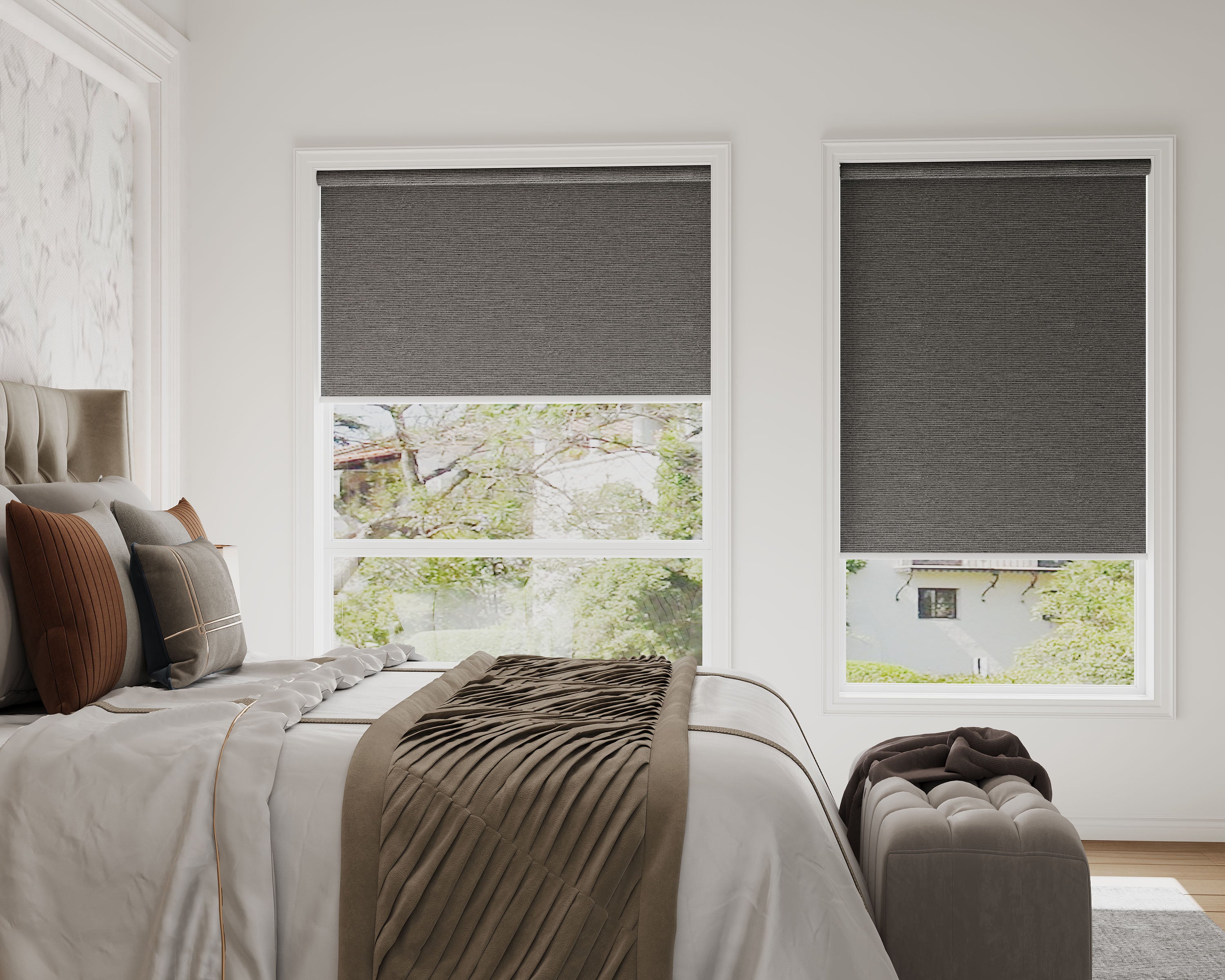
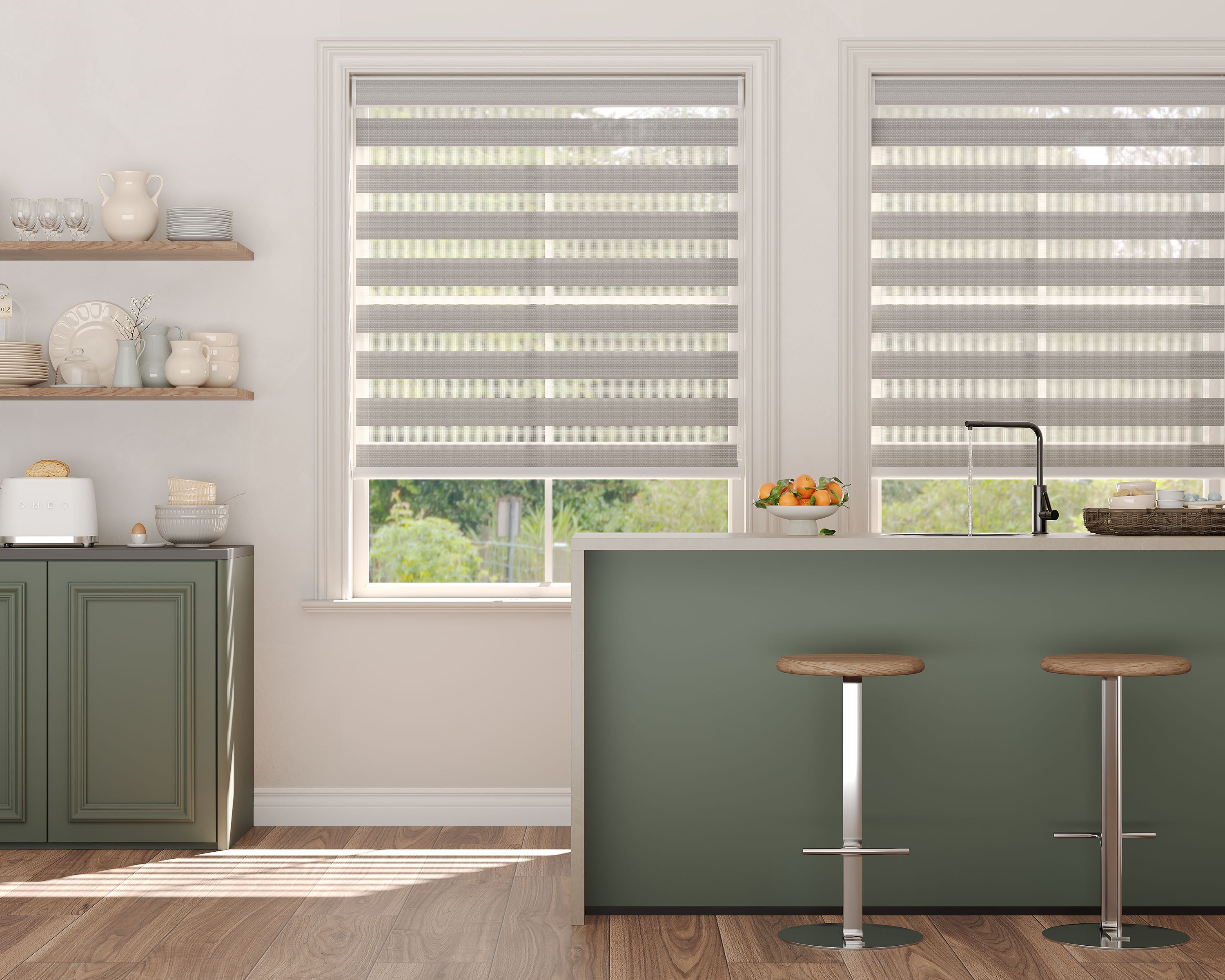
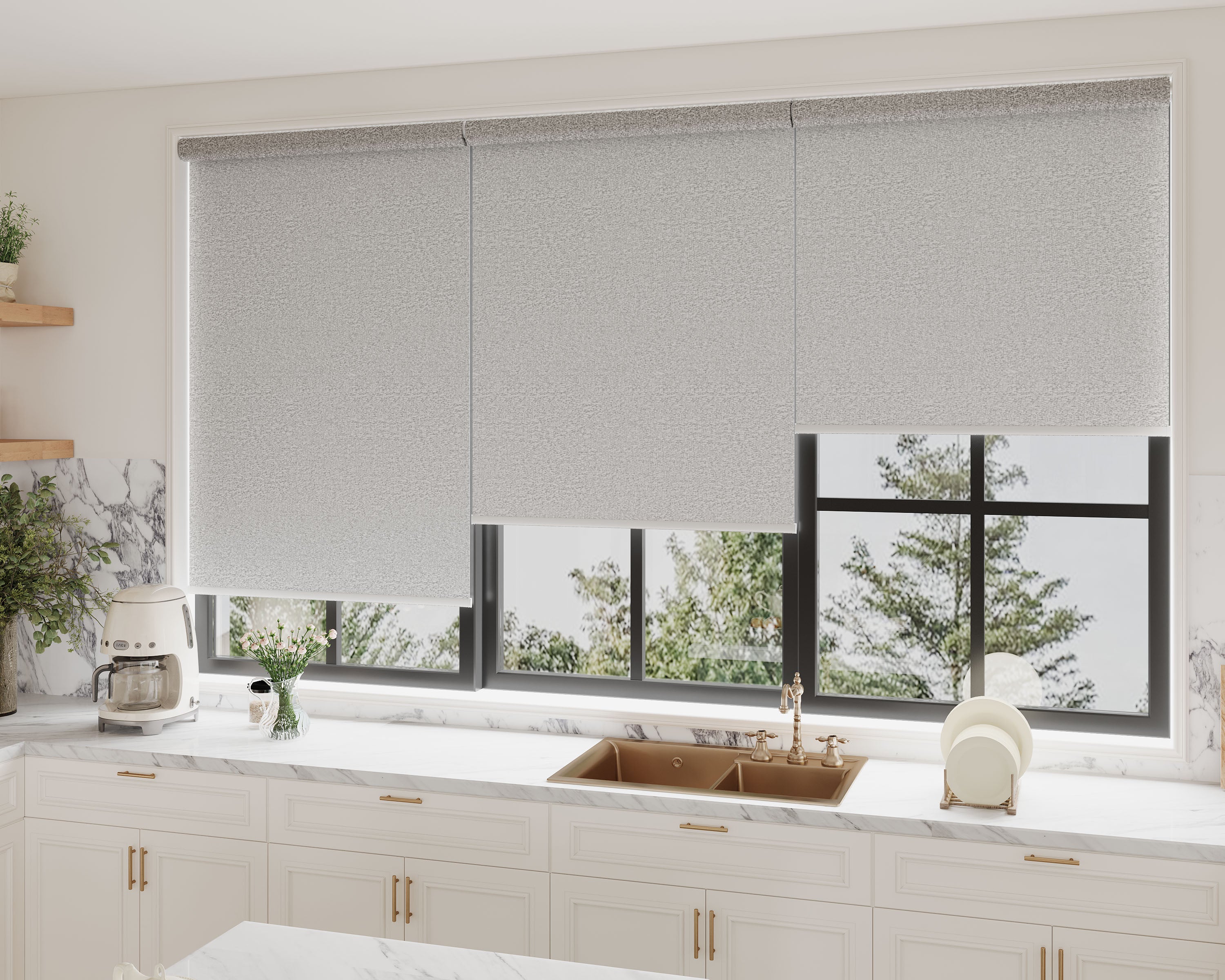
Contemporary Shade Designs
Contemporary shade styles bring a crisp, modern look, focusing on clean lines, neutral hues, and clever material mixes. It’s all about simplicity and a fresh, right-now vibe that works in just about any space.
Sleek Silhouettes
Contemporary shade designs are all about shapes that are clean and simple. Drum, cone, and cylinder shades are big—tight edges, no frills. These forms keep rooms feeling open and uncluttered.
A bonus with these shapes: they fit just as well in a minimalist room as they do in a more eclectic space. No loud patterns or over-the-top trim—just a crisp, geometric look. Square and rectangular shades, for example, echo the lines of modern furniture, adding a sense of order.
Minimalist Color Choices
Color matters just as much as shape. Most contemporary shades stick with neutral or muted tones—white, black, gray, and matte finishes. They blend in easily, so you don’t have to worry about clashing if you change up your décor later.
Solid colors are the move here. Skip the ornate prints and busy patterns. A black cotton drum shade? Instantly makes a space feel sharper. Want something softer? Light taupe or ivory is warm but still modern.
Here’s a quick cheat sheet:
| Color | Mood | Best Use |
|---|---|---|
| White | Clean, Crisp | Small, bright rooms |
| Black | Dramatic, Bold | Accent lighting |
| Gray | Calm, Neutral | Offices, bedrooms |
| Taupe | Warm Modern | Living spaces |
Keeping the color palette tight helps the whole room feel intentional. Stick to shades that complement your scheme, not fight it.
Metal and Glass Combinations
Materials can totally define a space’s vibe, and honestly, nothing feels more modern than metal and glass together. Brushed nickel, matte black, and chrome are go-to finishes for a reason. When you pair them with frosted or clear glass, the contrast just pops.
Usually, we go for shades with a slim metal rim around the glass, or glass globes dangling from a metal bracket. This mix brings a subtle industrial touch—perfect in kitchens, dining rooms, or anywhere you want a bit of edge.
One thing I appreciate: both metal and glass are a breeze to clean, so it doesn’t take much to keep them looking sharp. They also spread light evenly, so you get a soft glow without those annoying glare spots. It’s a win for style and practicality, making the space feel fresh and purposeful.
Eclectic and Global-Inspired Shades
Eclectic and global-inspired shades just bring a whole new energy, mixing influences from all over. You get a real sense of variety—unexpected designs, bold colors, and lighting that’s both fun and functional.
Mixing Textures and Patterns
With eclectic or global styles, it’s all about mixing things up. You’ll find handwoven bamboo, rattan, or even recycled paper paired with clay, glass, or metallic bits. That sort of combo adds depth without making things feel messy.
A favorite trick: set a textured lamp base under a shade with a totally different pattern or finish. Imagine a Turkish mosaic shade on a smooth iron base, or a bold Indian cotton drum shade on a rustic wood lamp.
Some pairings that work surprisingly well:
- Batik fabric with matte ceramic
- Jute or seagrass with glossy glass
- Block-printed fabrics with brushed metals
Mixing opposites is where the personality comes in. Still, it’s good to keep a bit of balance—anchor busy details with simple shapes or neutrals so things don’t spiral into chaos.
Bold Colors for Statement Lighting
Color’s a huge part of global-inspired design. We’re drawn to jewel tones, deep indigos, sunny yellows, and those punchy reds. These shades can ground a room or add a bold accent.
If you’re blending influences, a bold shade—like Moroccan teal, Mexican pink, or Nigerian indigo—on a simple fixture grabs attention without making the room feel crowded.
Try pairing solid brights with a little metallic trim, or pick a pattern that ties in several global hues. Here’s a quick comparison:
| Color Family | Typical Influence | Effect |
|---|---|---|
| Cobalt Blues | Moroccan, Greek | Cool, calming |
| Warm Reds | Indian, Mexican | Energizing |
| Earthy Neutrals | African, Scandinavian | Grounding |
For a lighter, airier take on global inspiration, our look at roman shades for coastal homes shows how relaxed linens and soft colors evoke breezy, seaside vibes.
Bold shades keep things looking curated and lively rather than cluttered or random.
Customizing Shade Styles for Unique Spaces
Every space has its own needs—big open layouts, tiny corners—they all need a different approach. Getting that cohesive look while making sure everything actually works comes down to how you layer lighting and pick accents.
Layering Lighting in Open Concepts
Open concepts can get overwhelming fast, or just... blah. Layering lighting helps break up the space into zones—dining, kitchen, living—all within view.
Mix pendant shades over islands with drum or globe shades in seating areas. It gives each spot its own vibe and adds depth. I’d say, stick to styles that relate somehow—material, color, or shape—so things feel pulled together.
Task lighting, like adjustable sconces or spotlights, defines workspaces but won’t drown out the softer shades you use for ambiance. Here’s a handy table:
| Area | Shade Type | Purpose |
|---|---|---|
| Kitchen | Pendant | Task, Focus |
| Dining | Drum/Globe | Ambience |
| Living Area | Floor/Lamp | Accent |
Each area gets its own look, but the whole place still feels like one home.
Choosing Accents for Small Areas
Small spaces can easily feel either ignored or crowded. The trick is to pick shades that are compact but still have personality—think mini pendants, petite drums, or sleek clip-ons.
Scale’s everything. Oversized shades overwhelm a nook, while clear or light materials help bounce light and make the room seem bigger. Wall-mounted fixtures save precious space—an easy fix for tight spots.
A splash of color or a cool texture—rattan, smoked glass, metal mesh—keeps things interesting without making it feel cramped. For a functional and stylish solution in a compact workspace, consider the practical benefits outlined in roman shades for home offices. Go bold, but within reason, and you’ll keep things open and inviting.
Practical Tips for Making the Right Choice
Finding the right shade isn’t just about what’s trending. It’s about what fits your space and how it all works together. Let’s keep it real—beautiful and practical, with the right proportions so nothing feels off.
Balancing Function and Aesthetics
It’s easy to go for the most eye-catching shade, but function’s just as important. In kitchens, washable and moisture-resistant materials like metal or glass make life easier. Living rooms might call for fabric or wood to warm things up, but consider how much light you want and whether you’re dealing with dust or allergies.
Make a quick list of your must-haves:
- Lighting needs: task, ambient, accent
- Material match: durable in busy spots, softer for cozy areas
- Cleaning ease: simple shapes or wipeable materials for high-traffic zones
Don’t skip your style goal—rustic? Go for distressed finishes and natural textures. Contemporary? You’ll probably want sleek profiles in neutral colors. One standout fixture keeps things interesting, but too many styles can get messy.
Sizing and Placement Guidelines
A shade that’s too small just looks lost, and one that’s too big takes over. Measure your space and check these quick tips:
| Location | Recommended Diameter | Hanging Height |
|---|---|---|
| Dining Table | 1/2 to 2/3 width of the table | 28-34 inches above the surface |
| Kitchen Island | 12-18 inches per fixture | 30-36 inches above the countertop |
| Bedside Pendant | 8-12 inches | 20-28 inches above the nightstand |
Leave some space from the walls and keep sight lines clear. If you’re not sure, tape out the fixture’s footprint and see how it feels. That way, you’re less likely to regret it later—and you won’t end up patching extra holes. Symmetry’s nice, but sometimes an intentionally “off-center” light really works.
Maintaining and Updating Your Shades
Keeping shades looking good isn’t hard, but it does take a bit of attention. With the right care and a few seasonal swaps, you can keep things fresh and in sync with your style.
Care Instructions for Different Materials
A little targeted care goes a long way. Fabric shades—like linen or cotton—need a quick vacuum with a brush attachment now and then. For spots, blot gently with mild soap and water, but don’t go wild with scrubbing.
Wood and bamboo shades want a soft cloth or duster. Keep them dry—too much moisture and they’ll warp. A quick wipe and a little furniture polish is plenty. For vinyl or synthetics, a damp cloth with soap does the trick, but avoid soaking them.
Here’s a quick cheat sheet:
| Material | Cleaning Tool | Cautions |
|---|---|---|
| Fabric | Vacuum, mild soap | Blot, don’t scrub |
| Wood/Bamboo | Duster, polish | Avoid water, dry wipes |
| Vinyl/Synthetic | Damp cloth, soap | Don’t soak, air dry |
Seasonal Shade Swaps
Changing shades with the seasons is a simple way to refresh a room and protect delicate fabrics. In summer, swap in UV-blocking or lighter shades to bounce harsh light and keep things cool.
When colder weather rolls in, switch to heavier or insulated shades—think thick drapes or lined roman blinds—to keep the warmth in and the drafts out.
Store off-season shades rolled or folded (not crammed!) and keep them dry to prevent creases or mildew. Labeling storage bags or snapping a quick photo saves time—and confusion—the next time you swap.
Shop Roman Shades by Light Control


Frequently Asked Questions
Getting into shade styles and decor themes can raise all sorts of questions. Let’s clear up a few of the trickier ones about style, trends, and finding what fits.
What are the defining elements of rustic contemporary style in home decor?
Rustic contemporary style mixes the warmth of wood, stone, and neutrals with clean lines and minimal fuss. You’ll see open spaces, exposed beams, leather, and metal touches. It’s that cozy-meets-modern balance that feels just right.
How can you blend modern and rustic themes in your interior design?
Try combining simple, modern furniture with rough or reclaimed materials. Maybe a concrete countertop with wooden stools, or a steel lamp on a weathered wood table. Stick to earthy colors, but a little black or metal detail keeps it feeling current.
What interior design trends are taking over from the classic farmhouse look?
If you’re wondering about the longevity of classic styles, our analysis on are roman shades still in style confirms their enduring place in contemporary decor.
Trends are moving toward more eclectic mixes—vintage meets modern, softer earth tones, and way less shiplap. Japandi (that Japanese-Scandinavian blend), moody painted walls, standout lighting, and sculptural furniture are all popping up instead of the all-white farmhouse thing.
Can you give a breakdown of the seven most influential interior design styles?
Sure, here’s a quick rundown:
- Modern: Clean lines, minimal stuff, open spaces.
- Contemporary: Always changing, but softer than modern, with curves.
- Rustic: Raw woods, natural textures, cozy vibes.
- Farmhouse: Simple, practical, lots of whites and antiques.
- Industrial: Metals, brick, factory-inspired.
- Mid-Century Modern: Retro shapes, tapered legs, bold colors.
- Scandinavian: Light woods, simple forms, airy feel.
How do you determine which decor style best suits your personality and home?
Think about your lifestyle, the mood you want, and what colors or materials you naturally like. Visit showrooms, collect inspiration, or take a quick style quiz to help narrow it down. Mixing what works with what you love is key.
What are some must-know tips for transitioning to a contemporary decor style?
Start with a neutral palette, but don’t be afraid to toss in a few bold pops of color here and there. If your fixtures look like they belong in another decade, swap them out for something sleeker. Heavy drapes? Try sheer curtains instead—they let in more light and just feel fresher. When it comes to furniture, go for clean lines and simple shapes. Oh, and seriously, declutter those decorative accessories. Less really does feel like more when you’re aiming for that contemporary vibe.
