

Zebra shades come in a vast spectrum of colors, spanning neutral foundations, nature-inspired earth tones, bold statement hues, and sophisticated patterns, allowing for complete design customization. However, the choice extends far beyond mere decoration; the color you select directly impacts light filtration, privacy, room ambiance, and even energy efficiency. From the functional brilliance of bright whites to the dramatic depth of charcoal, each color family serves a distinct purpose. To explore the full visual potential, begin by browsing our curated collection of versatile zebra blinds and shades.
This definitive guide provides an exhaustive analysis of color in window treatment design. Here’s what we’ll cover to ensure your choice is both beautiful and intelligent:
-
A complete breakdown of standard color families—neutrals, earth tones, bold colors, and patterns—with specific use-case scenarios for each.
-
A scientific analysis of how color affects performance, including light reflection, solar heat gain, and perceived privacy.
-
A room-by-room color strategy for bedrooms, home offices, living areas, and bathrooms, aligning hue with function.
-
A detailed guide on coordinating with existing decor, including wall paint, flooring, and furniture, with a focus on creating harmony or intentional contrast.
-
Practical considerations for maintenance, fading, and how to accurately evaluate fabric samples in your home's unique light.
By the end of this guide, you will possess the knowledge to select a zebra shade color that not only matches your style but actively enhances your daily living experience.
Understanding Zebra Shade Color Families
Zebra shade colors are typically organized into cohesive families that share underlying characteristics. Understanding these families is the first step to narrowing your search and making a confident choice.
Neutrals: The Foundation of Flexibility
Neutral colors form the backbone of most zebra shade collections, prized for their versatility and timelessness.
-
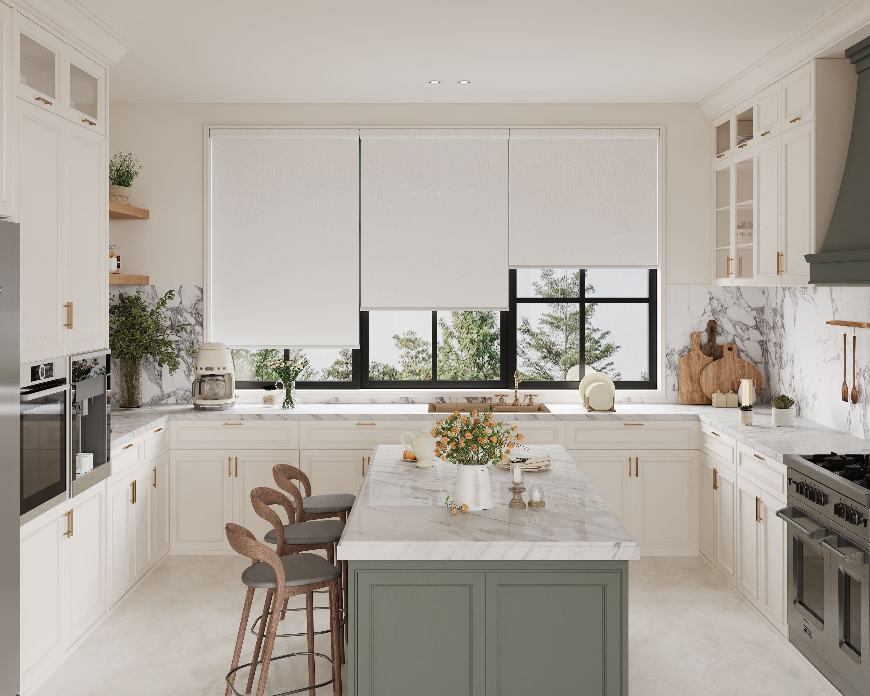
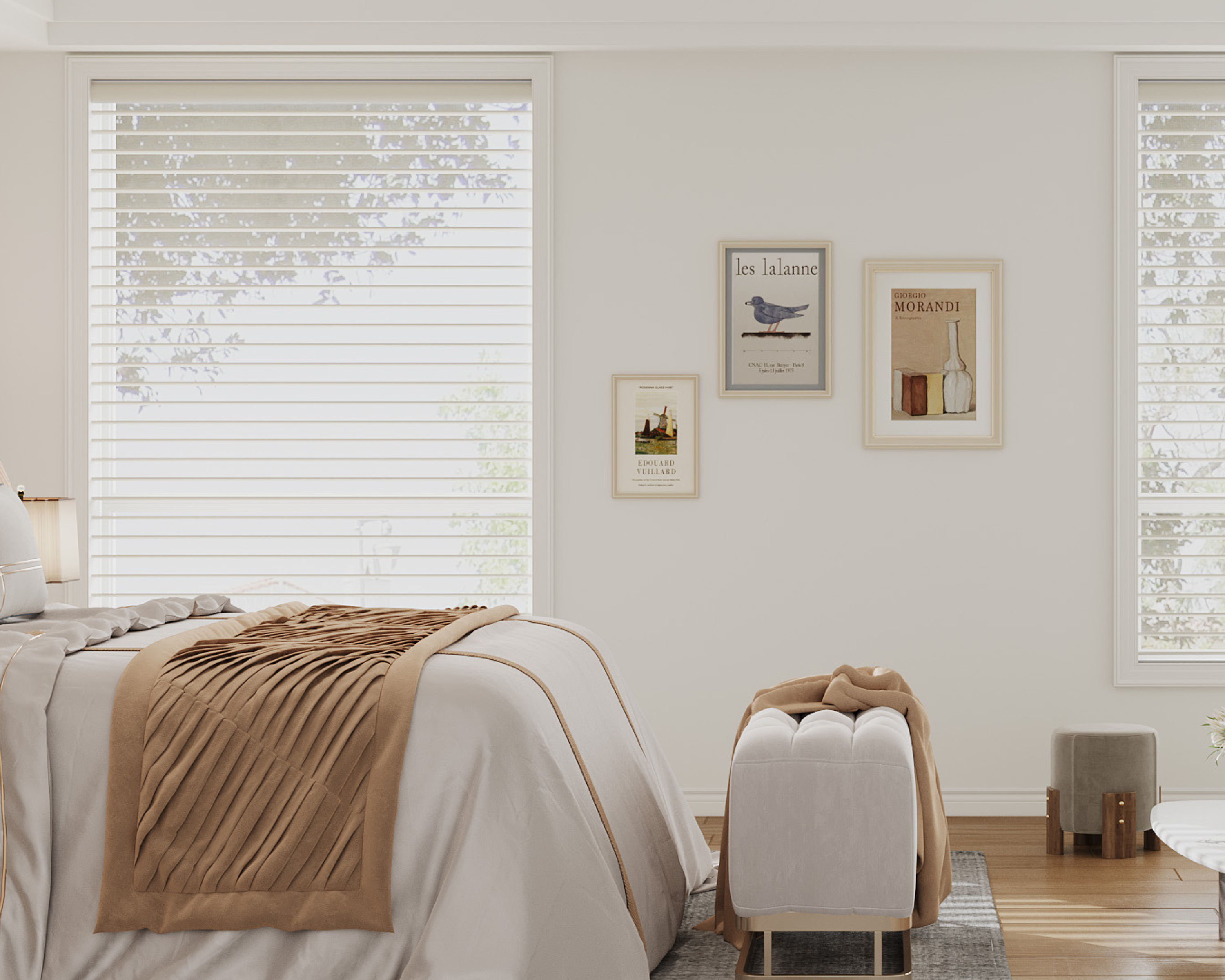
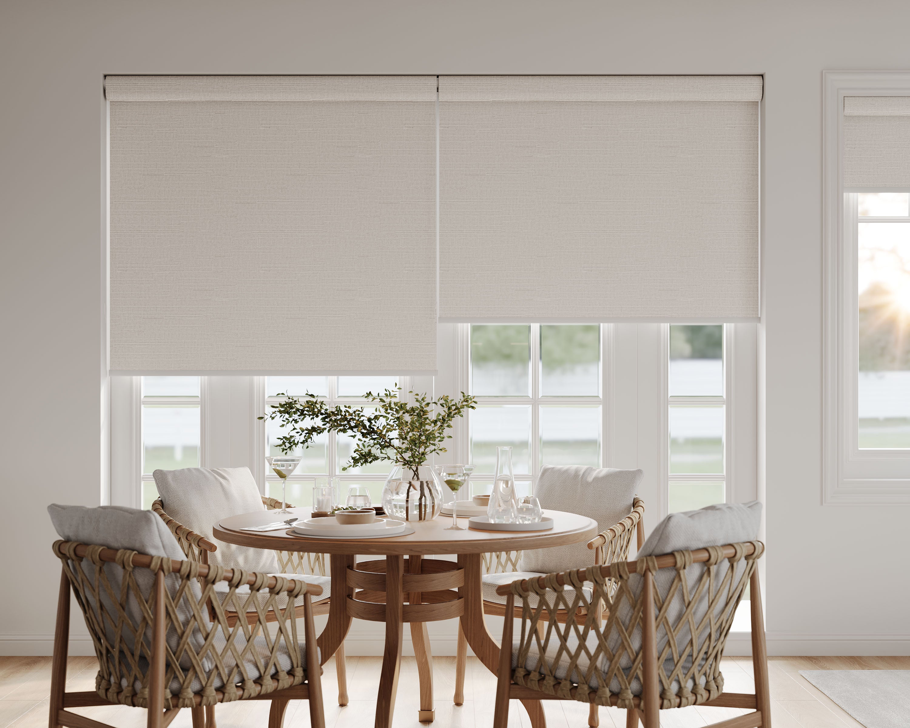
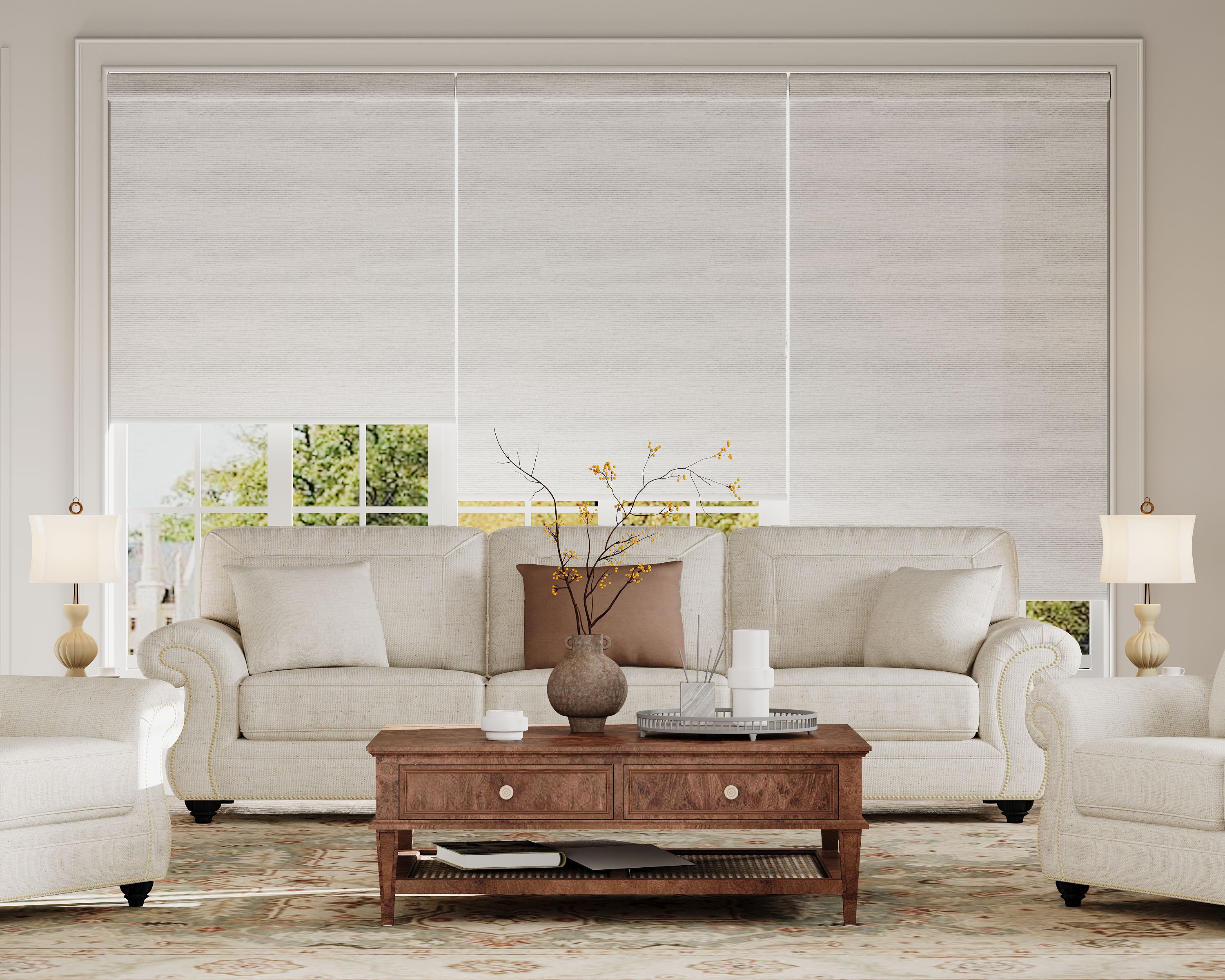
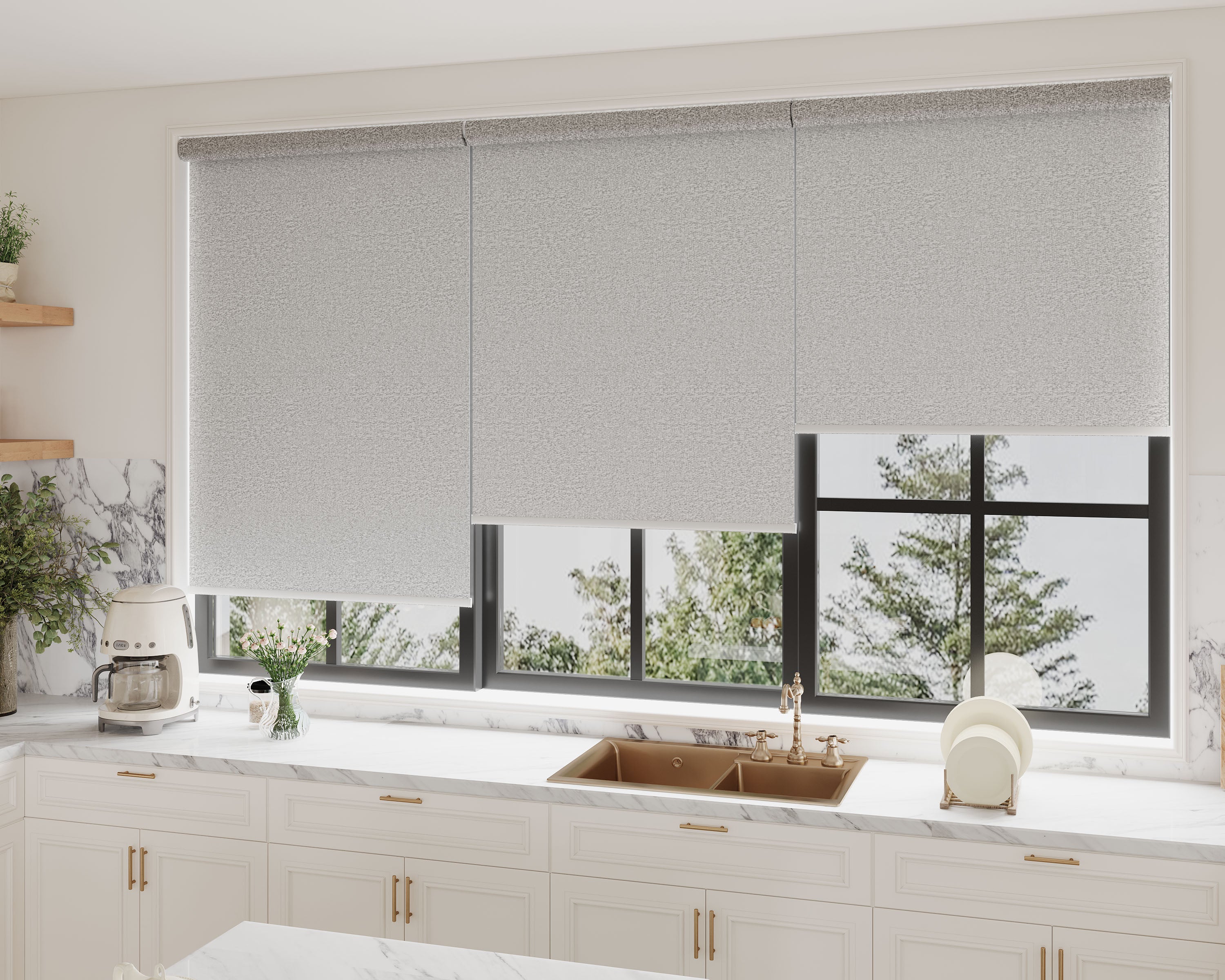
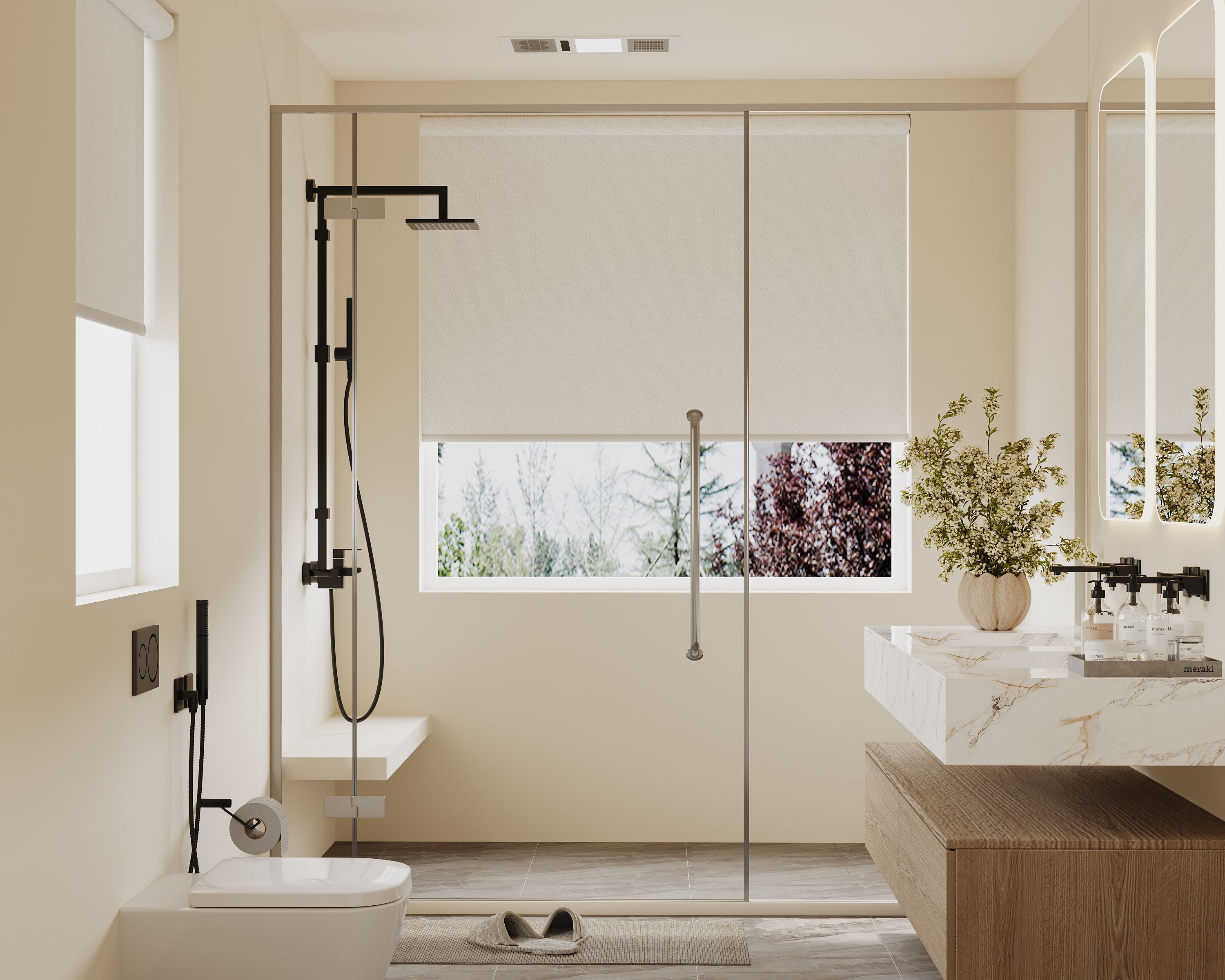
Whites & Off-Whites: Pure white, linen, ivory, and cream. These colors maximize light reflection, making rooms feel larger, airier, and more open. They are ideal for creating a clean, modern backdrop and are perfect for north-facing rooms or spaces lacking natural light. A pure white shade provides the highest level of privacy at night when interiors are lit, as it reflects back the most light.
-
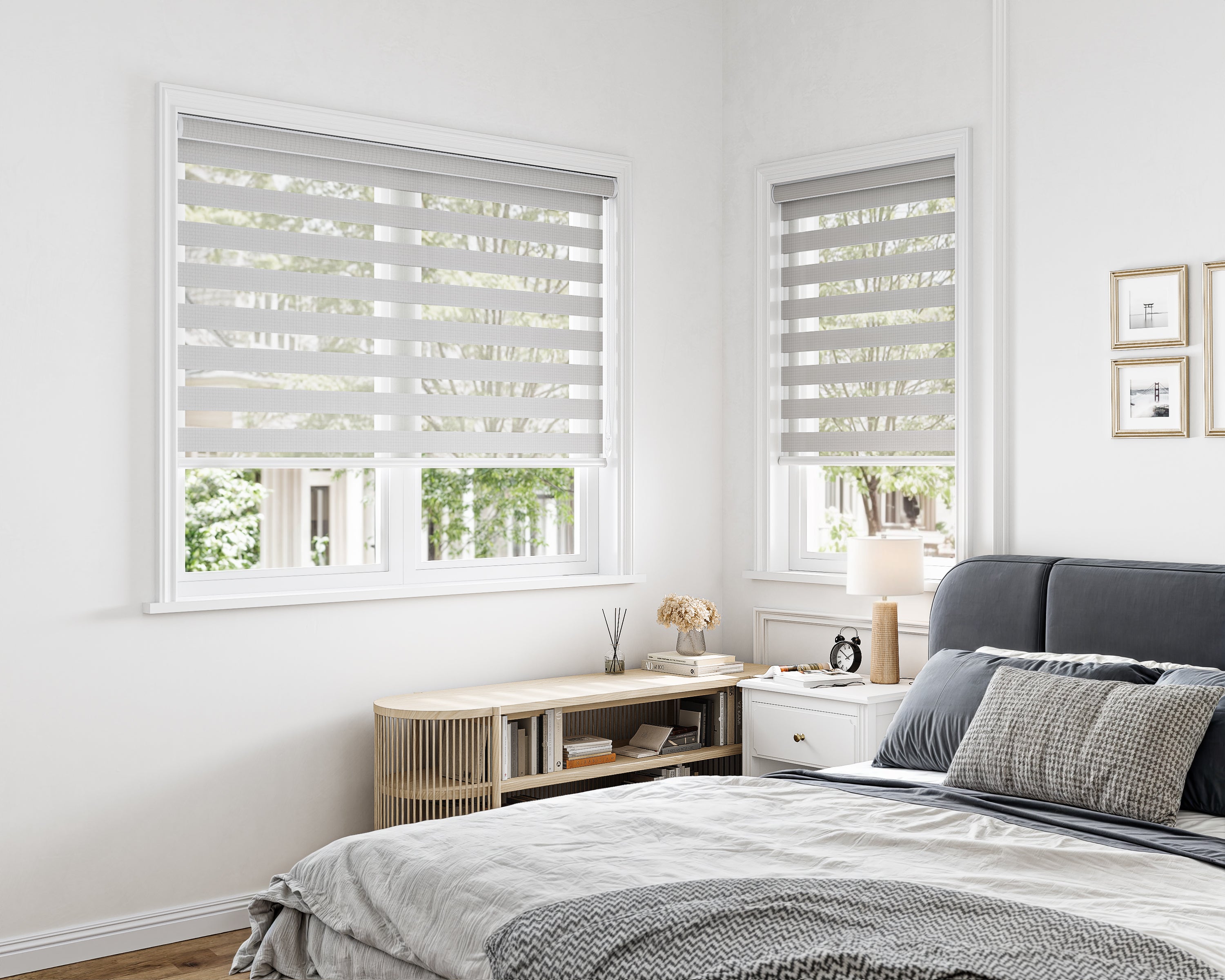
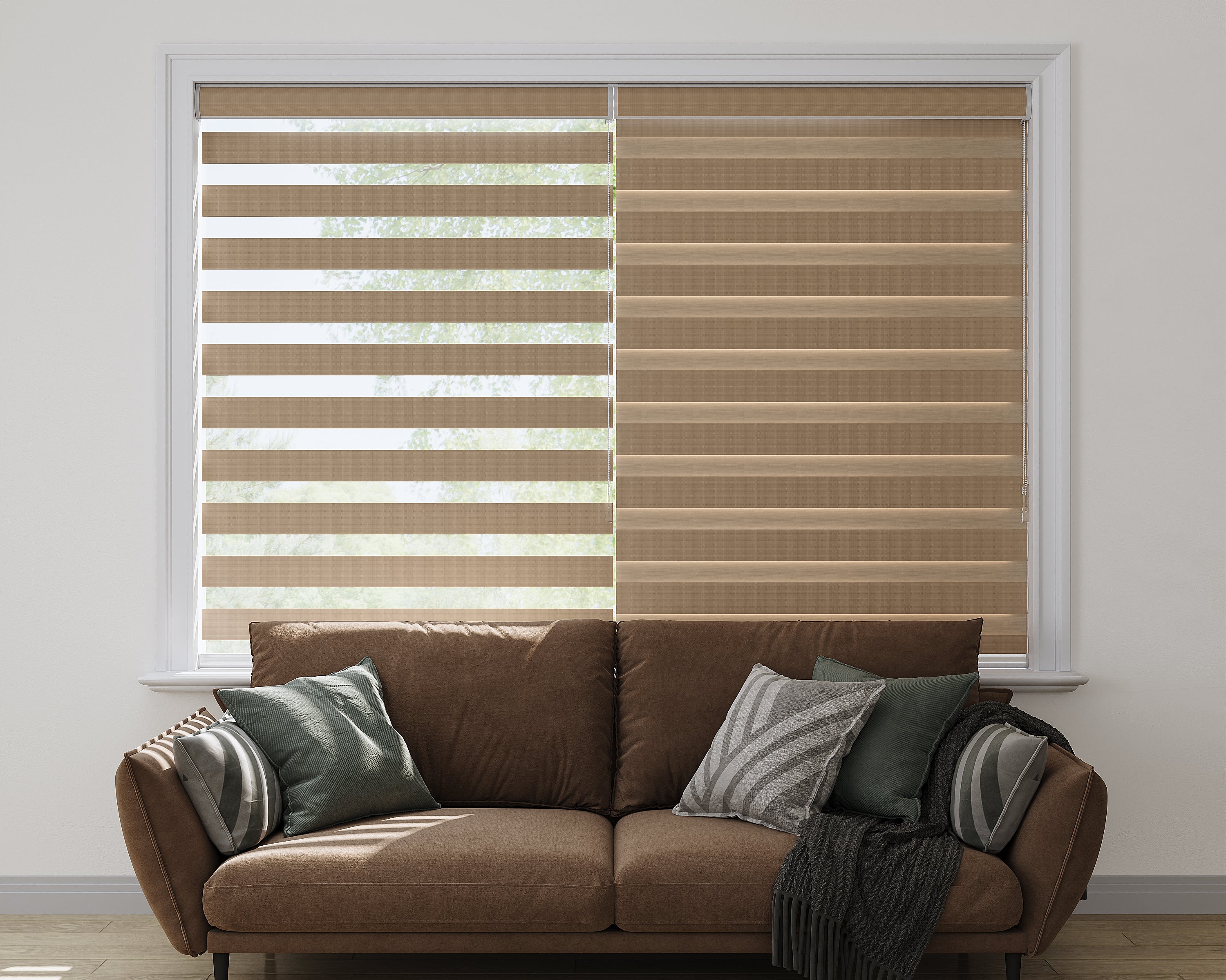
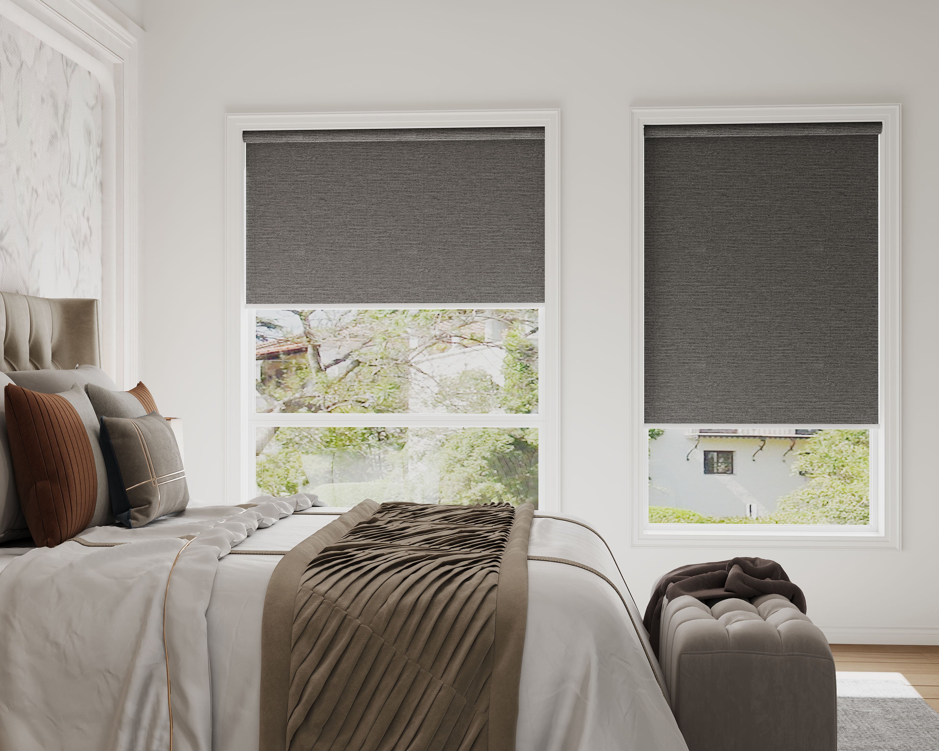
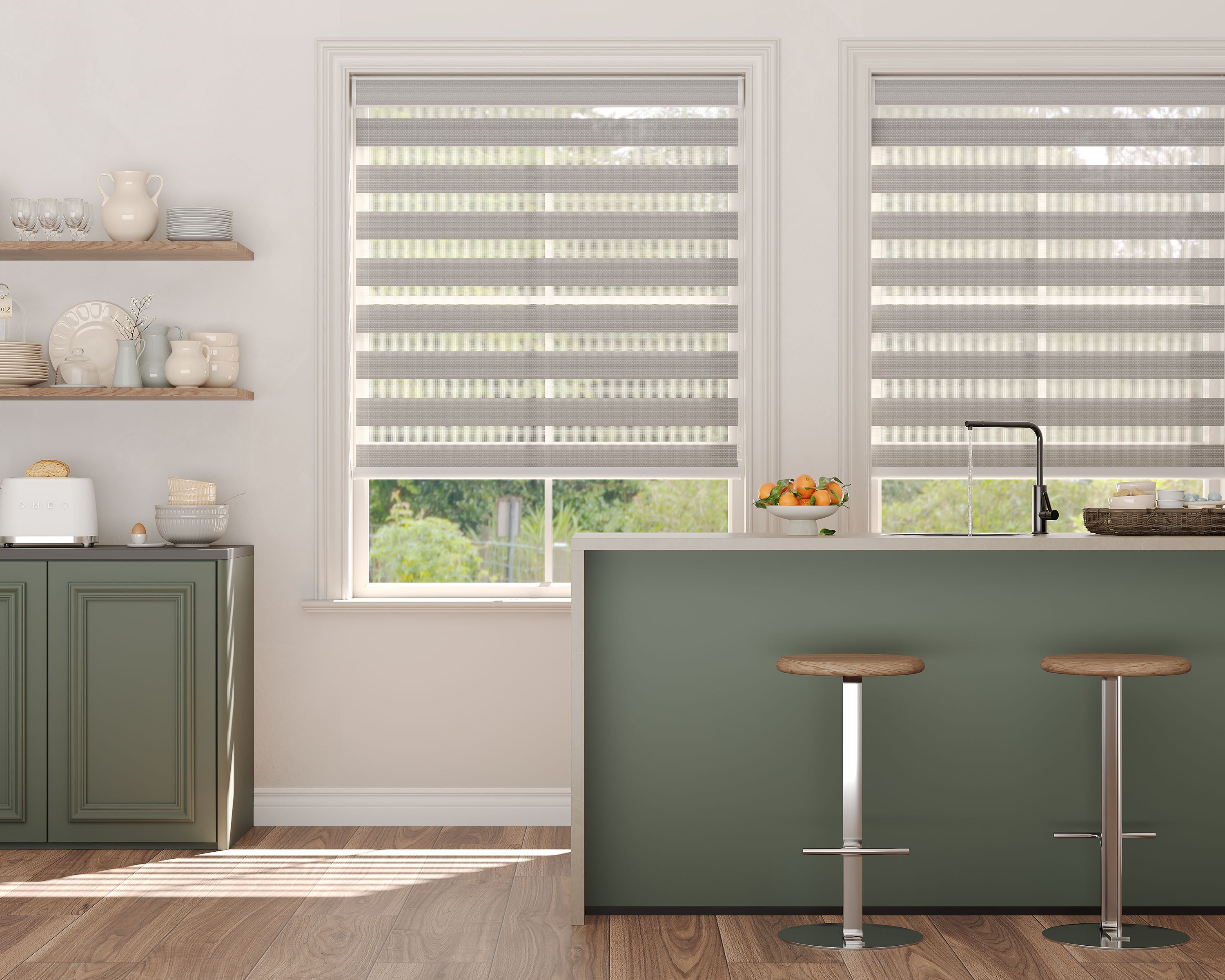
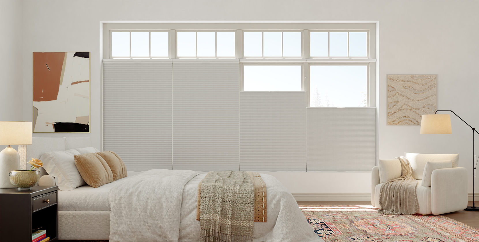
Grays: The most expansive neutral category, ranging from cool light grays and silvers to warm greiges (gray-beige) and deep charcoals. Light grays offer a softer alternative to white, reducing glare while maintaining brightness. Mid-tone grays are exceptionally versatile, working with both warm and cool color palettes. Charcoal and near-black grays offer superior room-darkening effects, absorb more solar heat, and create a dramatic, grounded look.
-
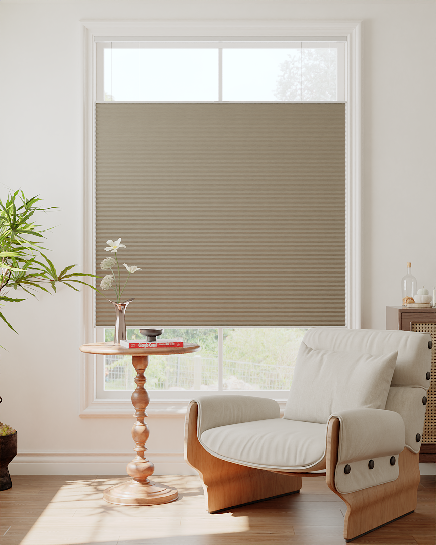
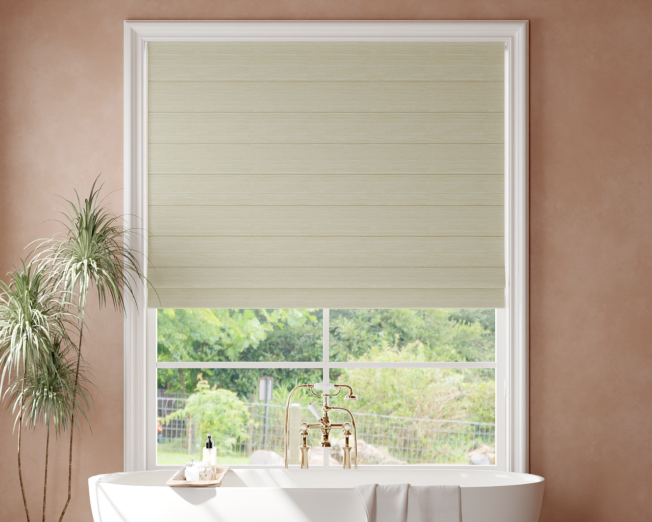
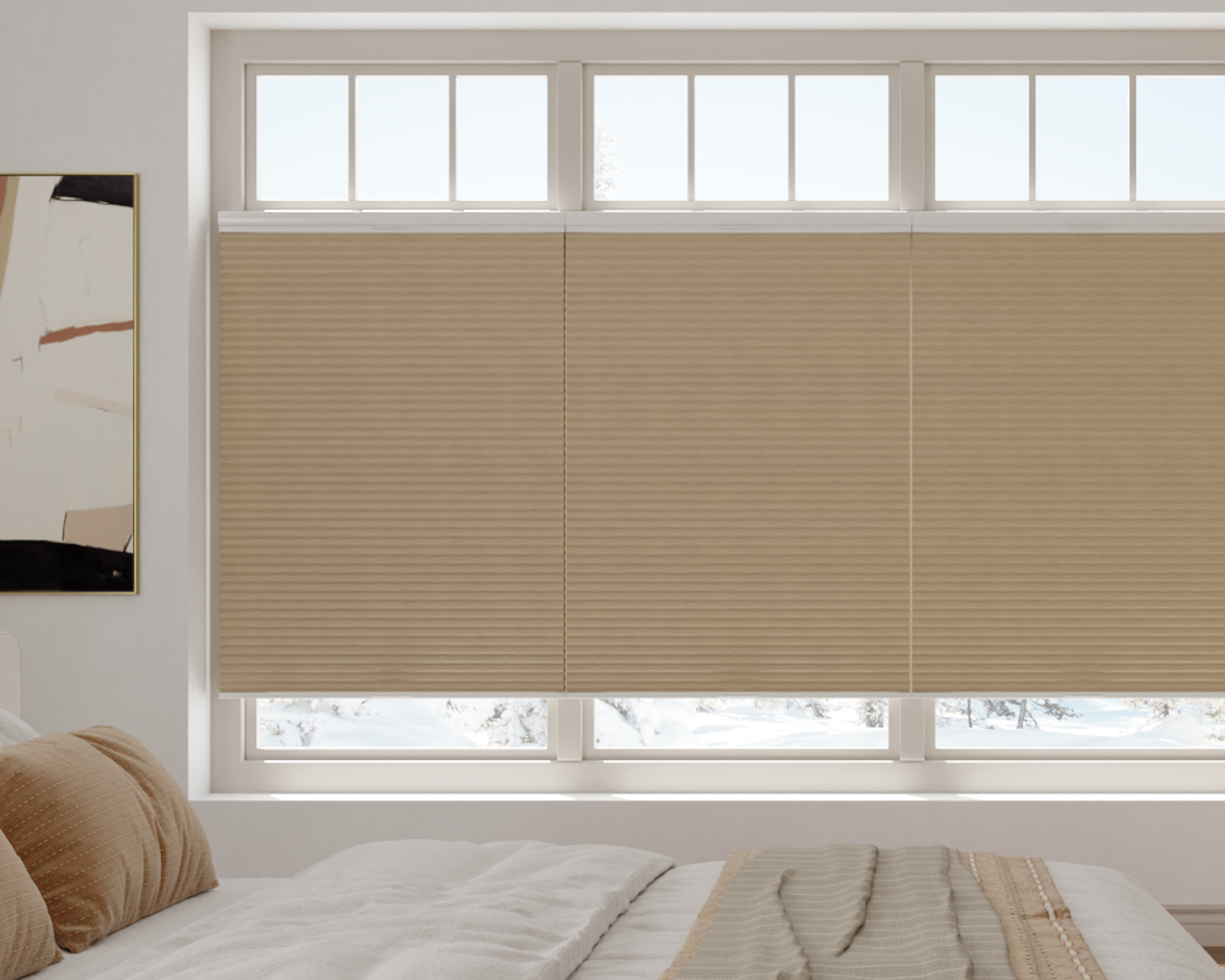
Beiges & Tans: Sand, taupe, and khaki. These warm neutrals create cozy, inviting, and traditional atmospheres. They excel at hiding dust and are excellent for blending with wooden trim, rustic decor, or warm wall colors without the stark contrast of white or gray.
Earth Tones & Nature-Inspired Hues
These colors draw inspiration from the natural world, bringing a sense of calm and organic texture indoors.
-
Greens: From soft sage and muted olive to deep forest. Green is inherently restful and connecting, making it a premier choice for bedrooms, studies, and sunrooms. It complements indoor plants and wooden elements beautifully.
-
Blues: Ranging from pale sky and powder blues to serene navy and peacock. Lighter blues promote calm and are classic in coastal or cottage styles. Deeper blues like navy offer a rich, professional alternative to black, providing excellent light absorption and a luxurious feel.
-
Browns & Terracottas: Warm browns, cocoa, and clay-inspired terracotta. These colors add significant warmth and richness to a space. They are ideal for creating a sense of intimacy, working well in libraries, dining rooms, or rooms with abundant natural light that can balance their depth.
Bold Colors & Statement Makers
For those seeking to define a space with personality, bold colors make a deliberate design impact.
-
Black: The ultimate statement for modern, minimalist, or industrial interiors. Black zebra shades offer the highest degree of room darkening and light absorption. They create striking contrast against light walls and are particularly effective at making window frames disappear and outdoor views pop when the shades are open.
-
Jewel Tones: Emerald, sapphire, amethyst, and ruby. These saturated colors add drama, luxury, and a highly customized look. They are best used in spaces where you want to anchor the design or in rooms used primarily in the evening, as their depth can absorb a lot of ambient light.
-
Pastels: Blush pink, seafoam, lavender, and butter yellow. Pastels provide a soft, playful, or romantic accent without overwhelming a space. They work well in nurseries, craft rooms, or bathrooms to create a light, cheerful mood.
Textures, Patterns, and Woven Looks
Beyond solid colors, many zebra shades feature visual texture.
-
Textured Weaves: Fabrics that mimic linen, burlap, or silk dupioni. These add a tactile, dimensional quality to the shade, impacting how light plays across the surface and enhancing privacy during the day by scattering light.
-
Subtle Patterns: Pinstripes, herringbones, or geometric micro-patterns woven into the fabric. These add depth and interest while maintaining a relatively neutral overall appearance from a distance.
-
Simulated Natural Materials: Woven wood or bamboo-look fabrics that offer the aesthetic of natural materials with the consistent operation of a roller shade.
The Functional Science of Color Choice
Color is not merely decorative; it is a functional component of your window treatment with measurable effects on your environment.
Light Control and Room Darkening Performance
The color of the opaque bands directly affects how much light is blocked or absorbed when the shade is closed.
-
Darker Colors (Black, Charcoal, Navy): Absorb light rather than allowing it to transmit through the fabric. This makes them significantly more effective at creating a dark room environment, a critical factor for bedrooms, media rooms, or shift workers. For an in-depth look at this, our analysis of lab-tested differences between room-darkening and blackout shades is highly relevant.
-
Lighter Colors (White, Beige, Light Gray): Reflect more light. While they diffuse and soften it, a lighter "room darkening" shade will not create the same level of darkness as a darker one of the same material weight. They are better for creating a bright, diffuse glow.
Energy Efficiency and Solar Heat Gain
Color plays a key role in thermal management.
-
Light Colors: Reflect a higher percentage of solar radiation, helping to keep rooms cooler in summer by rejecting heat.
-
Dark Colors: Absorb solar radiation, which can be beneficial in winter by adding passive solar heat to a room but may contribute to overheating in summer. The insulating structure of the shade itself helps mitigate this, but the color is a contributing factor. For a complete understanding of energy dynamics, see our guide on how cellular shades trap air and cut winter heating bills.
Privacy and Aesthetics from the Exterior
Your choice affects how the shades look from the outside—a key consideration for street-facing windows.
-
Light Colors: Tend to appear more uniform and "boxy" from the exterior, presenting a clean, consistent facade.
-
Medium to Dark Colors & Textures: Can blend more naturally with the exterior, especially if they approximate the color of window frames or siding. Textured weaves break up the visual plane, making the shade less conspicuous.
Zebra Shade Color Performance Guide
| Color Family | Best for Room Ambiance | Light Control Tendency | Thermal Effect | Maintenance Note |
|---|---|---|---|---|
| Whites & Lights | Bright, airy, spacious, modern. | High light reflection; creates diffuse glow. | Reflects heat; cooler in summer. | Shows dust more readily; requires frequent gentle dusting. |
| Medium Grays/Beiges | Balanced, versatile, calming. | Moderate light absorption; good diffusion. | Neutral thermal impact. | Excellent at hiding dust and minor soil. |
| Dark Colors (Charcoal, Navy) | Dramatic, intimate, modern, focused. | High light absorption; superior room darkening. | Absorbs heat; warmer in sun. | Shows lint and dust but less than white; water spots may be visible. |
| Earth Tones (Green, Blue) | Restful, organic, nature-connected. | Varies with depth (see above). Light greens/blues behave like neutrals. | Varies with depth. | Similar to equivalent neutrals. |
| Textured Weaves | Added depth, tactile interest, rustic to refined. | Enhanced light diffusion; increased daytime privacy. | Dependent on base color. | Textures can trap more dust; may require vacuuming. |
Strategic Color Selection by Room
Aligning color with room function ensures your shades work as hard as they look.
For Bedrooms: Promoting Rest and Privacy
Prioritize colors that support sleep and relaxation. Deep charcoals, navies, or warm, deep browns are excellent for maximizing darkness. Softer sage greens, serene blues, or warm greiges promote calm. Avoid overly bright or stimulating colors unless they are specifically desired in a child's room or a bedroom that also functions as a sitting area.
For Home Offices: Managing Glare and Professionalism
Color here should aid concentration and manage technology. Mid-tone grays or beiges provide a neutral, professional backdrop for video calls without causing eye strain from glare. Darker shades can be used to control glare on south or west-facing windows. For more on this specific application, our article on zebra shades for home offices delves deeper.
For Living & Dining Rooms: Enhancing Style and Social Spaces
This is where personal style shines. Choose colors that complement your overall decor scheme. Larger rooms can handle darker or bolder colors, while smaller living areas benefit from light neutrals to feel more expansive. Consider the shade's appearance both day and night as a part of your interior landscape.
For Bathrooms: Balancing Moisture and Light
In bathrooms, material often dictates color choices. For moisture-resistant fabrics, choose light colors like white or beige to mitigate potential water spotting and maintain a spa-like feel. If using a darker color, ensure it's in a suitably resistant material. Good ventilation is key. Our guide on moisture-resistant fabrics for kitchens and baths is essential reading for this space.
Coordinating with Your Existing Decor
The goal is harmony, not necessarily matchy-matchy perfection.
Working with Wall Colors
-
Monochromatic: Choose a shade color several tones lighter or darker than your wall for a subtle, layered look.
-
Contrasting: Use the shade as a deliberate contrast. White or cream shades on a dark wall are crisp and defining; black or charcoal shades on a light wall are dramatic and grounding.
-
Complementary: Select a color from the opposite side of the color wheel from your wall's dominant hue for a vibrant, dynamic effect (e.g., slate blue shades with warm tan walls).
Considering Flooring and Large Furniture
View your floor and largest furniture pieces (sofa, bed frame) as the foundation. Your shade color should feel connected to this palette. Warm wood floors pair naturally with beiges, warm grays, and earth tones. Cool gray floors or white furniture call for cooler shade tones like pure whites, grays, and blues.
The Critical Importance of Sampling
Never, ever choose a zebra shade color from a screen alone. Lighting dramatically alters color perception.
-
Order Physical Samples: Get large swatches (at least 4"x6") of your top 2-3 choices.
-
Test in Situ: Tape them to your window glass and observe them at different times of day—morning, noon, and evening.
-
View in Context: See how the color looks against your walls, trim, and flooring with both natural and artificial light.
-
Check the Mechanism: Operate the sample to see how the sheer and opaque bands look together, as this is the true finished effect.
Conclusion: Choosing with Confidence
Selecting a zebra shade color is a multifaceted decision that blends art with science, personal emotion with practical physics. The perfect color is one that fulfills its functional mandate for the room—be it darkness, light control, or thermal management—while simultaneously speaking to your personal aesthetic and creating the desired emotional atmosphere.
Move beyond safe neutrals only if your room's function and lighting allow it. Remember that darker colors enhance the room-darkening performance you pay for, while lighter colors maximize a sense of space and light. Always validate your choice with physical samples viewed in the unique context of your home. This careful, considered approach ensures your zebra shades will be a source of daily satisfaction for years to come.
Key Highlights
-
Color directly affects performance: Darker shades provide better room darkening and light absorption; lighter shades maximize brightness and heat reflection.
-
Neutrals offer maximum flexibility, while earth tones promote calm and bold colors make a definitive design statement.
-
Align color with room function: Prioritize sleep in bedrooms, glare control in offices, and style in living areas.
-
Physical samples are non-negotiable. Screen colors are unreliable; you must see and touch the fabric in your own light.
-
Consider the exterior view and maintenance requirements (dust showing, potential water spots) as part of your decision.
Explore Custom Zebra Shades


Frequently Asked Questions (FAQ)
Do light-colored zebra shades get dirty easily?
Light colors, especially pure white and off-white, will show dust and airborne particles more readily than medium or darker tones. However, this does not mean they get dirtier—it simply means soil is more visible. Regular, gentle dusting with a microfiber cloth or vacuum brush attachment is recommended for all shades, but is more critical for maintaining the appearance of light colors. Most zebra shade fabrics are treated for stain resistance and are easy to spot clean.
Can I get custom-colored zebra shades?
Most major manufacturers offer a curated selection of dozens of colors, but truly custom-dyed fabrics (where you provide a paint swatch for an exact match) are rare and prohibitively expensive in the roller shade market. The standard approach is to select from the manufacturer's extensive palette, which is designed to coordinate with common interior design colors.
How does the sheer fabric color affect the overall look?
The sheer bands are typically a neutral white, cream, or light gray, regardless of the opaque band color. This is for manufacturing consistency and light diffusion. When the shade is in a mid-adjustment position, you will see stripes of your chosen opaque color alternating with these neutral sheers. It's important to visualize this striped effect, which is part of the shade's character, not a flaw.
Should all the zebra shades in my home be the same color?
Not necessarily. While using the same color throughout creates a cohesive, flowing feel, it is perfectly acceptable—and often more interesting—to use different colors tailored to each room's function and decor. A common strategy is to use the same color on all street-facing windows for exterior consistency, while varying colors on the interior or rear of the home. The most important factor is that the choices feel intentional, not haphazard.
