
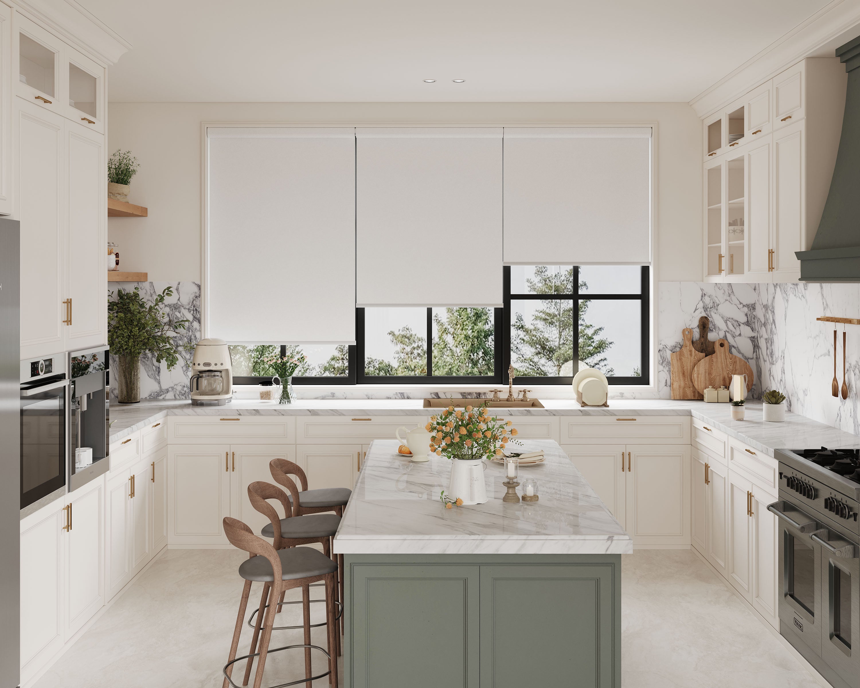
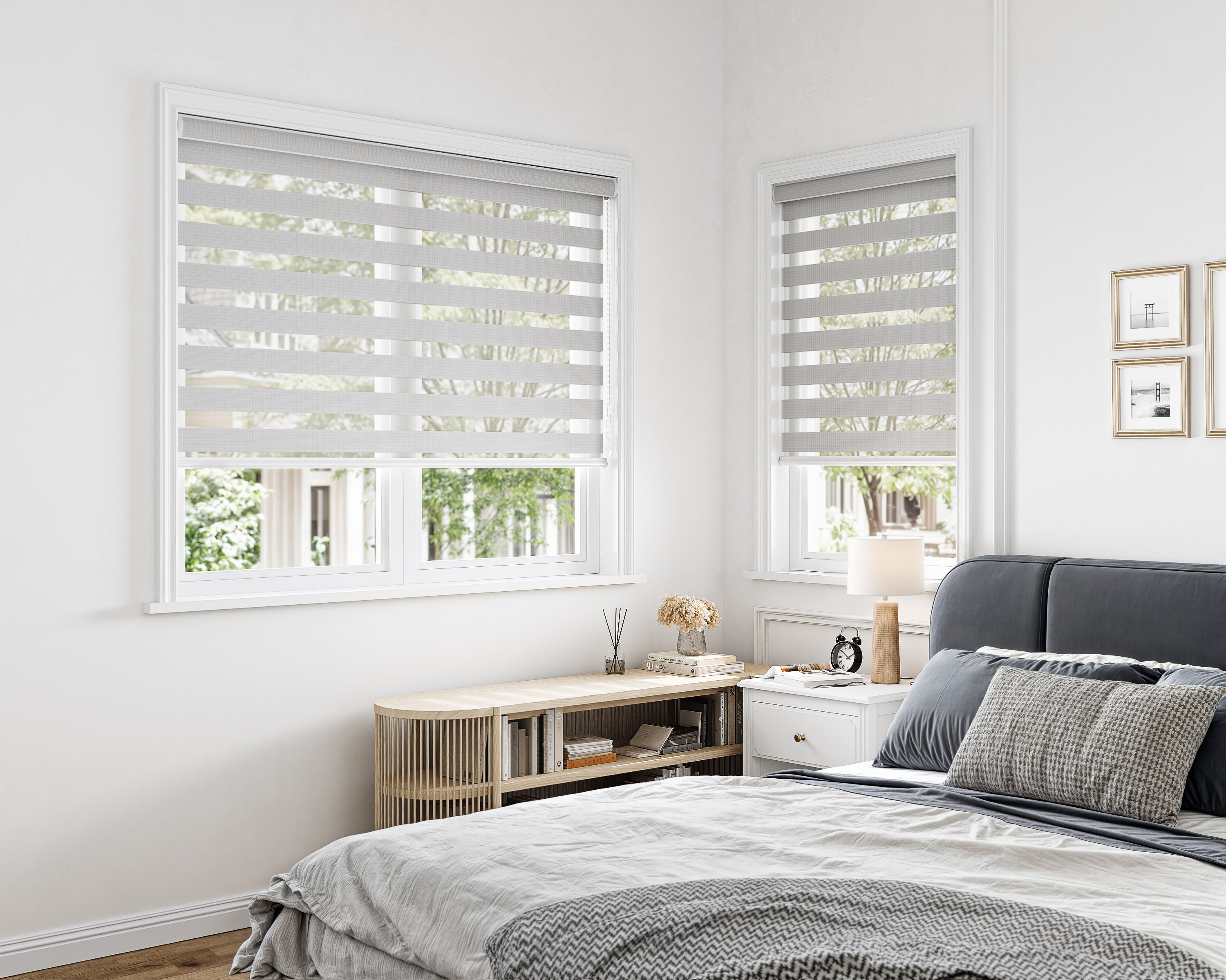
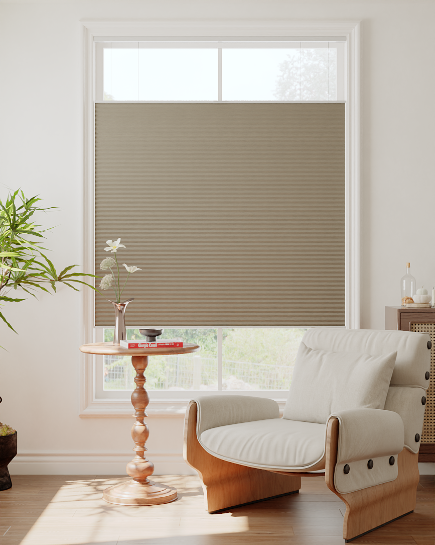
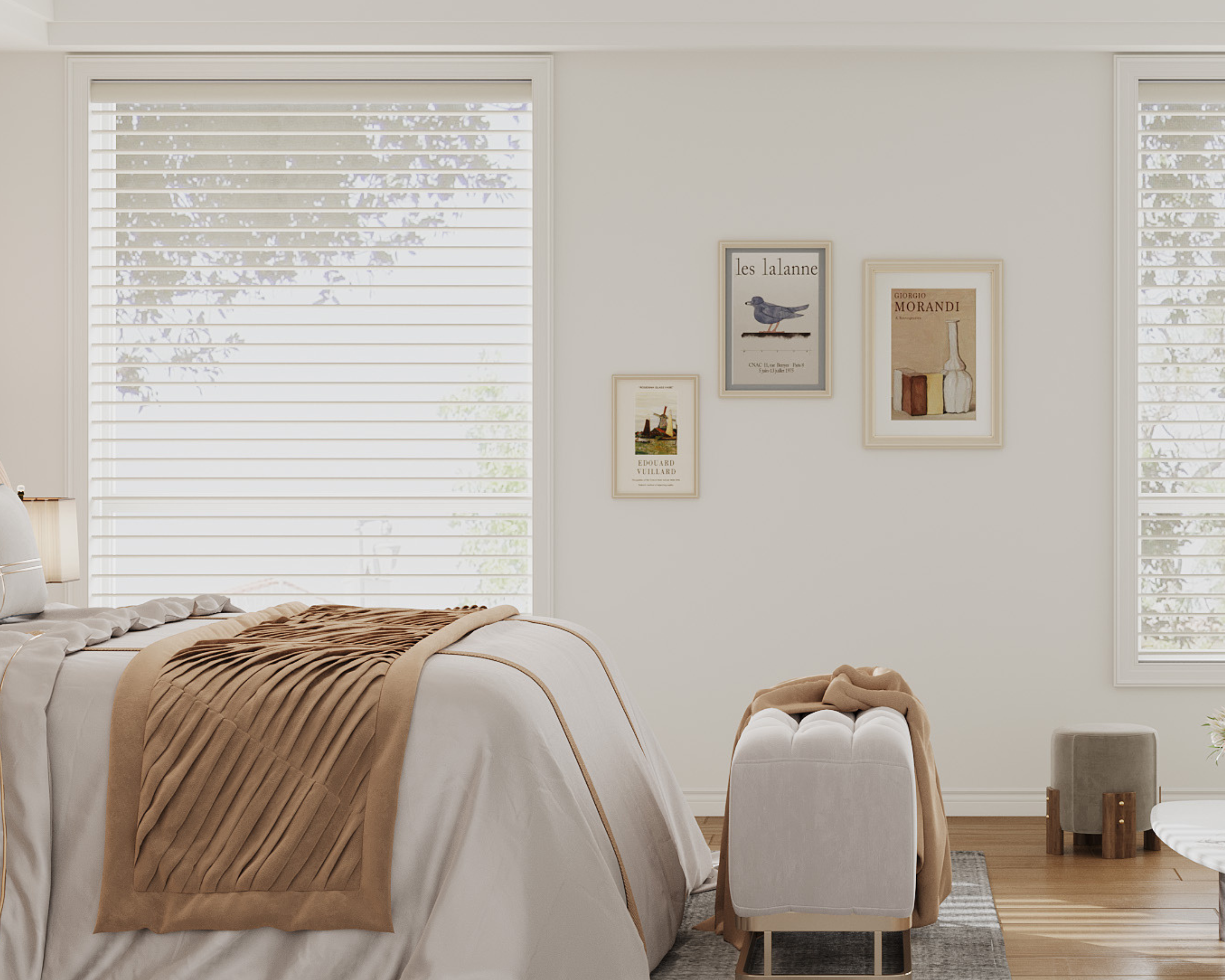

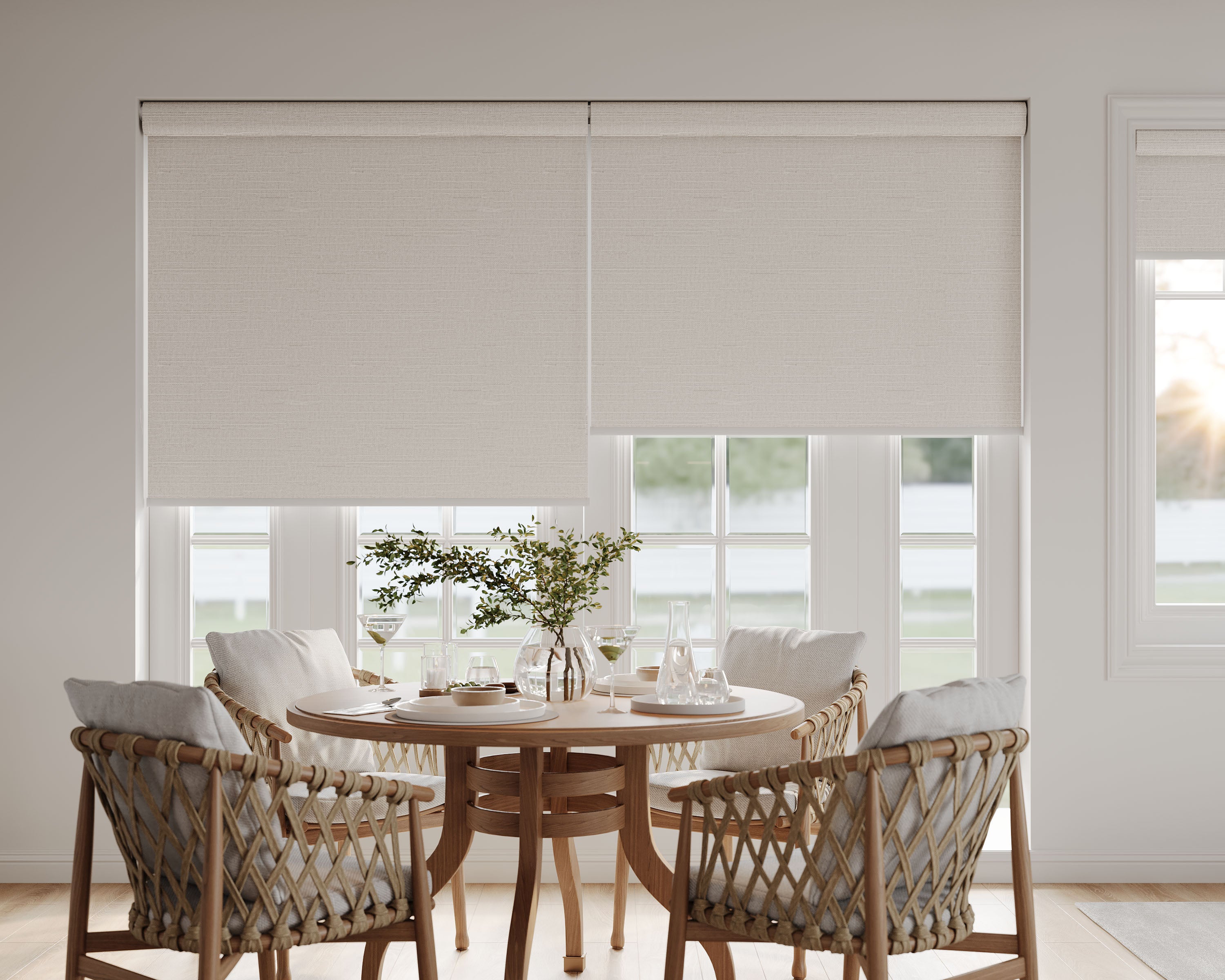


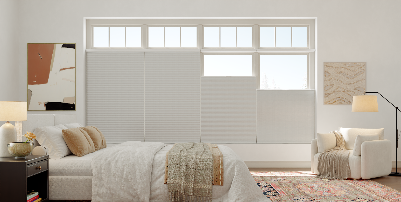


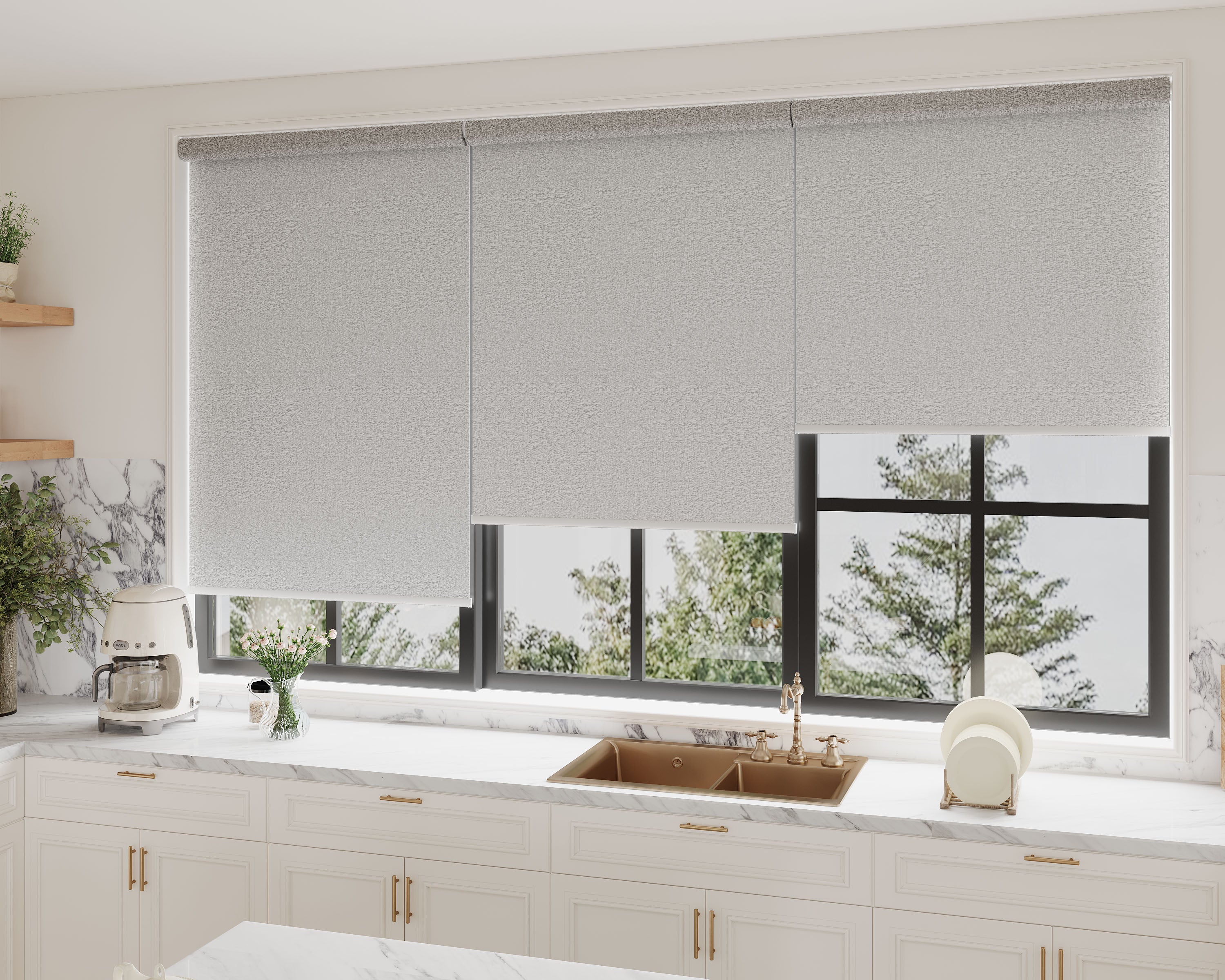

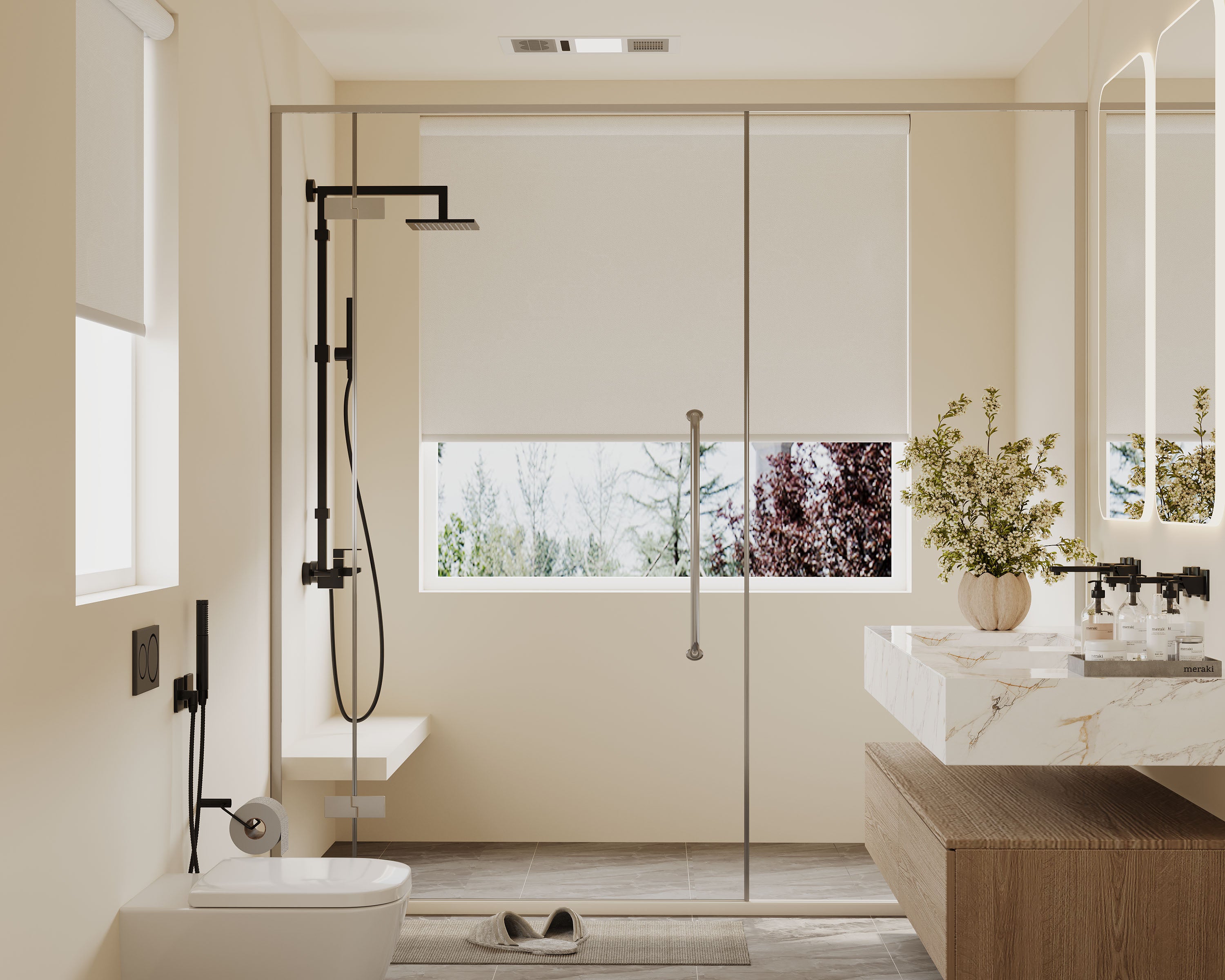


Choose your roller shade fabric series in this order: light control, surface texture, then the exact color code. SenseBlinds' light-filtering and blackout rollers share several series names, but their fabrics and codes are separate choices. A white Shantung sample from one product should not stand in for the other.
This guide compares the fabric series currently listed for SenseBlinds roller shades. Use it to narrow your shortlist, then compare the selected samples in the room before configuring the complete shade.
Start with the light-control product
Choose light-filtering roller shades when softened daylight is the starting goal. Choose blackout roller shades when you want opaque fabric that blocks light through its surface. Installed light around the fabric's edges remains a separate consideration.
The fabric series then helps you choose the appearance within that product. A textured surface does not automatically provide more privacy or stronger blackout than a plainer surface. Light-filtering privacy depends on the particular fabric, color and lighting on each side of the window.
If you are still choosing between light-control categories, start with the roller shade opacity guide. If fiber content, coatings or a damp location is the unresolved question, use the roller fabric material guide. The series comparison below is for choosing the surface you want to see.
Compare the current roller fabric series
The current blackout listing describes six named fabric groups: AYM65, AYM53, Shantung, Uluru, Arizona and Doris. The light-filtering listing describes four: AYM, Shantung, Uluru and Arizona. The product selectors group these into broader texture labels, so the series name and full color code help identify the actual choice.
| Series | Appearance to compare | Current product choices | Example color code |
|---|---|---|---|
| AYM65 | A quieter plain weave | Blackout | White — AYM6500 |
| AYM53 | Fine plain weave with subtle horizontal yarn definition and a linen-like look | Blackout | Soft White Woven — AYM5301 |
| AYM | The plain option in the light-filtering selection | Light filtering | White — AYM-1 |
| Shantung | Linen-inspired crosshatch and heathered detail | Light filtering and blackout | Shantung1111 or Shantung1911, depending on the product |
| Uluru | Woven texture with visual depth and variation | Light filtering and blackout | ULURU1101 or ULURU1901, depending on the product |
| Arizona | A two-tone weave with horizontal texture | Light filtering and blackout | Arizona1101 or Arizona1901, depending on the product |
| Doris | A fine, two-tone speckled texture | Blackout | White Textured — Doris 1901 |
These descriptions summarize SenseBlinds' current product copy; they are appearance cues rather than measured performance rankings. The listed series are described as polyester. AYM53's linen-like appearance and Shantung's linen-inspired texture do not mean those fabrics contain linen.
The blackout selector also lists Black — P1907 under Plain Color. Its code does not establish that it belongs to AYM65, so keep P1907 as its own exact selection when checking samples or an order.

AYM53 is one of the blackout fabric groups. Use product photographs to shortlist a texture, then assess the physical sample in your room.
Narrow the textures around the room's finishes
Begin with the finish beside the window that you are keeping: painted trim, a wood frame, a stone counter or the wall color. Compare how much detail the shade should add when it is lowered across the window.
For a quieter fabric field, compare AYM65 or light-filtering AYM first. These are sensible starting points when the room already has patterned curtains, a busy rug or strongly grained furniture. Decide whether you want the shade to blend with those features or provide a deliberate color contrast.
For a linen-like direction, compare AYM53 and Shantung in the appropriate product. AYM53 is currently a blackout choice. Shantung appears in both opacity products, with different codes. Compare the texture rather than assuming that two ivory or white names will produce the same result.
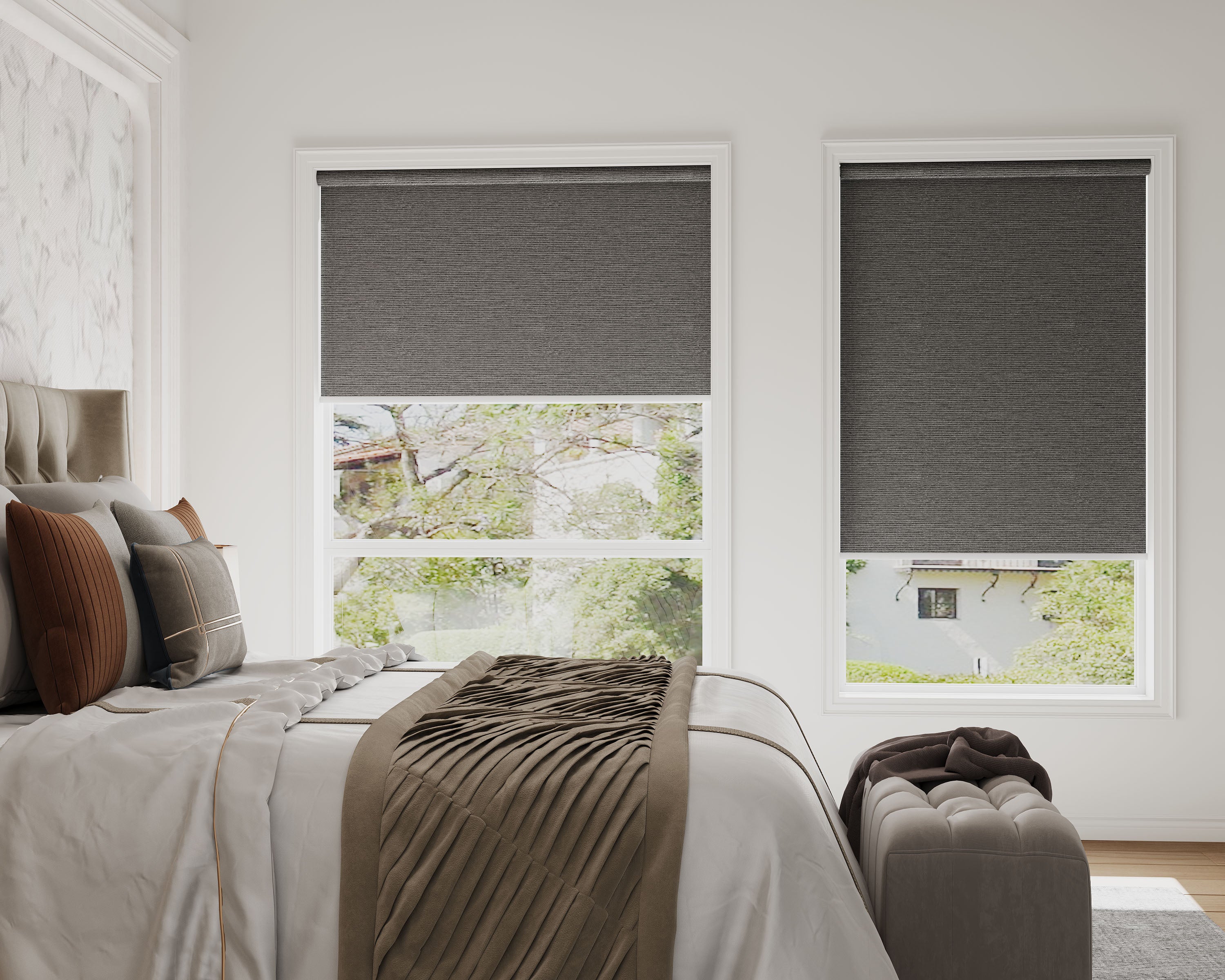
For more visible woven detail, compare Uluru and Arizona. Uluru's description emphasizes woven depth, while Arizona emphasizes horizontal, two-tone texture. Look at them both straight on and from the usual seat in the room. A close-up can make a weave appear more prominent than it will from across the space.
For a fine speckled surface, add Doris to the blackout shortlist. Its current choices include White Textured, Warm Greige, Sand Beige, Light Silver Gray, Charcoal and Black. That gives you a different visual direction from a plain or linear weave; it does not establish a separate insulation, stain-resistance or acoustic rating.
These are starting comparisons, not rules about which fabric belongs in a particular style of home. A sample beside your existing finishes is more useful than choosing solely from a room-style label.
Keep the opacity and exact code together
A series name can recur across products without identifying the same fabric. Record the product name and complete color label together. These current examples show why:
| Light-filtering selection | Blackout selection | What to keep separate |
|---|---|---|
| White — AYM-1 | White — AYM6500 | Different product and code, despite the shared color word |
| Snow White Texture — Shantung1111 | Snow White Texture — Shantung1911 | Different opacity-specific Shantung selections |
| White Textured Weave — ULURU1101 | Soft White Textured Weave — ULURU1901 | Similar series and color direction, with different labels and codes |
| White Linear Texture — Arizona1101 | White Linear Texture — Arizona1901 | The same descriptive color name does not replace the full code |
For adjoining rooms, you might want light filtering in one space and blackout in another. Order or request the relevant samples for both products before deciding that they coordinate. Shared series names alone do not promise an identical face color, texture or appearance when backlit.
The current light-filtering selector does not include Doris or AYM53. If one of those blackout surfaces is your favorite but the room needs daylight, compare the available light-filtering alternatives on their own merits rather than assuming the same fabric can be supplied in another opacity.
Compare samples before configuring the shade
Use a small shortlist that answers a specific question: plain versus textured, warmer versus cooler, or the same series in two opacity products. Label each sample with the product, series and full code so that the choice remains identifiable when the samples are moved between rooms.
Hold the samples near the window in daylight and under the room's normal evening lighting. Compare them beside both the wall and trim, then view them from your usual sitting or standing position. Keep track of whether you are judging surface color, backlit appearance or privacy; those are different observations. Our paint-and-trim sample plan walks through that comparison.
Before returning to the product page, record four decisions:
- Light control: light filtering or blackout for this window's task.
- Fabric identity: the selected series, full color name and code.
- Room comparison: what you liked beside the actual finishes and lighting.
- Complete configuration: the offered lift, top treatment and mount to check for your window.
Then configure the selected blackout roller shade or light-filtering roller shade, using that product's current measuring and option instructions. A fabric sample identifies the material you want; the product configuration determines the complete shade you are ordering.
