

Choosing the right shade fabrics for our windows really sets the vibe of a room, but matching them with wall paints and trim can feel like a headache. Here’s the thing: colors interact, and when we get that, our rooms just work. It’s not just about picking a color we love—it’s about making everything feel like it belongs, from the textiles to the paint to those little trim details that pull the space together.
We all want rooms that feel inviting and look effortless, but let’s be honest, choosing the wrong shade fabric can throw everything off balance. That’s why we’re diving into simple strategies and expert tips to help us pair fabrics, wall colors, and trim finishes. To see fabrics designed to harmonize beautifully with wall paints and trim, browse our coordinated roman shade fabrics for elegant pairings that elevate any room.
Key Takeaways
- Color coordination brings a room together and prevents clashing.
- Matching fabrics with wall and trim colors requires a plan and a few expert tips.
- Avoiding common mistakes sets us up for design success.
Understanding Color Theory for Interior Design
Choosing colors for our space isn’t just picking favorites. The right mix depends on how colors relate, their undertones, and whether they’re warm or cool.
The Color Wheel and Its Role in Home Decor
The color wheel is our cheat sheet for pairing. Three primary colors (red, blue, yellow), three secondary (green, orange, purple), and six tertiaries. Once we know where colors sit, it’s way easier to choose fabrics and paints that actually look good together.
A few classic combos:
- Complementary: Opposites, like blue and orange—lots of contrast.
- Analogous: Neighbors, like green, blue-green, and blue—super harmonious.
- Triadic: Evenly spaced, such as red, yellow, and blue—full of energy.
If the walls are soft green, we could grab curtain fabrics in similar greens or throw in a pop of deep red. The color wheel helps us skip the guesswork.
Warm vs Cool Tones: What You Need to Know
Colors lean warm (reds, oranges, yellows) or cool (blues, greens, violets). Warm tones cozy things up. Cool tones chill things out.
Paint and trim in warm tones pair best with similarly warm shades—like beige curtains with buttery walls. Cool-loving combos might be gray-blue drapes with crisp white trim.
Not sure? Hold something up next to a true red and a true blue. The undertone usually gives itself away.
How Undertones Affect Perception
Undertones are sneaky. They turn basic white into icy, creamy, or even a little pink, just by shifting those subtle hues.
Matching fabrics with paint means spotting and respecting these undertones. A white wall with blue undertones won’t love warm ivory shades, but it’ll look seamless with a cool gray fabric.
We always put samples side by side, in both daylight and under our usual lamps. Colors show their true selves only in real life. That quick check saves us from the dreaded “something feels off” vibe.
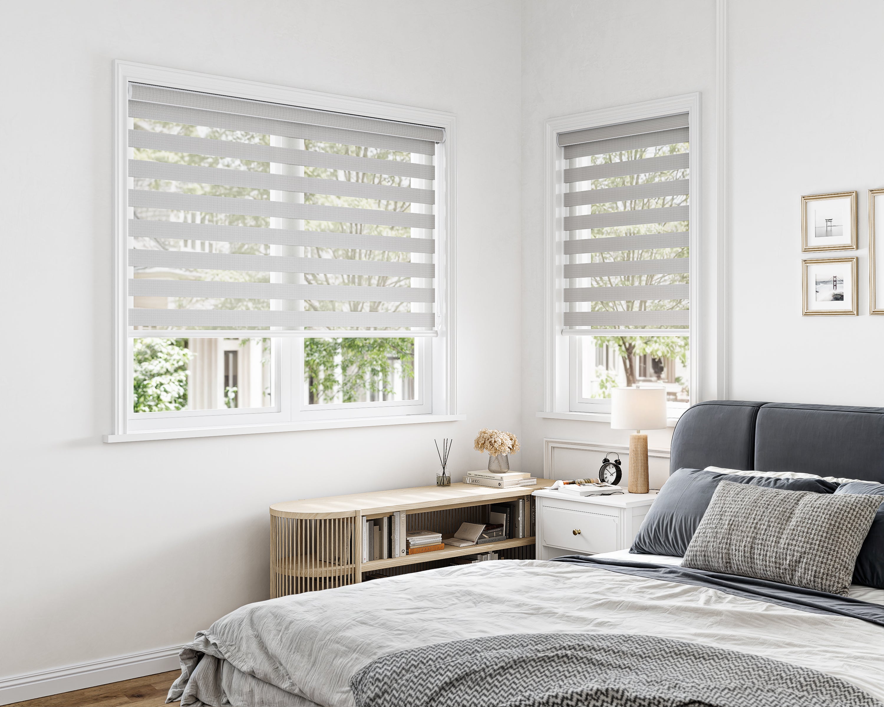
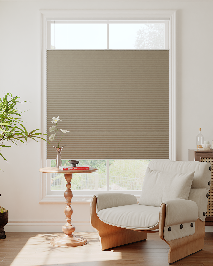
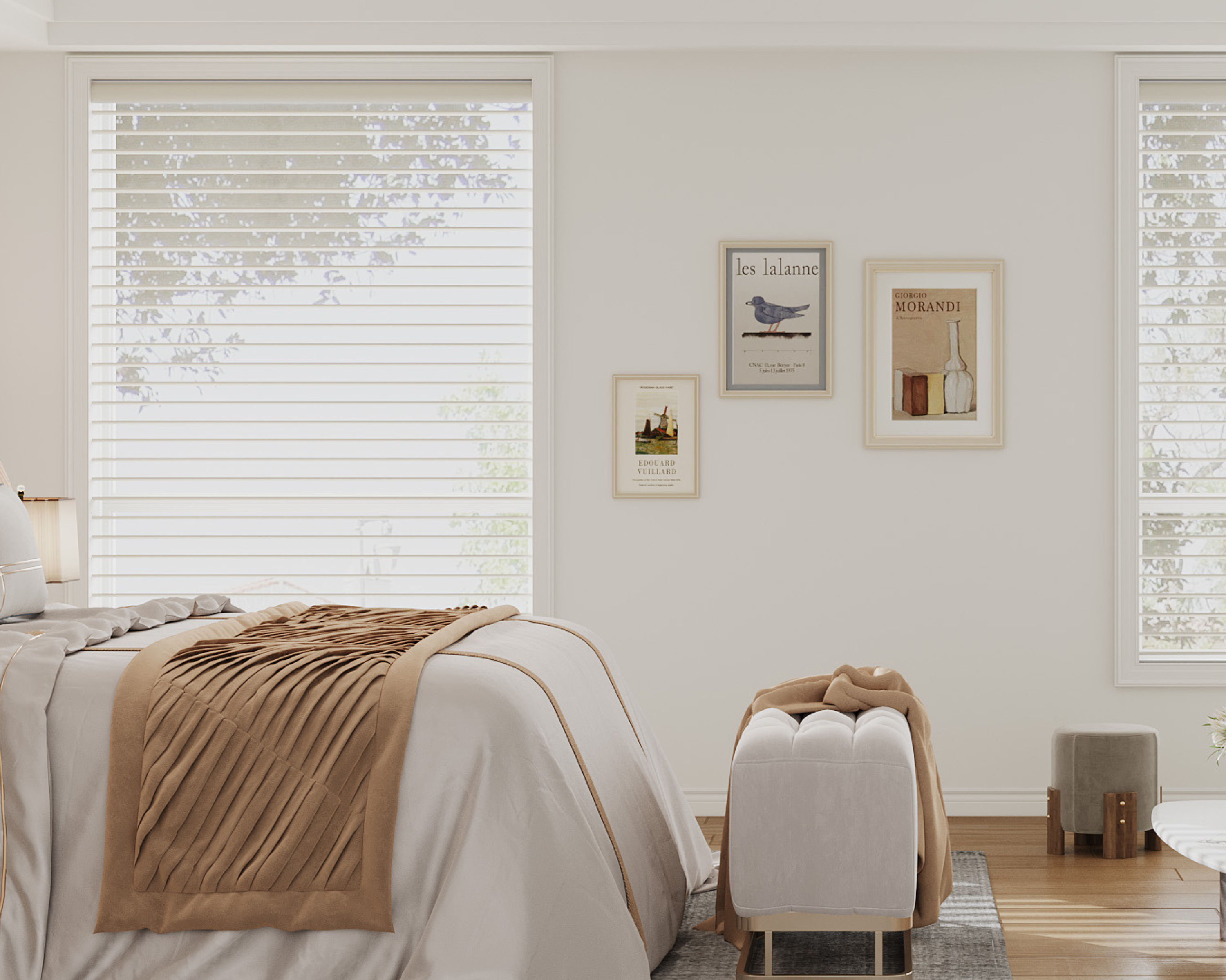
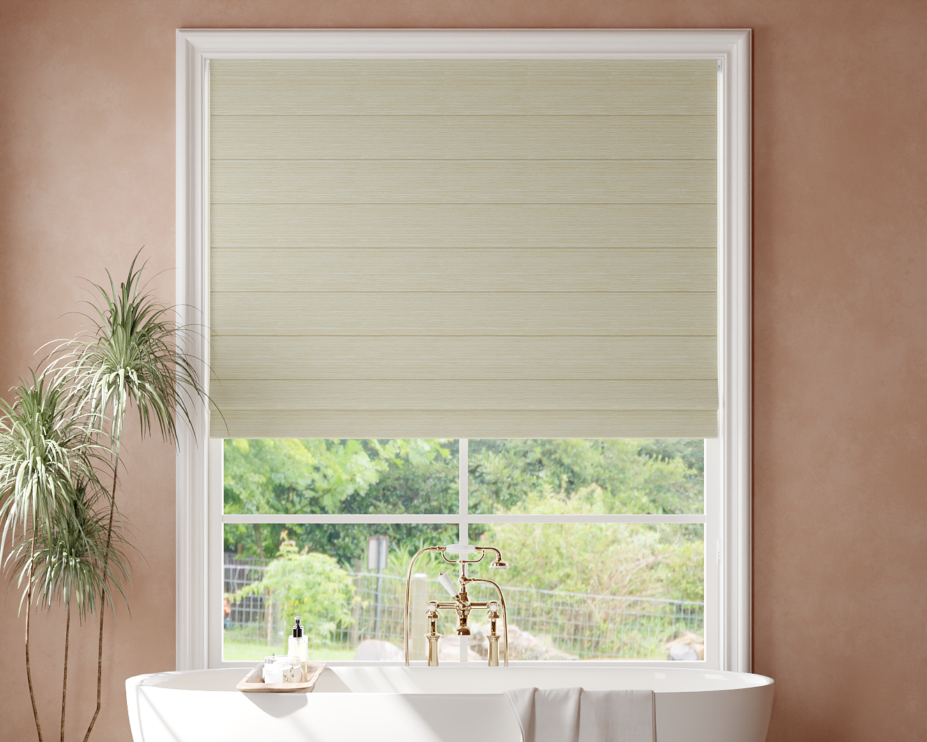
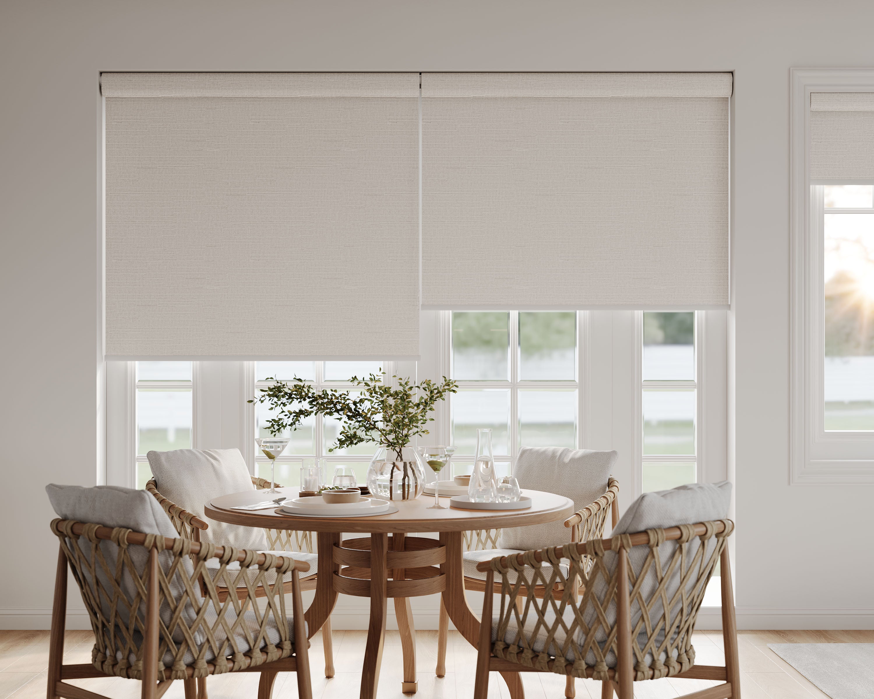
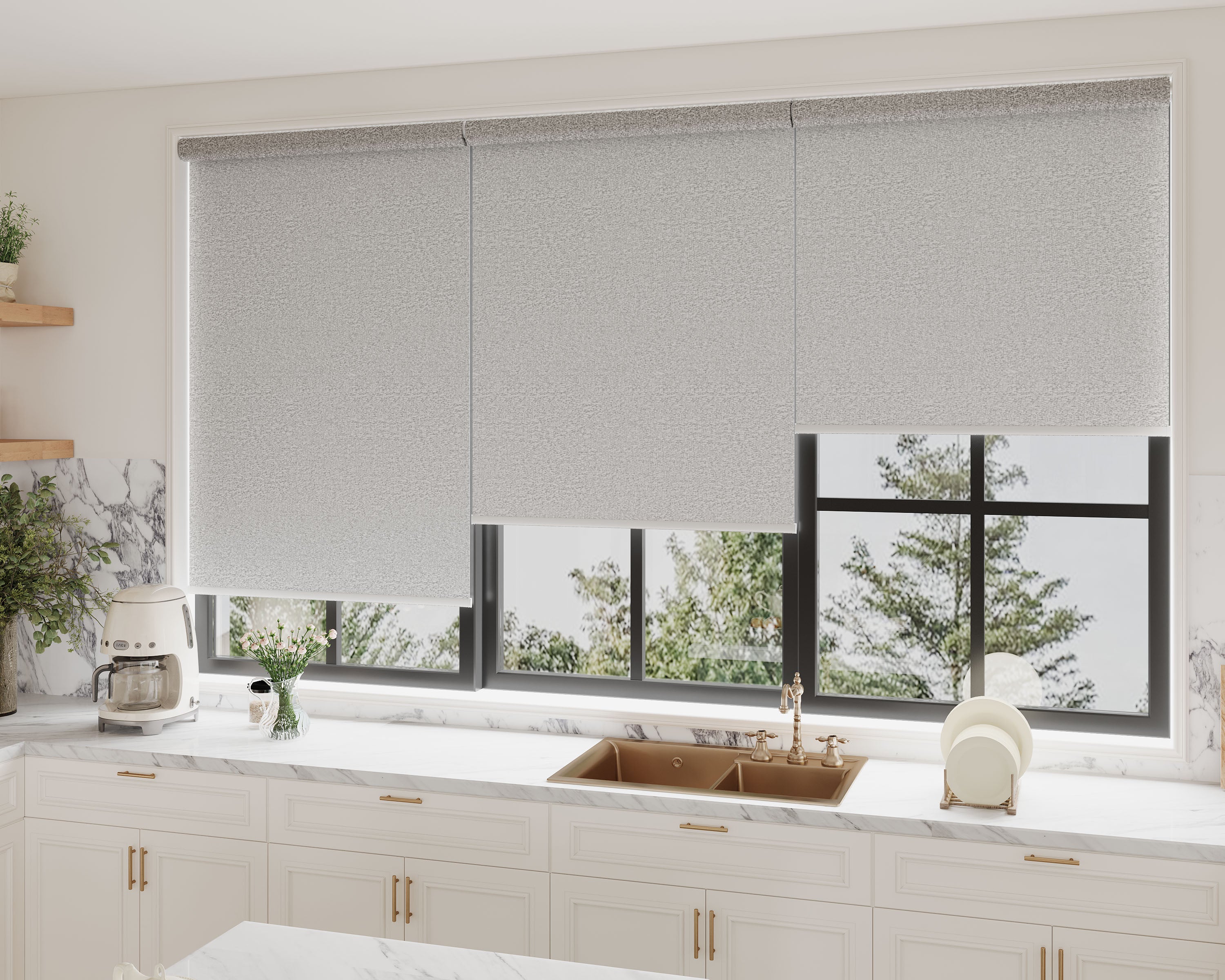
Choosing the Right Shade Fabrics
Picking shade fabrics isn’t just about color. The material, texture, and how much light comes through can totally change how the shade sits next to paint and trim. Lighting’s a wild card too—some colors pop, others fade, depending on the hour.
Fabric Types and Their Impact on Color Appearance
Every fabric type plays with color in its own way. Linen softens and mutes; polyester and synthetics go bolder and brighter. Cotton’s somewhere in between, not too showy, not too dull.
Fabrics with sheen—like silk or faux silk—shift between lighter and darker, depending on the angle and paint finish nearby. If the walls are matte and the fabric’s shiny, the contrast can be pretty dramatic.
Quick comparison:
| Fabric Type | Color Effect | Best For |
|---|---|---|
| Linen | Muted, soft | Relaxed, natural looks |
| Polyester | Bold, crisp | Modern, vivid palettes |
| Silk | Shimmery, changes | Glam, elegant touches |
| Cotton | Balanced, casual | Everyday style |
For understanding how texture influences color perception and pairing, this guide on texture as a design tool explains when to choose woven vs smooth fabrics for perfect harmony.
Opacity, Texture, and How They Play With Color
Opacity’s a bigger deal than we think. Sheer fabrics let wall and trim color bleed through, which can create weird undertones. If we want a truer color match, something more opaque is usually best.
Texture does its own thing. Heavily textured fabrics—like jacquard or embroidery—break up color in interesting ways. Smooth weaves keep things more uniform. If our walls or trim are already textured, adding another bold texture might get a little chaotic.
If we’re on the fence, just hold samples up to the painted wall or trim at different times of day. Surprises show up fast.
Lighting Considerations for Shade Fabrics
Lighting changes everything. Natural light with cool undertones makes blues and grays pop, while warm bulbs cozy up reds, oranges, and yellows. North-facing rooms cool things down; south-facing rooms warm everything up.
If the lighting changes a lot, the same fabric might look like three different colors from morning to night. Always check swatches under every light source we use.
Direct sunlight fades fabrics, especially dark ones. To explore how different fabric opacities affect perceived color and light interaction, this breakdown of the difference between light-filtering and solar shades clarifies their role in color coordination. Lining shades or picking UV-resistant materials is a smart move for sunny spots.
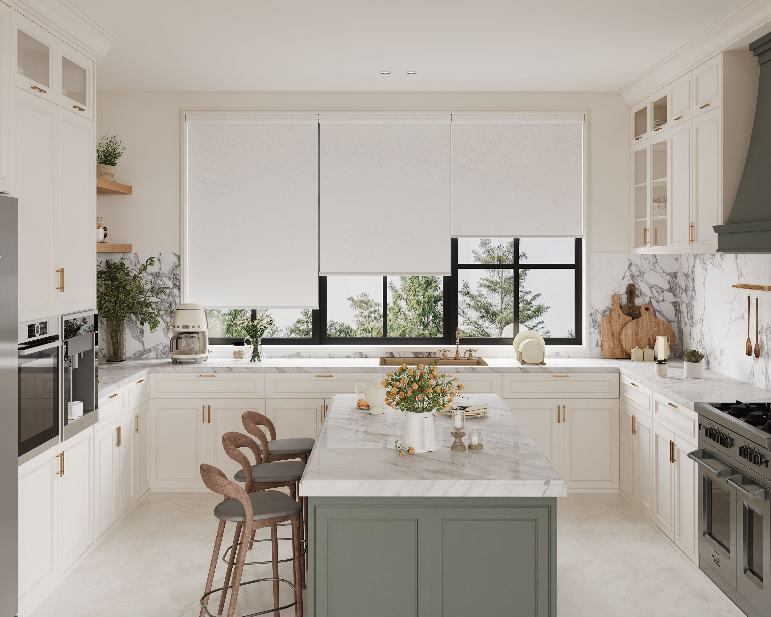
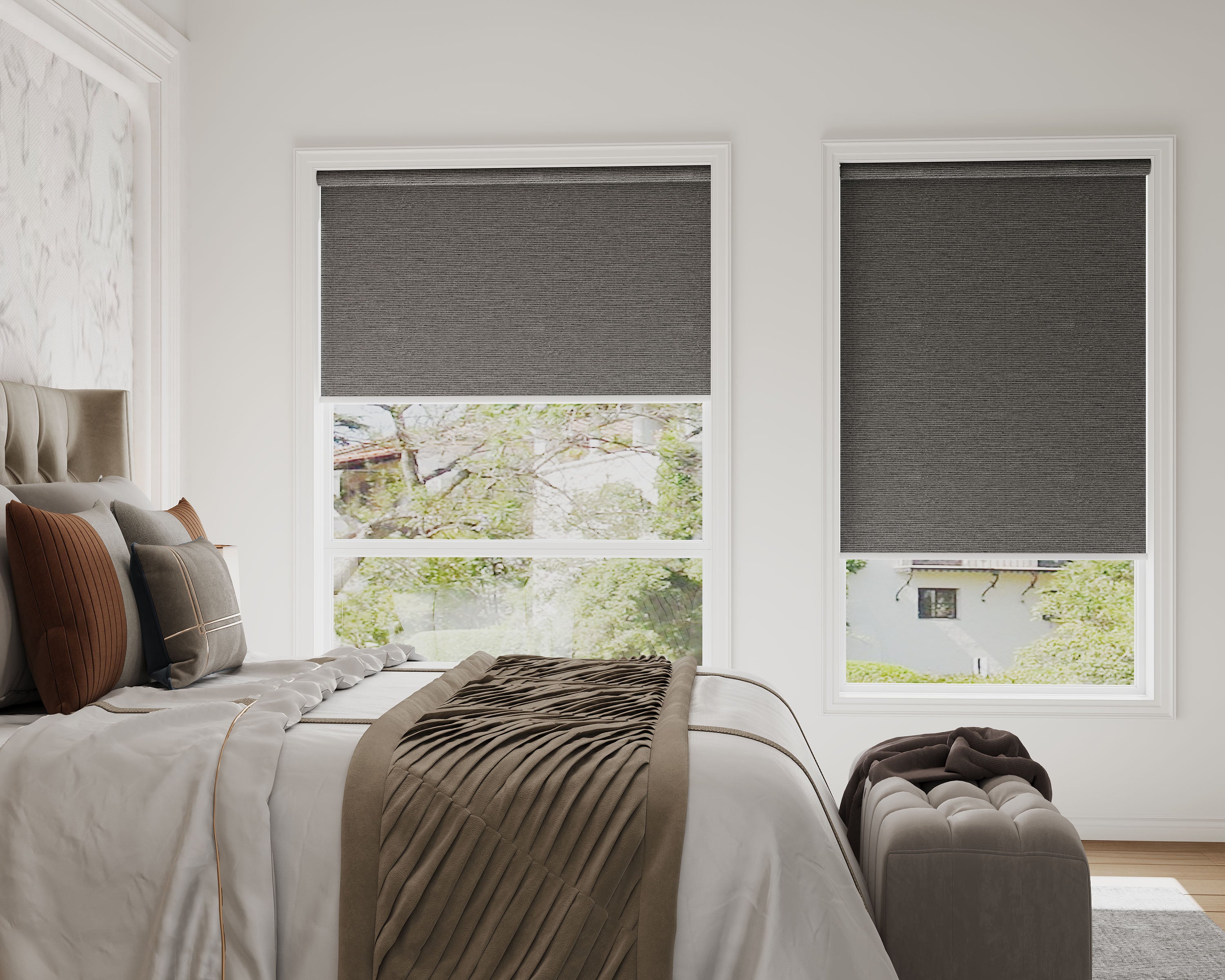
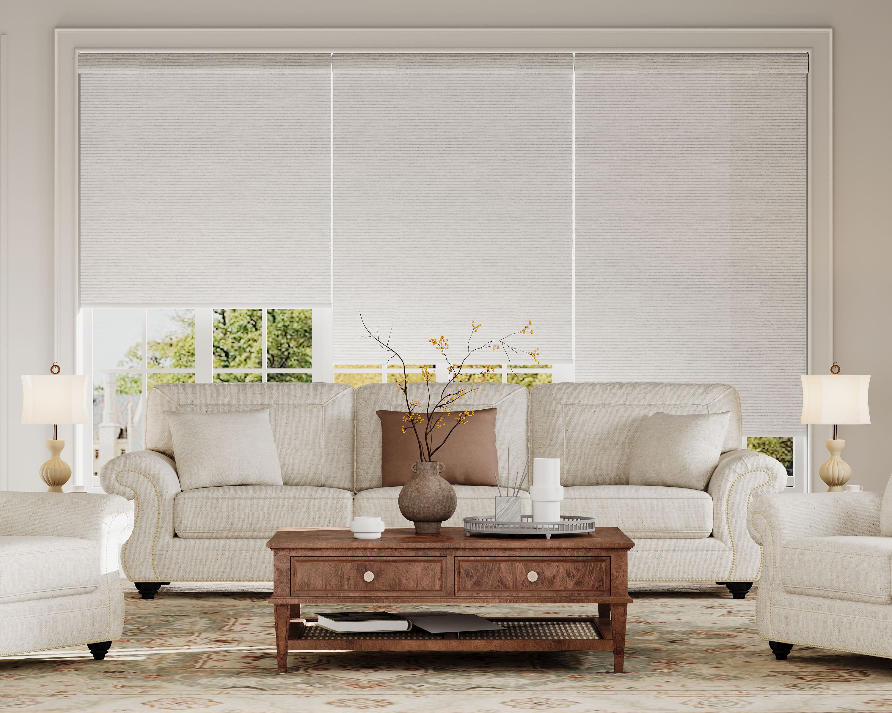
Coordinating Shade Fabrics With Wall Paint Colors
Let’s be real, finding that sweet spot between shade fabrics and wall paint colors can feel like a tiny puzzle. When it clicks, rooms feel balanced and full of personality. It’s about choosing to match or complement, making contrast work, and knowing which combos actually look fresh.
Matching Versus Complementing: Pros and Cons
Matching shade fabrics to wall paint makes everything feel seamless and open, especially with lighter tones or neutrals. It’s a safe bet if we love minimalism. But sometimes, matching can be a little… boring.
Complementing brings life and depth. Picking shades a step or two away on the color wheel gives a curated, not chaotic, look. The catch: it’s trickier. We have to pay attention to undertones and light.
Quick tip: Cool undertone walls (blue or gray)? Go with cool undertone shades. Warm undertone walls (yellow or red)? Stick with warm shade fabrics. Swatch comparisons in daylight save us from regret.
Creating Contrast Without a Clash
Contrast adds character, but too much is just loud. Pair dark shades with light walls, or the other way around. Navy blue shades with crisp white paint? Classic. Oatmeal linen against charcoal walls? Also great.
Texture is a lifesaver. Matte walls? Try a textured fabric for interest without wild color swings. Subtle stripes or woven fabrics keep things lively.
Stick to a shared undertone or intensity. Soft sage walls with rich emerald shades work because both are muted. For coordinating fabrics that also manage privacy and natural light effectively, this guide on balancing privacy and natural light in open-concept homes offers complementary strategies. Pairing super brights with muted walls? Only if we want the shades to be the star, every single day.
Popular Color Combinations That Work
Some combos just never fail:
| Wall Paint Color | Recommended Shade Fabric Colors |
|---|---|
| Soft Gray | White, Charcoal, Muted Yellow |
| Warm Beige | Rust, Olive Green, Warm White |
| Deep Blue | Tan, Natural Linen, Pale Gray |
| Sage Green | Cream, Terracotta, Dusty Rose |
| Crisp White | Navy, Slate, Rich Chocolate |
Earthy pairings like taupe walls and clay-colored shades work, too. Or go classic: pale blue walls with white or medium gray fabrics.
Natural textures—flax, linen—play nice with almost anything and help soften bold wall colors. Feeling bold? Color-blocked shades in two tones from the room’s palette look custom without much risk.
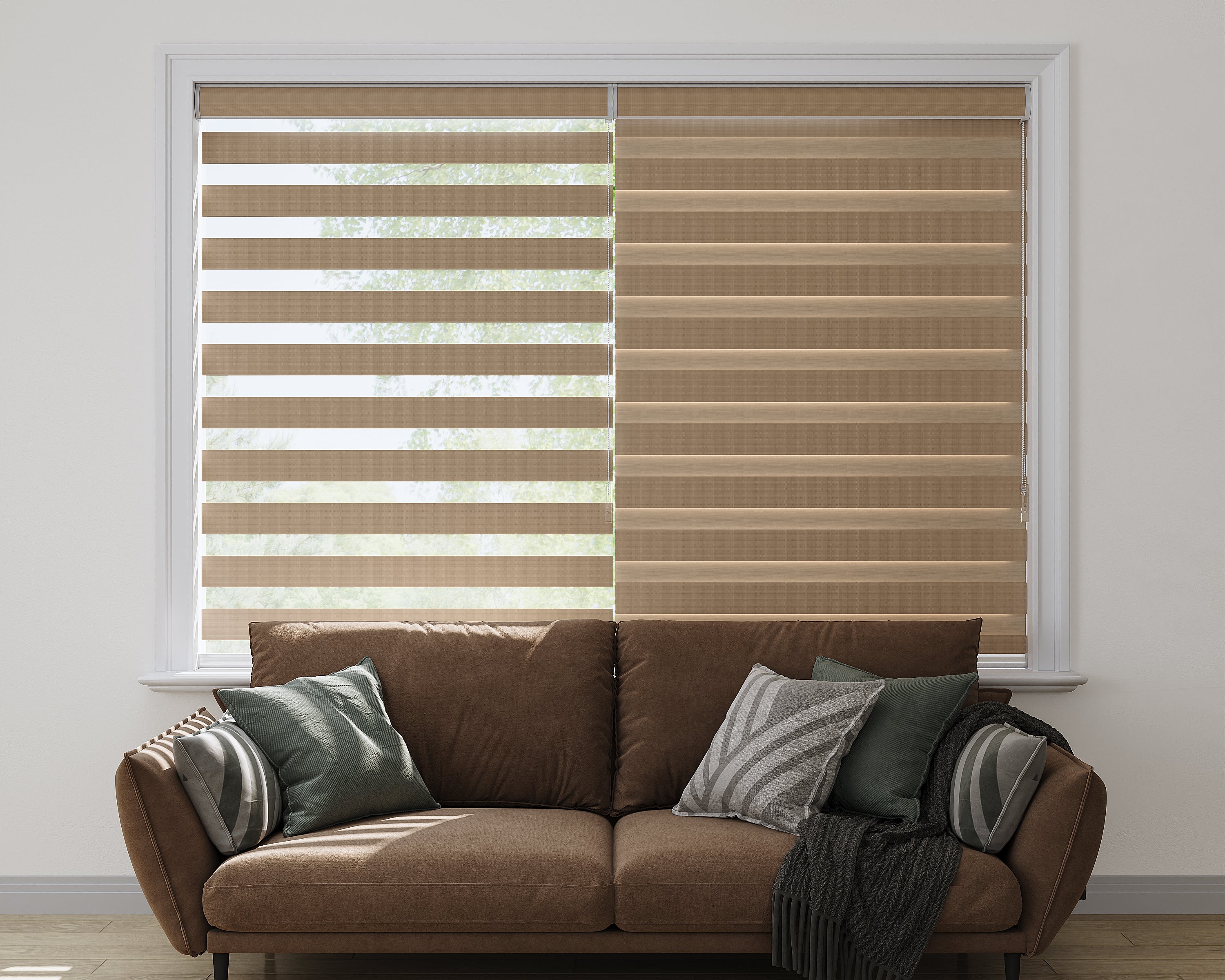
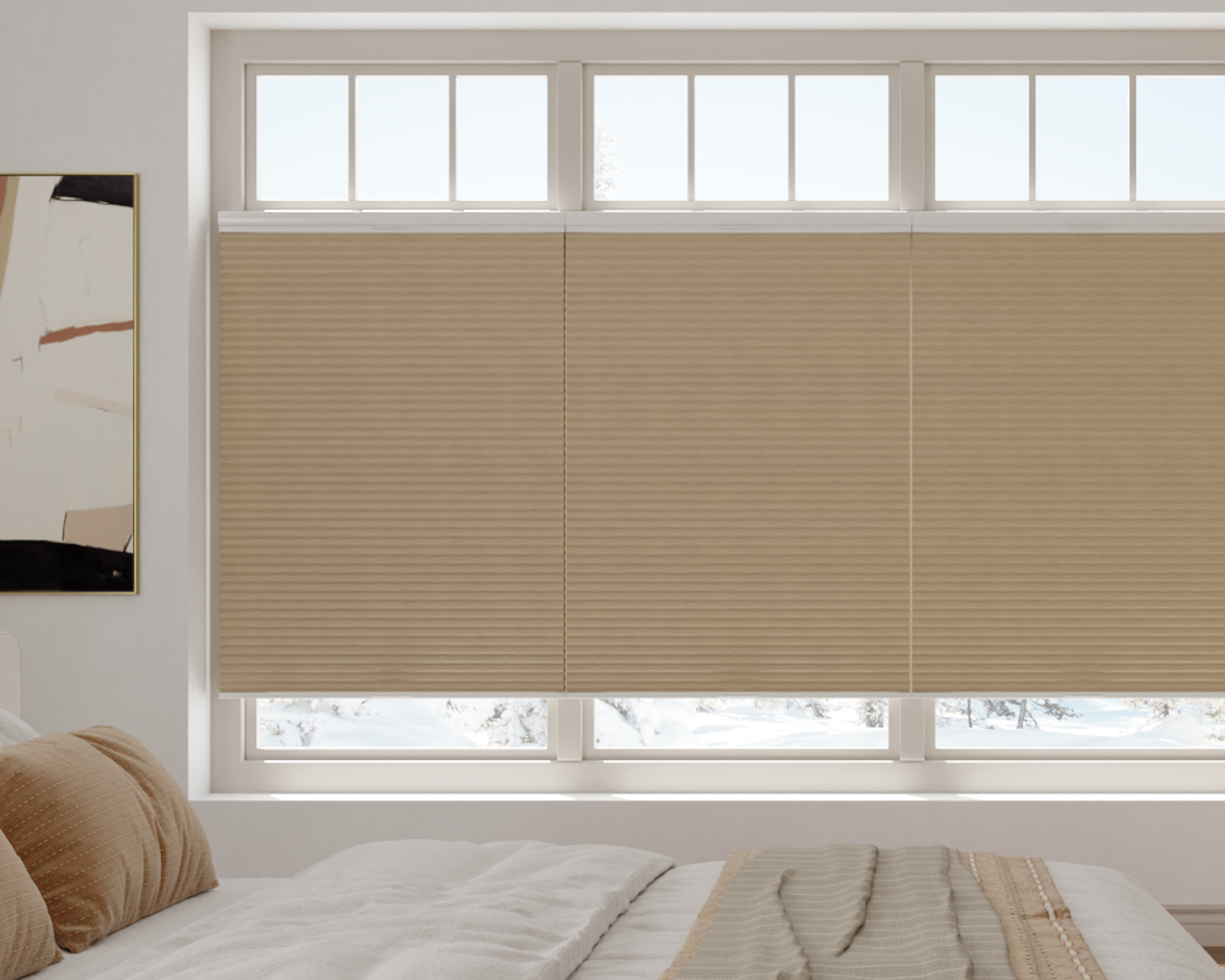
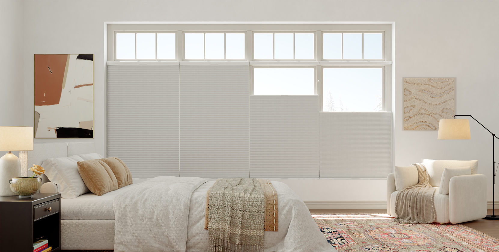
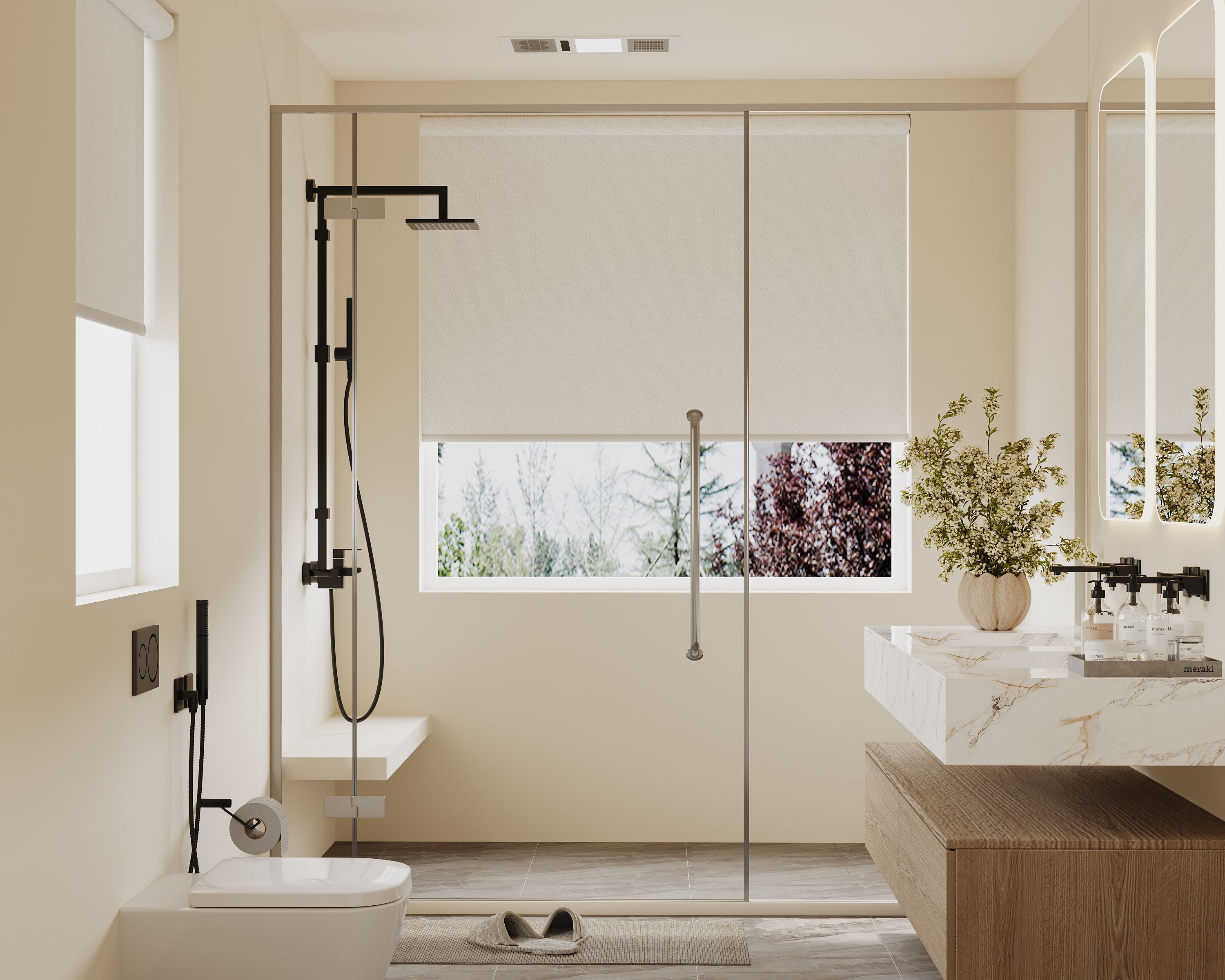
Selecting Fabrics That Pair With Trim and Molding
Pairing fabrics with trim isn’t just about matching colors—it’s about making the whole room feel intentional. The right combos highlight architectural details and set the mood.
Identifying Trim Undertones
Trim and molding might look white or off-white, but they’ve got undertones. Warm undertones lean yellow, beige, or pink; cool ones have hints of blue, gray, or green.
We should check our trim in daylight before deciding. Holding fabric samples right up to the trim makes undertone differences obvious. Even a small mismatch can throw things off.
If our trim is warm, fabrics with similar warmth (ivory, taupe, blush) work best. Cool trim? Crisp whites or soft blues are safer.
| Trim Color | Likely Undertone | Good Fabric Pairings |
|---|---|---|
| Stark white | Cool | Navy, charcoal, gray |
| Creamy or buttery | Warm | Warm linen, gold, rust |
| Pale gray | Cool | Soft blues, blue-greens |
| Greige or taupe | Warm | Olive, brown, coral |
For clean, understated fabric and trim combinations that maintain a refined look, this overview of minimalist window design explores achieving clean lines with low-profile roller shades.
Balancing Light and Dark Elements
Contrast between fabrics and trim adds drama or keeps things chill. Light fabrics against dark trim look crisp and modern. Dark fabrics with lighter trim anchor the space without overpowering.
For older homes with ornate or dark woodwork, we usually want fabrics that stand out but still blend. Patterns with subtle nods to the trim color—like cream with brown accents—pull everything together.
Layering neutrals with a couple of bolder colors keeps things fresh. Here’s a quick table:
| Trim Shade | Matching Approach | Fabric Ideas |
|---|---|---|
| Bright white | High or low contrast works | Navy, emerald, bold prints |
| Off-white | Softer contrast preferred | Beige, taupe, blush |
| Dark wood | Lighter, textured fabrics | Linen, pale tweed, pastels |
Color Matching Mistakes to Avoid
We've all stared at paint chips and fabric swatches until our eyes blur, right? Let’s try to dodge some of the usual pitfalls.
Forgetting Lighting: Rooms shift with the sun and lamps. Always check colors in different lighting before you commit. Trust me, it’s worth the hassle.
Ignoring Undertones: White isn’t just white, and beige isn’t just beige. Undertones sneak up on you. If your wall paint has a cool undertone but your shade fabric is warm, things get weird fast.
Overmatching: No need to make everything match exactly. Perfect matches can make a room feel flat. It’s better to coordinate and let a few contrasts sneak in.
Forgetting Texture: Even when two fabrics are technically the same color, their texture can make them look totally different. Mixing matte and shiny finishes can sometimes distract more than delight.
Sample Size Problems: Tiny swatches lie. Colors change on a bigger scale. Grab a larger sample or slap a paint patch on the wall before you decide—it’s a little extra work, but it pays off.
Checklist for Reference:
| Mistake | Quick Fix |
|---|---|
| Forgetting lighting | Check colors day and night |
| Overmatching shades | Mix similar but not identical |
| Skipping large samples | Test bigger swatches and patches |
Bringing It All Together: Sample Rooms and Mood Boards
Pairing shade fabrics with wall paints and trim isn’t just theory—it’s about actually testing ideas before making big changes. Playing around with fabric swatches and digital tools helps you see how colors really work together in your own space.
Tips for Testing Fabric Swatches at Home
Physical fabric swatches are a must before making any final calls. Lighting can mess with colors more than you’d think. Stick swatches near windows, next to trim, or right on the wall, and watch them throughout the day.
Staying organized helps. Try scribbling notes in a chart like this:
| Location | Daytime Color | Evening Color | Matches Wall? | Matches Trim? |
|---|---|---|---|---|
| Living Room | Looks cool | Looks warmer | Yes | No |
| Bedroom | Too dark | Too blue | No | Yes |
Hold up swatches next to your furniture too. It’s the best way to check if your new shades will actually vibe with what you already own. Sometimes a color you love on its own just doesn’t fit when everything’s together—been there.
Digital Tools for Visualizing Color Combinations
Digital tools are a lifesaver when you want to preview combinations before you start painting or ordering. Apps like Canva, Adobe Color, and Benjamin Moore’s Color Portfolio let you upload room photos and play with fabric and paint picks.
Mood boards help you see everything at once. Drag in wall colors, trim, and swatch images for a quick snapshot of your ideas. Tweak, swap, and experiment as much as you want—no mess.
You can even share these mockups with friends or family for a second opinion. It’s so much easier to adjust things before you start spending real money or time. For layering fabrics that enhance color coordination without visual clutter, this guide to effective layering of shades explores combining sheer and blackout shades without bulk.
Expert Insights: Trends and Timeless Choices
Lately, earthy tones like terracotta, sage, and clay keep popping up everywhere for walls and fabrics. They work especially well with natural wood trim and bring a cozy, grounded energy to a space.
If you’re more into classic looks, whites, creams, and grays still rule. These neutrals almost never clash, so they’re a safe move when you’re not sure about bold colors.
My go-to trick? Use the rule of three. Pick a main color, a supporting color, and an accent. For example:
- Main: Soft gray wall paint
- Supporting: Navy blue shade fabric
- Accent: Crisp white trim
Mixing textures is catching on too—linen against glossy trim, velvet with matte walls. It adds depth without making things feel too busy.
Here are some current pairings I’ve seen and liked:
| Wall Paint | Shade Fabric | Trim |
|---|---|---|
| Pale Olive | Warm Cream | Deep Walnut |
| Dusty Blue | Soft Beige | White |
| Light Charcoal | Mustard Yellow | Black |
Trends come and go, but some combos—like navy with white or taupe with soft green—just don’t quit. Don’t stress about finding the “perfect” match every time. Sometimes, good enough is more than enough.
Recommended Shades for Your Window


Frequently Asked Questions
Getting the right color match makes a room flow, highlights cool features, and helps a space feel more welcoming. With a little practice, anyone can get better at picking colors that blend or contrast well.
How can I pick a bedroom paint color that complements my bed linens?
Try pulling a main or accent color from your bedding for the walls. If your linens have a pattern, look for a lighter or softer shade from that design for a pulled-together look.
Solid bedding gives you more freedom, but it’s usually smart to stick to paint colors in the same family or go for a gentle contrast—like cool blue-grey walls with crisp white sheets.
What are three colors that work together for a harmonious room design?
Triadic color schemes are fun for balance and a little energy. Soft green, muted gold, and navy make a space feel fresh but grounded.
Another trio: dusty rose, charcoal, and ivory. It’s warm, a bit sophisticated, and doesn’t overpower the room.
Can you suggest some interior paint combinations that are currently in vogue?
Sage green, off-white, and warm taupe are everywhere right now. Navy blue with pale peach and soft grey is another combo that feels modern but still easy to live with.
If you want something bold but not too much, try creamy beige walls with deep olive and a hint of matte black.
What's the secret to choosing exterior paint colors that suit my home's style?
Start by looking at your home’s architecture and what’s typical in your neighborhood. Pick a main color that works with your roof and any brick or stone you’re not painting.
Classic white or soft black trim usually ties things together. For a fun twist, try a front door in deep red or navy—it adds personality without fighting the rest of the house.
What two color combinations can make my living room pop without overwhelming the space?
Soft greige paired with deep blue accents—like pillows or a painted wall—adds interest but isn’t chaotic. For a modern vibe, muted blush pink with dark olive or emerald green accessories works well.
These combos bring in color but still feel calm and work with just about any furniture style.
What perennial wall color choice is both stylish and timeless for any room?
Honestly, you just can’t go wrong with a soft white—especially the kind that’s got a hint of warmth. It feels inviting, not cold or clinical. Soft greys? Those are pretty reliable too. They stick around no matter how many times you change up your style or bring in new pieces.
Both of these shades basically work like blank canvases, letting your art, furniture, and all those little details actually stand out.
